In the docassemble web app, every screen that a user sees is
generated by a question block, which is a section of YAML code
that contains a question specifier. (Well, you can also generate
a screen using the message() function, but that is an advanced
topic.)
All blocks in an interview file must either be initial blocks,
code blocks, or contain a question specifier.
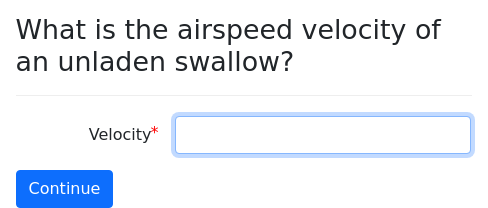
The question block
question: |
  What is the airspeed velocity of an
  unladen swallow?
fields:
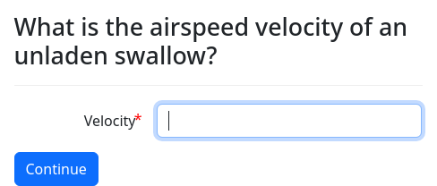
- Velocity: swallow_velocityBy including the above YAML block in your interview file, you are
telling docassemble that if it ever needs to know the value of
swallow_velocity, it should ask the user the question “What is the
airspeed velocity of an unladen swallow?” and provide the user with an
input box labeled “Velocity” in which the user can type the answer.
Like many things in docassemble, the question specifier can
contain Markdown and Mako. For example:
question: |
  What is the *airspeed* velocity of an
  unladen ${ african_or_european }
  swallow?
fields:
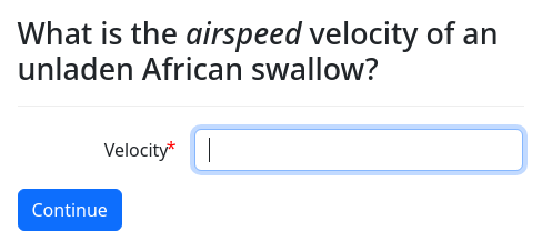
- Velocity: swallow_velocityIn this example, the word “airspeed” is italicized, using the
Markdown syntax for italics. The type of swallow is given by a
variable (african_or_european), the value of which ("African") is
incorporated using Mako. (One of the features of Mako is that
anything enclosed in ${ ... } is evaluated as Python code.)
The subquestion specifier
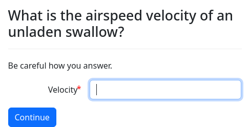
The optional subquestion adds text underneath the question. It is
typically used to explain the question in more detail, if such an
explanation is necessary.
question: |
  What is the airspeed velocity of an
  unladen swallow?
subquestion: Be careful how you answer.
fields:
- Velocity: swallow_velocityThe under specifier
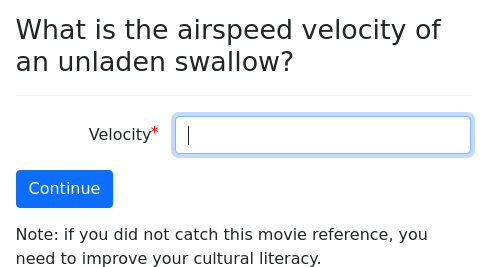
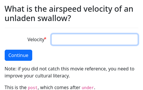
The optional under specifier adds text underneath the buttons.
question: |
  What is the airspeed velocity of an
  unladen swallow?
fields:
  - Velocity: swallow_velocity
under: |
  Note: if you did not catch this
  movie reference, you need to
improve your cultural literacy.The pre specifier
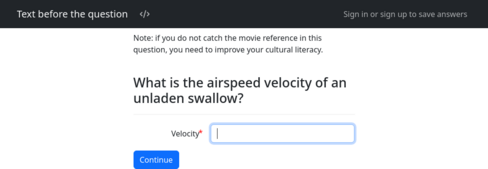
The optional pre specifier adds text before the question.
question: |
  What is the airspeed velocity of an
  unladen swallow?
fields:
  - Velocity: swallow_velocity
pre: |
  Note: if you do not catch the
  movie reference in this question,
  you need to improve your cultural
literacy.The post specifier
The optional post specifier adds text after the question.
question: |
  What is the airspeed velocity of an
  unladen swallow?
fields:
  - Velocity: swallow_velocity
under: |
  Note: if you did not catch this
  movie reference, you need to
  improve your cultural literacy.
post: |
  This is the `post`, which comes
after `under`.The right specifier
The optional right specifier adds text on the right-hand side of the
screen, or below the question on small screens.
question: |
  What is the airspeed velocity of an
  unladen swallow?
fields:
  - Velocity: swallow_velocity
right: |
  ### Note

  If you did not catch this
  movie reference, you need to
improve your cultural literacy.If your interview has questions that use the right specifier, you
might want to set the centered feature to False so that the text
on the right is wider.
features:
  centered: False
---
question: |
  What is the airspeed velocity of an
  unladen swallow?
fields:
  - Velocity: swallow_velocity
right: |
  ### Note

  If you did not catch this
  movie reference, you need to
improve your cultural literacy.The css class specifier
The optional css class specifier can be used to set a CSS class
for the <body> of the screen of a question.
css class: first-question
mandatory: True
question: |
  View the source and look for
the word `first-question`.The table css class specifier
The optional table css class specifier can be used to set the CSS
class of any Markdown-generated tables that appear in the question.
There is no feature in Markdown for specifying a class of a table.
The class of tables can be customized at the question level, or at
the interview level with default screen parts, or you can set a
server-wide default with the table css class Configuration
directive.
The question metadata specifier
The optional question metadata specifier allows you to associate
custom metadata with a question. You can use any format YAML will
accept, and you can use Mako in text. The metadata will appear in the
JSON representation of the question.
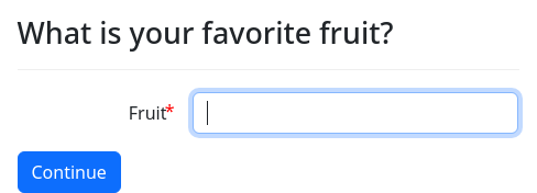
question: |
  What is your favorite fruit?
fields:
  - Fruit: favorite_fruit
question metadata:
  inspiration: Sophocles
  antagonists:
    - Frozen vegetables
    - Roasted tree nuts
    - ${ favorite_automobile }
Using questions to set variables
Here is a brief summary of the types of questions that can be asked. More detail about how these question types work is provided in the next section.
True or false: yesno and noyes
A yesno question will set a variable to True or False when a Yes
or No button is pressed. noyes does the opposite.
question: |
  Are you at least 18 years of age?
yesno: over_eighteenMultiple choice: choices or buttons
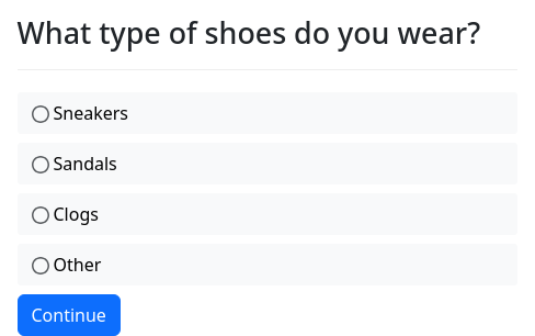
You can ask a multiple-choice question by providing a list of choices:
question: |
  What type of shoes do you wear?
field: target_variable
choices:
  - Sneakers
  - Sandals
  - Clogs
- OtherOr, if you would prefer to use one-click buttons instead of “radio
buttons” in combination with a “Continue” button, use can use
buttons instead of choices.
question: |
  What type of belly button do you
  have?
field: target_variable
buttons:
  - Innie
  - Outie
- No belly buttonThe variable indicated by field will be set to the value supplied in
the choices/buttons list.
Acknowledgement button: continue button field
If you simply want the user to acknowledge something by clicking
“Continue,” provide a continue button field.
The variable indicated by continue button field will be set to
True when the user clicks “Continue.”
continue button field: target_variable
question: |
  Welcome to the interview.
subquestion: |
  When you are ready to begin, press
Continue.One or more fill-in fields: fields
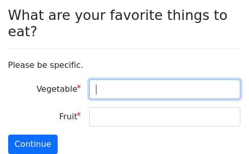
You can ask the user to fill in multiple fields using fields.
question: |
  What are your favorite things to eat?
subquestion: |
  Please be specific.
fields:
  - Vegetable: target_variable
- Fruit: other_target_variableThere are many other types of input that you can gather with
fields, including large text areas, file uploads, radio buttons,
and checkboxes. There are a variety of ways you can insert text into
the list of fields to help guide the user. If you know HTML, you
can insert arbitrary HTML,
CSS, and
JavaScript. Using the
show if feature, you can cause fields to appear or disappear
depending on the values of other fields.
User’s signature: signature
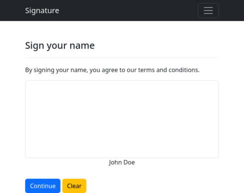
You can ask the user to write his or her signature using signature:
question: |
  Sign your name
subquestion: |
  By signing your name, you agree to
  our terms and conditions.
signature: target_variable
under: |
${ user }The signature will be stored as an image file in the variable
indicated by signature.
Ending screens
Sometimes, the purpose of your question is not to gather
information but to present an end screen to the user. You can create
such “questions” by marking them as mandatory:
question: |
  Congratulations!
subquestion: |
  You are all done with the interview.
mandatory: TrueIf you have more than one possible ending screen in your interview,
use the event feature described below.
Special buttons
Using the buttons or choices syntax
described above, you can add special buttons to a screen. These
buttons are special because they do not set a variable.
These buttons are particularly useful on “terminal” screens.
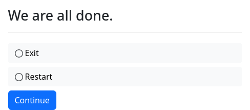
question: We are all done.
buttons:
  - Exit: exit
  - Restart: restart
mandatory: TrueThe above example allows the user to “exit” the interview (i.e., to be redirected to a different web site) or “restart” the interview (i.e., go back to the beginning, with all of the answers forgotten).
There are six special button functions:
restartnew_sessionexitlogoutexit_logoutleavecontinuerefreshsignin
restart resets the user’s variable store,
except that any parameters that were originally passed through as URL
parameters will be used again. The user is redirected to the first
question of the interview.
new_session does not disturb the current
interview session, but starts a new session for the same interview,
with the same URL parameters and Referer.
exit means that the user’s variable store will be
erased and the user will be redirected either to the URL given by the
associated url text, or if no url is defined, to the exit url
defined in the metadata, or if that does not defined, then to the
exitpage defined in the configuration. If the user tries to
come back to the interview again, he will start the interview again,
as though it had never been started. Original URL parameters will be
lost.
For example:
question: |
  Congratulations, you found Nemo!
buttons:
  - Try again: restart
  - Learn More: exit
    url: https://en.wikipedia.org/wiki/Amphiprioninae
mandatory: TrueMako can be used in the url text.
logout logs the user out, if the user is logged in.
exit_logout does the same thing as exit,
except that it also logs the user out, if the user is logged in.
leave works like exit except that the user’s
variable store will be left intact. This means that if the user comes
back to the interview again, he will pick up where he left off.
continue means that docassemble will move
on from the question without really doing anything. Here is an
example of when it is useful:
mandatory: True
code: |
  menu_items = [ action_menu_item('Visit Cow', 'see_cow') ]
---
event: see_cow
question: |
  Moo!
subquestion: |
  [FILE cow.jpg]

  Cow illustration designed by
  [Freepik](http://www.freepik.com/free-photos-vectors/animal)
buttons:
  - Continue: continue
---
question: Welcome to the interview
subquestion: |
  Check out the menu in the
  upper-right corner.
mandatory: TrueThis example uses the actions feature and the menu_items special
variable to present a special screen that shows a picture. This
screen does not set any variable, but the user can click the button to
“continue” with the normal course of the interview.
The continue button can also be used with a question that is shown
because it is mandatory.
mandatory: True
question: |
  Please note that this app is only right for you if
  you are a bear.
buttons:
  - I am not a bear: exit
  - Continue: continue
---
mandatory: True
question: |
  Instructions for bears
subquestion: |
  Grip the doorknob and turn it.

Then look for the pantry. That is where they keep the food.While using continue can be useful sometimes, it is generally not a
good idea to structure interviews around questions that use
continue. These questions cannot use the generic object
modifier or index variables.
refresh re-runs the interview logic. It has
much the same effect as refreshing the page in the browser. It is
useful in multi-user interviews when the user is waiting for another
user to finish entering information. It can also be useful in
interviews that use external data sources.
mandatory: True
code: |
  tell_time
---
event: tell_time
question: |
  The current time is
  ${ current_datetime().format_time() }.
buttons:
- Tell me again: refreshsignin redirects the user to the
docassemble sign-in page.
mandatory: True
code: |
  if user_logged_in():
    goodbye_page
  else:
    sign_in_page
---
question: |
  Please sign in
buttons:
  - Sign in: signin
sets: sign_in_pageInstead of using buttons, you can use
choices to get a radio list instead of a selection of
buttons.
question: We are all done.
choices:
  - Exit: exit
  - Restart: restart
mandatory: TrueThe functionality is the same.
The command() function allows you to do similar things with Python
code. In addition, the url_of() function provides URLs that
accomplish a similar purposes.
Mixing special buttons with buttons that set a variable
Note that since “special” buttons do not set a variable, you should
not include a field in the question. If you include a
field in the question, docassemble will assume you are
creating an ordinary multiple choice question.
If you wish to mix “special” buttons with buttons that set a variable,
you can use the command() function in code to trigger the same
effects as clicking on a “special” button.
The following example uses a mandatory code block
to determine the course of the interview. Depending on the answer to
an ordinary multiple choice question, it either exits from the
interview or proceeds to another screen.
mandatory: True
code: |
  if user_choice == 'exit':
    command('exit')
  elif user_choice == 'proceed':
    final_screen
---
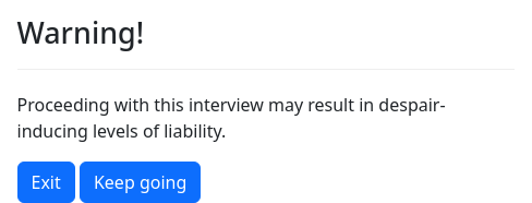
question: |
  Warning!
subquestion: |
  Proceeding with this interview may
  result in despair-inducing levels
  of liability.
field: user_choice
buttons:
  - Exit: exit
  - Keep going: proceed
---
event: final_screen
question: |
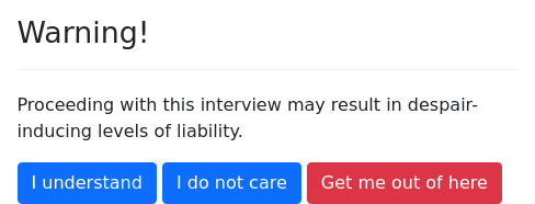
Hey, I warned you.Another alternative is to use multiple-choice buttons that run code:
question: |
  Warning!
subquestion: |
  Proceeding with this interview may
  result in despair-inducing levels
  of liability.
buttons:
  - I understand:
      code: |
        attitude = 'careful'
  - I do not care:
      code: |
        attitude = 'reckless'
  - Get me out of here: exit
---
mandatory: true
question: |
  % if attitude == 'reckless':
  You are foolish!
  % else:
  Ok, we are proceeding with caution.
% endifSpecial screens: event
Some screens are shown to the user when a special event occurs.
For example, if you have a multi-user interview and the interview
reaches a point where the user cannot proceed until the other
interviewee answers a question, the interview will present the user
with a question that explains why he or she needs to wait.
Or, you might want to provide the user with the ability to review his
or her answers on a single screen, using the review functionality.
The event specifier advertises to the interview logic that the
question should be asked if a special event occurs.
question: |
  This is a special screen.
event: show_special_screenThis specifier can be used to indicate an ending screen, where your interview has more than one possible ending screen and you use interview logic to direct the user to the appropriate screen.
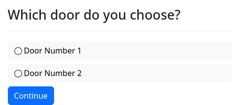
question: |
  Which door do you choose?
field: door_choice
choices:
  - Door Number 1
  - Door Number 2
---
mandatory: True
code: |
  if door_choice == 'Door Number 1':
    good_luck
  if door_choice == 'Door Number 2':
    bad_luck
---
question: |
  You walk into a field of clover.
event: good_luck
---
question: |
  You walk into a stinky swamp.
event: bad_luckIn this example, good_luck and bad_luck are actually names of
Python variables. However, they are Python variables that will
never be defined. If a reference to these variables is made, as it is
in the mandatory code block, docassemble will locate the
good_luck and bad_luck questions, just as it looks for questions
that offer to define any variable.
See interview logic for more information about how to
give direction to your interview by adding code blocks that are
marked with the mandatory modifier.
The event specifier is also used to create screens that the user can
reach from the menu or from hyperlinks embedded in question text. For
more information, see event, url_action(),
process_action(), action_menu_item(), and menu_items.
Include additional buttons on the screen
In many questions, the only button the user can click is
“Continue.” You can set a variable using a buttons specifier with
a field. You can also use a buttons screen that does
not set a variable. You can also use question back button to move
the “Back” button to the buttons area, or question help button to
move the interview help button to the buttons area.
If you want to include additional button choices on a screen, you can
use action buttons. When the user clicks a button it will run an
action in the interview.
question: |
  I will give you
  ${ quantity_noun(num_apples, 'apple') }.
field: show_quantity
action buttons:
  - label: More
    action: change_quantity
    arguments:
      amount: 1
    color: success
    css class: quantity-up
    icon: chevron-up
  - label: Less
    action: change_quantity
    arguments:
      amount: -1
    color: danger
    css class: quantity-down
    icon: chevron-down
---
event: change_quantity
code: |
num_apples += action_argument('amount')For each button, the required items are action and label. You can
optionally include color to indicate the Bootstrap color of the
button (primary, secondary, success, danger, warning,
info, light, link, or dark). The default color is primary.
You can also optionally include icon to indicate a Font Awesome icon
name to include in the button. If your action requires arguments,
you can indicate the arguments using arguments. To specify that a
particular button should have a particular CSS class, you can specify
css class. You can use Mako templating in any of these elements.
If you want to define the buttons programmatically, you can set
action buttons to a dictionary where the only item is code.
question: |
  What is your favorite fruit?
fields:
  - Fruit: favorite_fruit
---
question: |
  Thank you for that information.
field: thank_user
action buttons:
  code: |
    [{'action': 'eat',
      'arguments': {'fruit': favorite_fruit},
      'label': 'Eat ' + favorite_fruit,
      'color': 'secondary',
      'css class': 'eat-button'}]
---
event: eat
code: |
  log('Nom nom nom.  That ' + action_argument('fruit') + ' was good.', "info")
set_save_status('ignore')When you use code to define the action buttons, you need to
provide a Python expression that evaluates to a list of
dictionaries, where each dictionary has the items action and label
at a minimum.
By default, the buttons indicated by action buttons will be placed
after the “Continue” button or any other buttons specified in the
question, and before the question help button (if present). If
you want a button to appear before the standard buttons of the
question, set placement to before.
question: |
  I will give you
  ${ quantity_noun(num_apples, 'apple') }.
field: show_quantity
action buttons:
  - label: More
    action: change_quantity
    arguments:
      amount: 1
    color: success
    icon: chevron-up
    placement: before
  - label: Less
    action: change_quantity
    arguments:
      amount: -1
    color: danger
    icon: chevron-down
    placement: before
---
event: change_quantity
code: |
num_apples += action_argument('amount')If you set the action of an button to a web URL (beginning with
http://, https://, /, or ?) or a JavaScript URL (beginning
with javascript:), then the button will act like a hyperlink with
the value of the action as the href.
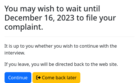
question: |
  You may wish to wait until
  ${ today().plus(weeks=3) }
  to file your complaint.
subquestion: |
  It is up to you whether you wish
  to continue with the interview.

  If you leave, you will be directed
  back to the web site.
field: wishes_to_continue
action buttons:
  - label: Come back later
    action: https://docassemble.org
    color: warning
icon: sign-out-altIf you want the link to open in another window, use new window:
True.
By default, if the user starts an action
and then starts a second action without finishing the first, then when
the user finishes the second action, the first action will be resumed.
This is sometimes desirable and sometimes not. If you want the action
launched by your button to be the only active action, set forget
prior: True in the action button definition; then all prior actions
will be forgotten.
If you want a button to be included only conditionally, set show if
to a Python expression. If the expression evaluates to a false value,
the button will not be shown. When you define buttons with code, you
can include show if in a dict for a button, and if it is a false
value, the button will be omitted.
Customizing screen parts
When the user looks at a screen in an interview, there are many
different “parts” of the screen. Above, you were introduced to the
question, subquestion, under, right, and css class
parts.
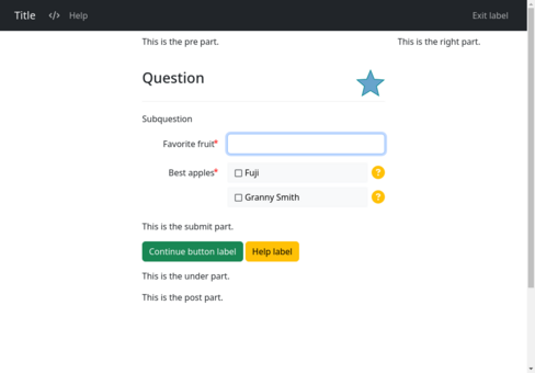
There are other parts of the screen as well, which by default are empty or have a useful default. The following interview demonstrates where each part is located. Try out the interview and look at the results with different screen sizes.
metadata:
  title: Title
  short title: Short title
  subtitle: |
    This is the subtitle part.
  pre: |
    This is the pre part.
  submit: |
    This is the submit part.
  post: |
    This is the post part.
  under: |
    This is the under part.
  right: |
    This is the right part.
  exit link: leave
  exit label: |
    Exit label
  help label: |
    Help label
  help button color: warning
  continue button label: |
    Continue button label
  continue button color: success
  resume button label: |
    Resume button label
  resume button color: info
  back button label: |
    Back button label
  back button color: danger
  footer: |
This is the footer part.- The
titleis the “long title” that appears in the upper-left on a large screen. - The
short titleappears in the upper-left on a small screen. If not provided, thetitleis used in its place. - The
title urlis the URL to which the user will be directed if the user clicks on the title. The default is that clicking the title does nothing. - The
title url opens in other windowcan be set toFalseif you do not want thetitle urlto open in new window or tab. - The
subtitleis not visible on the screen, but can be seen in the list of Available Interviews. - The
logo, if set, will replace thetitleandshort titlewith custom HTML content, such as an image. This HTML is placed inside of a<span>element, so it is important to only use “inline” HTML elements. You can provide CSS to the interview and reference CSS classes in yourlogo. Ideally the logo should be no taller than 20 pixels. If thelogois taller, the navigation bar will expand to fit, and you will need to adjust the CSS to specify different values for.da-pad-for-navbarand.da-top-for-navbar. - The
short logo, if set, will replace thelogoon a small screen. - The
prearea is above thequestion. - The
submitarea is above the buttons, if the screen has buttons. - The
underarea is directly below the buttons. - The
rightarea is to the right, but if the screen is too small, it wraps and appears under theunderarea. - The
postarea is below everything except for image attributions, which are below thepostarea. - The
footerarea is at the bottom of the screen, in a 60px tall box with the Bootstraplightcolor. If aglobal footerormain page footeris defined in the Configuration, you can turn off the default footer by setting thefooterarea tooff. - The
exit linkis not a visible component, but rather a value that is eitherexitorleave. It controls the operation of the exit link in the upper right corner, which is present ifshow loginis set toFalse. - The
exit labelis the visible label of the exit link in the upper right corner, which is present ifshow loginis set toFalse. - The
exit urlis a URL to which the user will be directed when they click the exit link. - The
help labelis the default label for the “help” tab. It can be overridden by alabelspecifier inside ahelpmodifier. If you set aquestion help button, thehelp labelwill be used for the help button, while the label for the help tab will be the less conspicuous word “Help.” - The
help button coloris the Bootstrap color of the help button that appears when you set aquestion help buttonis enabled. This also affects the color of the question mark icon that appears when a choice in a multiple choice list has help text associated with it. - The
continue button labelis the label for the “Continue” button. If thequestionis areviewquestion, this is called theresume button label. - The
continue button coloris the Bootstrap color of the “Continue” button. If thequestionis areviewquestion, this is called theresume button color. - The
back button labelis the label for the back button that appears within the question itself whenquestion back buttonis enabled. - The
back button coloris the Bootstrap color of the back button that appears within the question itself whenquestion back buttonis enabled. - The
corner back button labelis the label for the back button that appears in the upper-left corner. - The
css classwill be added to the classes of the<body>of the question. - The
table css classwill be the class of any<table>elements created based on Markdown tables. You can set this totable table-borderedfor a Bootstrap “bordered” table. You can also usetable css classto specify a class for the<thead>within the table. If you settable css classtotable table-bordered, thead-dark, then the<table>will have the classtable table-borderedand the<thead>will have the classthead-dark. - The
navigation bar htmllets you add HTML to the navigation bar. The HTML will be inserted into a<ul class="nav navbar-nav">element, so for best results, the HTML should consist of one or more items in a form like<li class="nav-item"><a class="nav-link" href="/some_link">Label</a></li>. For more information about how these CSS classes work, see the documentation for the Bootstrap Navbar. On small screens, the HTML is shown when the user clicks the toggler icon. You may wish to used-none d-md-blockclasses to hide the HTML when the screen is small. Make sure your HTML does not contain any errors, or else the HTML of the entire screen could be affected.
There are a variety of ways that you can specify what content should appear in these areas. These ways range from question-specific specifiers to interview-wide defaults to server-wide defaults. You should pick whatever method works best for your purposes.
You can customize many of the screen parts as part of a question
block. As explained above, there are specifiers for the question,
subquestion, under, and right parts. There are also
modifiers for continue button label, continue button color,
resume button label, resume button color, back button
label, and corner back button label. When you set
question-specific help, you can indicate a label that will be
used as a label for the help tab or the help button.
There are three methods for specifying interview-wide default values for parts of the screen:
- Using the
set_parts()function in Python code to set default values for the screen parts. You can use Python logic and theget_language()function to set different values for different languages. Mako templating is not supported and formatting must use raw HTML. - Using a
default screen partsblock to specify dynamic content using Mako templating and Markdown formatting, which is re-evaluated every time the screen loads. Using thelanguagemodifier (or adefault languageblock in a separate YAML file), you can write differentdefault screen partsblocks for different languages. - Using a
metadatablock to specify static content that is the same for all sessions of the interview. Mako templating is not supported and formatting must use raw HTML. You can specify different content to be used for different languages. An advantage ofmetadataoverdefault screen partsis that it is visible to the Available Interviews list, whereas other methods of setting defaults are not.
Finally, there is a server-wide method for specifying default values,
which is to set the Configuration directives main page pre,
main page post, etc. Mako templating is not supported and
formatting must use raw HTML. These directives allow you to set
different content for different languages.
These different methods override each other in this order. A
metadata block will override Configuration directives, a
default screen parts block will override a metadata block,
set_parts() will override a default screen parts block, and
question-specific specifiers will override parts specified by
set_parts().
For more information about each method, see its documentation.
