To instruct docassemble to store user input that it receives in
response to a question, you need to include in your question a
variable name to hold the information. You also
need to indicate what type of variable it is (e.g., text, a date, a
number), and how you want to ask for the input (e.g., with a label).
This section explains the many ways that variables can be populated
using questions.
A note about variable names
Variable names are Python identifiers, which means they can be any
sequence of uppercase or lowercase letters, digits, and underscores,
except the first character cannot be a digit. No spaces are allowed
and no punctuation is allowed except for the underscore, _.
The following are valid variable names:
fried_fish1NyanCatnyancat(variables are case-sensitive, so this is not the same as the above)__f645456DG_greij_43(but why would you use something so ugly?)USER_PHONE_NUMBER(ok, but why are you yelling?)
The following are not valid variable names, and if you try to use such variable names you will may get an error or unexpected results:
8th_plaintiff(you can’t begin a variable name with a number; Python will say “invalid syntax”)Nyan-Cat(this is arithmetic:NyanminusCat)fried.fish1(this is valid code, but Python will think you are referring to the attributefish1of the objectfried)user's_phone_number(apostrophes are not allowed; Python recognizes them as single quotes)favorite animal(spaces are not allowed)beneficiary#1(punctuation marks other than_are not allowed)applicant_résumé(only plain alphabet characters can be used)user.__ssn(attributes beginning with__are not allowed)fororlicense.for(attributes cannot share names with built-in Python syntax. Names likefor,while, orinwill result in errors if used as variable names or attribute names. See reserved variable names for a list of names that cannot be used.
If you find yourself using variable names like automobile_one and
automobile_two, you should learn about groups and
generalizing. It would make more sense to work with
variables automobile[0] and automobile[1], or automobile[i].
If you find yourself using variable names like employment_income,
self_employment_income, and retirement_income, you should learn
about the DADict (a type of group). It would make more sense to
work with variables like income['employment'],
income['self-employment'], and income['retirement']. Then you
could generalize the questions you ask.
And if you find yourself using variable names like
defendant_spouse_ssn and defendant_spouse_date_of_birth, you
should learn about objects. It would make more sense to work with
variables like defendant.spouse.ssn and
defendant.spouse.birthdate. There are many advantages of working
with objects, such as being able to write defendant.age_in_years()
and defendant.spouse.age_in_years() to calculate the ages of people
based on their birthdates.
See reserved variable names for a list of variable names that you cannot use because they conflict with built-in names that Python and docassemble use.
Multiple choice questions (one variable only)
Yes or no questions
yesno and noyes
yesno causes a question to set a boolean (true/false)
variable when answered.
question: |
  Are you at least 18 years of age?
yesno: over_eighteenIn the example above, the web app will present “Yes” and “No” buttons
and will set over_eighteen to True if “Yes” is pressed, and
False if “No” is pressed.
noyes is just like yesno, except that “Yes” means
False and “No” means True.
question: |
  Are you at least 18 years of age?
noyes: user_is_minorNote that yes/no fields can also be gathered on a screen along with
other fields; to make screens like that, use
fields below.
yesnomaybe or noyesmaybe
These are just like yesno and noyes, except that they offer a
third choice, “I don’t know.” If the user selects “I don’t know,” the
variable is set to None, which is a special Python constant that
represents the absence of a value.
question: |
  Is Topeka the capital of Kansas?
yesnomaybe: topeka_is_capital_of_kansas
---
question: |
  % if topeka_is_capital_of_kansas:
  You were right that Topeka is the capital of Kansas.
  % elif topeka_is_capital_of_kansas is None:
  You should know your state capitals!
  % else:
  Actually, Topeka is the capital of Kansas.
  % endif
mandatory: TrueNote that both False and None are considered to be “false” values
in Python. So if you write:
% if not topeka_is_capital_of_kansas:
You are a dummy!
% endif
then the phrase “You are a dummy!” will be shown both if the value is
False and also if the value is None. If you need to test
specifically for the “I don’t know” answer, use is None.
Multiple choice buttons
A question block with buttons will set the variable
identified in field to a particular value depending on which of the
buttons the user presses.
buttons must always refer to a list, so that docassemble knows
the order of the buttons.
If an item under buttons is a YAML key-value pair (written in the
form of - key: value), then the key will be the button label that the
user sees, and the value will be what the variable identified in field
will be set to if the user presses that button.
question: |
  How would you like to pay for your
  car?
field: target_variable
buttons:
  - Buy it: purchaser
- Lease it: borrowerAn item under buttons can also be plain text; in that case
docassemble uses this text for both the label and the variable
value.
question: |
  What type of belly button do you
  have?
field: target_variable
buttons:
  - Innie
  - Outie
- No belly buttonIn other words, this:
field: user_gender
question: What is your gender?
buttons:
  - Male
- Femaleis equivalent to this:
field: user_gender
question: What is your gender?
buttons:
  - Male: Male
- Female: FemaleYou can also provide the label and the corresponding value by using a
dictionary containing keys label and value.
You can customize the appearance of buttons by specifying a css
class and/or a color in the dictionary.
field: user_gender
question: What is your gender?
buttons:
- value: male
label: Male
css class: male-button
color: info
- value: female
label: Female
css class: female-button
color: dangerThe color should refer to one of the Bootstrap colors (primary,
secondary, success, danger, warning, info, light, link,
or dark).
If you want one of the choices to be shown or not shown conditionally,
you can use show if to specify a Python expression. If the
expression evaluates to true, then the choice will be included, and if
it evaluates to false, it will be excluded.
field: target_variable
question: Which flour shall we use?
buttons:
  - value: almond
    label: Almond
  - value: oat
    label: Oat
  - value: wheat
    label: Wheat
    show if: gluten_tolerant
  - value: spelt
    label: Spelt
show if: gluten_tolerantUsing code to generate the choices
A powerful feature of buttons (which also works with
choices, dropdown,
and combobox) is the ability to use Python
code to generate button choices. If an item under buttons is a
key-value pair in which the key is the word code, then
docassemble executes the value as Python code, which is expected
to return a list. This code is executed at the time the question is
asked, and the code can include variables from the interview.
docassemble will process the resulting list and create additional
buttons for each item.
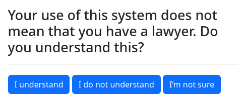
field: target_variable
question: |
  Your use of this system does not
  mean that you have a lawyer.  Do
  you understand this?
buttons:
  code: |
    [{'understands': "I understand"},
     {'does not understand': "I do not understand"},
{'unsure': "I'm not sure"}]Note that the Python code needs to return a list of key-value pairs (Python dictionaries) where the key is what the variable should be set to and the value is the button label. This is different from the YAML syntax.
This is equivalent to:
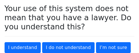
field: target_variable
question: |
  Your use of this system does not
  mean that you have a lawyer.  Do
  you understand this?
buttons:
  - "I understand": understands
  - "I do not understand": does not understand
- "I'm not sure": unsureYou can mix choices that are specified manually with choices that are specified with code:
field: target_variable
question: |
  Your use of this system does not
  mean that you have a lawyer.  Do
  you understand this?
buttons:
  - "I understand": understands
  - code: |
[{'does not understand':"I do not understand"}, {'unsure':"I'm not sure"}]Instead of using key-value pairs to represent what the variable is set
to and the label, you can use value and label as
keys in the dictionary. You can also use the dictionary keys css
class and color to modify the appearance of the buttons, and show
if to conditionally include the button.
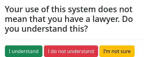
field: target_variable
question: |
Your use of this system does not
mean that you have a lawyer. Do
you understand this?
buttons:
code: |
[{'label': "I understand",
'value': 'understands',
'css class': 'good',
'color': 'success'},
{'label': "I do not understand",
'value': 'does not understand',
'css class': 'clueless',
'color': 'danger'},
{'label': "I object",
'value': 'objects',
'css class': 'ornery',
'show if': is_annoying,
'color': 'danger'},
{'label': "I'm not sure",
'value': 'unsure',
'css class': 'unsure',
'color': 'warning'}]The color should refer to one of the Bootstrap colors (primary,
secondary, success, danger, warning, info, light, link,
or dark).
As explained below, you can also use code to decorate the buttons with images.
If you need the variable to have a data type other than text, you need
to specify a datatype.
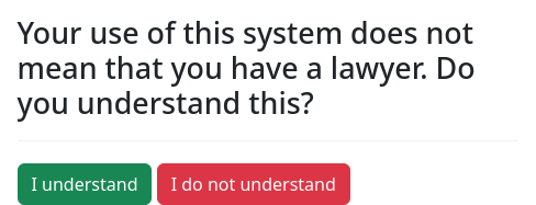
field: target_variable
question: |
Your use of this system does not
mean that you have a lawyer. Do
you understand this?
datatype: boolean
buttons:
code: |
[{'label': "I understand",
'value': True,
'css class': 'good',
'color': 'success'},
{'label': "I do not understand",
'value': False,
'css class': 'clueless',
'color': 'danger'}]The possible datatype values include boolean (True or False),
threestate (True, False, or None), and other
data types.
True/False buttons
You can use buttons as an alternative to yesno where you want
different text in the labels.
question: |
Are you satisfied?
field: user_is_satisfied
buttons:
- "You bet": True
- "No way": FalseIn order for the variable to be set to the special Python values
True and False, you need to make sure that the only values you
list are True and False, and nothing else, just like in the
example above. If you include a different value, your variable will
be set to 'True' or 'False', which could cause problems.
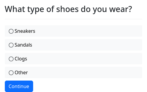
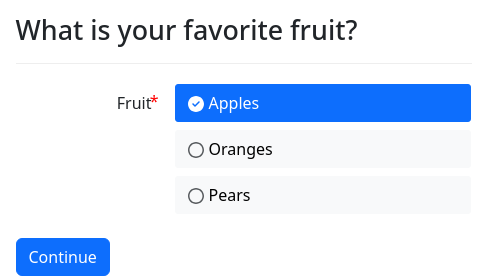
Multiple choice list
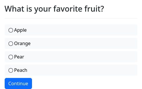
To provide a multiple choice question with “radio buttons” and a
“Continue” button, use field with a choices list:
question: |
What type of shoes do you wear?
field: target_variable
choices:
- Sneakers
- Sandals
- Clogs
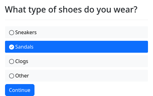
- OtherYou can specify a default value using default:
question: |
What type of shoes do you wear?
field: target_variable
default: Sandals
choices:
- Sneakers
- Sandals
- Clogs
- OtherAnother way to set a default is by adding default: True to the
choice that you want to be the default.
question: |
What type of shoes do you wear?
field: target_variable
choices:
- Sneakers: sneakers
- Sandals: sandals
default: True
- Clogs: clogs
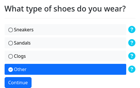
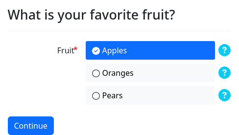
- Other: otherYou can also provide help text for a radio button using help:
question: |
What type of shoes do you wear?
field: target_variable
choices:
- Sneakers: sneakers
help: |
Comfortable shoes.
- Sandals: sandals
help: |
For summer.
- Clogs: clogs
help: |
For hippies.
- Other: other
default: True
help: |
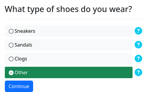
Because the other types suck.You can customize the appearance of a particular item by specifying
color and css class:
question: |
What type of shoes do you wear?
field: target_variable
choices:
- Sneakers: sneakers
help: |
Comfortable shoes.
css class: sneakers
color: secondary
- Sandals: sandals
help: |
For summer.
css class: sandals
color: danger
- Clogs: clogs
help: |
For hippies.
css class: clogs
color: warning
- Other: other
default: True
help: |
Because the other types suck.
css class: othershoe
color: successThe color should refer to one of the Bootstrap colors (primary,
secondary, success, danger, warning, info, light, link,
or dark).
If you want a choice to be included conditionally, you can use show
if to specify a Python expression that indicates when the choice
should be included or not.
question: |
Are you proper?
yesno: is_proper
---
question: |
What type of shoes do you wear?
field: target_variable
choices:
- Dress shoes: dress_shoes
show if: is_proper
- Boat shoes: boat_shoes
show if: is_proper
- Sneakers: sneakers
show if: not is_proper
- Sandals: sandals
show if: not is_proper
- Crocs: crocs
show if: not is_proper
- Other: otherThese customizations can also be specified when building a list of choices using code:
question: |
  What type of shoes do you wear?
field: target_variable
choices:
  code: |
    [{'sneakers': "Sneakers",
      'help': "Comfortable shoes.",
      'css class': "sneakers",
      'color': "secondary"},
     {'sandals': "Sandals",
      'help': "For summer.",
      'css class': "sandals",
      'color': "danger"},
     {'clogs': "Clogs",
      'help': "For hippies.",
      'css class': "clogs",
      'color': "warning"},
     {'crocs': "Crocs",
      'help': "For teenagers",
      'show if': not is_adult,
      'css class': "crocs",
      'color': "warning"},
     {'other': "Other",
      'default': True,
      'help': "Because the other types suck.",
      'css class': "othershoe",
'color': "success"}]Multiple choice dropdown
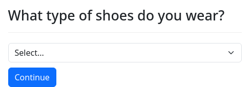
To provide a multiple choice question with a dropdown selector, use
field with a dropdown list:
question: |
  What type of shoes do you wear?
field: target_variable
dropdown:
  - Sneakers
  - Sandals
  - Clogs
- OtherMultiple choice combobox
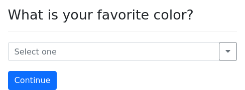
To provide a multiple choice question with a “combobox” selector, use
field with a combobox list:
question: |
  What is your favorite color?
field: favorite_color
combobox:
  - Red: red
  - Green: green
- Purple: purpleThe “combobox” selector allows users to choose a selection from a list or enter a value of their own.
Adding images to buttons and list items
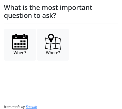
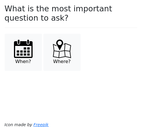
To add a decorative icon to a buttons choice, use a key/value pair
and add image as an additional key.
question: |
  What is the most important question
  to ask?
field: interrogatory
buttons:
  - "When?": when
    image: calendar
  - "Where?": where
image: mapThis works with choices as well:
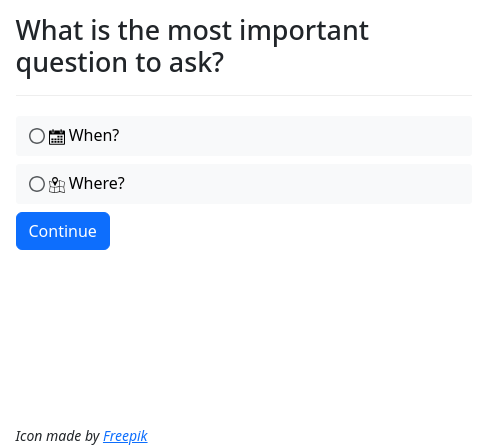
question: |
  What is the most important question
  to ask?
field: interrogatory
choices:
  - "When?": when
    image: calendar
  - "Where?": where
image: mapIt is not possible to decorate dropdown or combobox choices with
images.
In these examples, calendar and map are the names of decorations
that are defined in an images or image sets block.
If you create the list of choices with
code, you can specify an image by
including an additional key/value pair within an item, where the key
is image.
question: |
  What is the most important question
  to ask?
field: interrogatory
buttons:
  code: myoptions
---
code: |
  myoptions = \
    [{"when": "When?",
      "image": "calendar"},
     {"where": "Where?",
"image": "map"}]There is an additional feature available when you assemble buttons
with code: you can use DAFile or
DAFileList objects to indicate the image. This example uses an
uploaded image file as the source of the image for one of the buttons:
question: |
  What is the most important question
  to ask?
field: interrogatory
buttons:
  code: myoptions
---
code: |
  myoptions = \
    [{"when": "When?",
      "image": uploaded_file},
     {"where": "Where?",
      "image": "map"}]
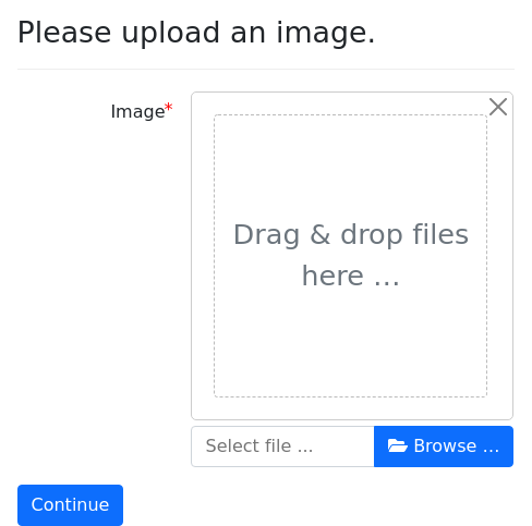
---
question: |
  Please upload an image.
fields:
  - Image: uploaded_file
datatype: fileEmbedding question and code blocks within multiple choice questions
Multiple choice questions can embed question blocks and code
blocks. These questions are just like ordinary questions, except they
can only be asked by way of the questions in which they are embedded.
You embed a question by providing a YAML key-value list (a
dictionary) (as opposed to text) as the value of a label in a
buttons, choices, or dropdown list.
question: What is your favorite color?
buttons:
  - Red:
      question: Dark red or light red?
      field: favorite_color
      buttons:
        - Dark Red
        - Light Red
  - Green:
      question: Dark green or light green?
      field: favorite_color
      buttons:
        - Dark Green
- Light GreenWhile embedding question blocks can be useful sometimes, it is
generally not a good idea to structure interviews with a lot of
embedded questions. You will have more flexibility if your questions
stand on their own. Embedded blocks cannot use the generic object
modifier or index variables.
It is also possible for multiple-choice questions to embed code
blocks that execute Python code. (If you do not know what code
blocks are yet, read the section on code blocks first.) This can be
useful when you want to set the values of multiple variables with one
button.
question: What kind of car do you want?
buttons:
  - Ford Focus:
      code: |
        car_model = "Focus"
        car_make = "Ford"
  - Toyota Camry:
      code: |
        car_model = "Camry"
car_make = "Toyota"The question above tells docassemble that if the interview logic
calls for either car_model or car_make, the question should be
tried. When the user clicks on one of the buttons, the code will be
executed and the variables will be set.
To undo a user’s choice on a question that embeds blocks, tag the
question with an id and call the forget_result_of()
function with the ID.
Questions with only a “continue” button
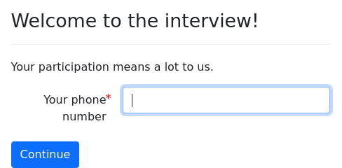
question: |
  Welcome to the interview!
subquestion: |
  Your participation means a lot to us.
continue button field: user_saw_introA question with merely a continue button field will offer the
user a “Continue” button. When the user presses “Continue,” the
variable indicated by continue button field will be set to True.
If you are using fields and you want the “Continue” button to set
a variable to True the way that this question type does, you can
add the continue button field specifier.
Questions that collect one or more fields on a screen
So far, we have discussed questions that set a single multiple-choice
variable and the use of continue button field to set a
single variable to True. These are helpful when you are collecting
True or False values or multiple choice values. However,
docassemble’s primary tool for collecting information in is the
fields specifier. fields allows you to collect many different
types of information and to collect more than one piece
of information on a screen.
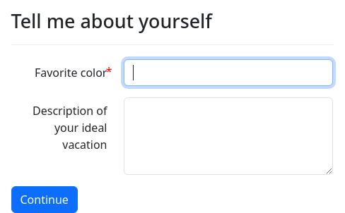
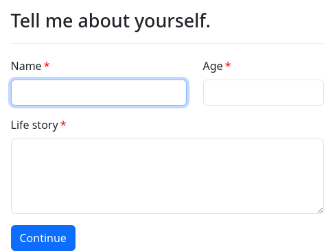
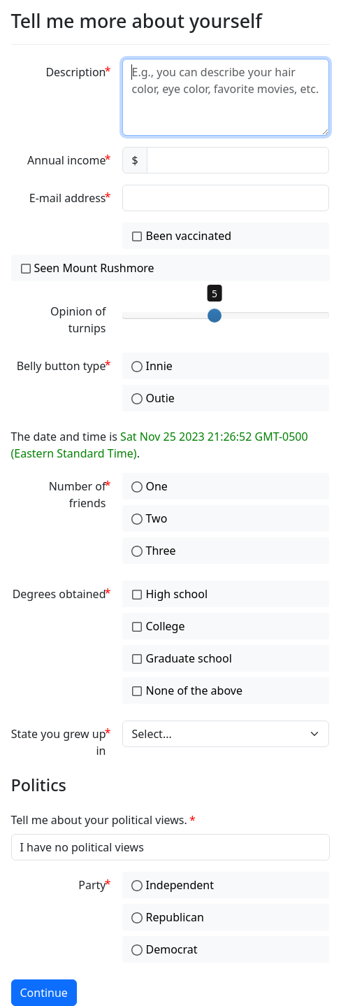
question: Tell me about yourself
fields:
  - Favorite color: user_favorite_color
  - Description of your ideal vacation: user_ideal_vacation
    input type: area
required: FalseThe fields specifier must refer to a YAML list of one or more
“fields”. Each list item must consist of one or more key/value pairs.
One of these keys (typically) is the label the user sees,
where the value associated with the key is the name of the variable
that will store the user-provided information for that field. The
other key/value pairs in the item (if any) allow you to modify how the
field is displayed to the user.
These field modifiers are distinguished from label/variable pairs based on the key; if the key uses one of the names listed below, it will be treated as a field modifier; if it is anything else, it will be treated as a label.
The next section describes the different types of variables you can
gather with fields and the different types of user interfaces you
can use.
Data types and input types
Within a fields question, there are many possible datatype
values that you can use. These affect what the user sees and how the
input is stored in a variable.
The possible values of datatype are:
usercameraenvironmentcamcordercheckboxesmultiselectcurrencydatedatetimeemailfilefilesintegermicrophonemlmlareanoyesnoyesmaybenoyesradionoyeswidenumberobjectobject_checkboxesobject_multiselectpasswordrangetext(the default)timeyesnoyesnomaybeyesnoradioyesnowide
In most cases, datatype controls both the user interface and the
format in which the data is stored. But for certain multiple choice
questions, you can use datatype to indicate how you want the data
stored, and use input type to indicate the type of user interface
to use. The possible values of input type are:
The following subsections describe the available datatypes and
input types that you can assign to a field within fields.
Plain text
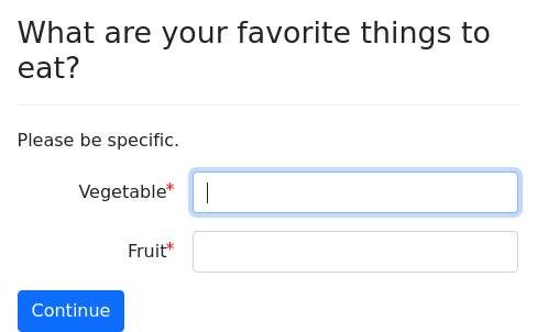
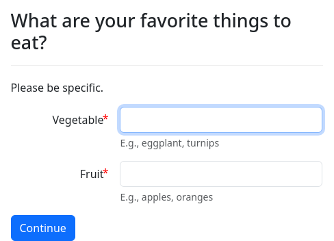
A datatype: text provides a single-line text
input box. This is the default datatype, so you never need to
specify it unless you want to.
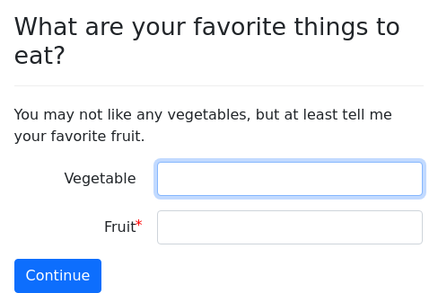
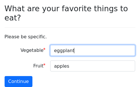
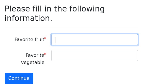
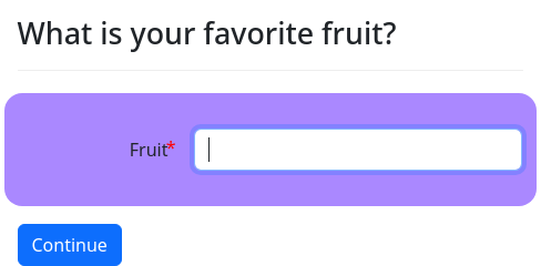
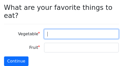
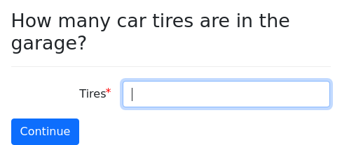
question: |
  What are your favorite things to eat?
subquestion: |
  Please be specific.
fields:
  - Vegetable: target_variable
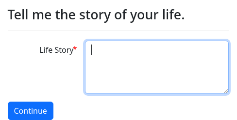
- Fruit: other_target_variableinput type: area provides a multi-line text area.
question: |
  Tell me the story of your life.
fields:
  - Life Story: target_variable
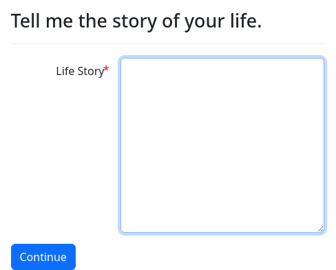
input type: areaYou can change the number of rows in the text area using the rows specifier:
question: |
  Tell me the story of your life.
fields:
  - Life Story: target_variable
    input type: area
rows: 10The default number of rows is four.
Passwords
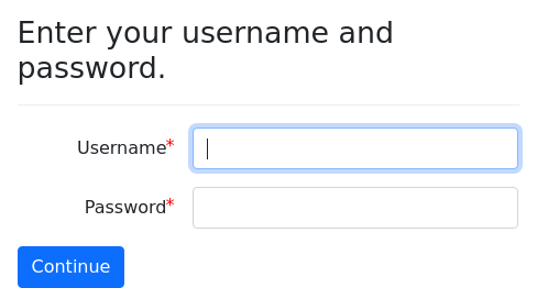
datatype: password provides an input box
suitable for passwords.
question: |
  Enter your username and password.
fields:
  - Username: user_name
  - Password: target_variable
datatype: passwordDates
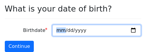
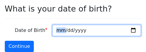
datatype: date provides a date entry input box. The style of the
input box depends on the browser.
question: |
  What is your date of birth?
fields:
  - Birthdate: target_variable
datatype: dateValidation is applied to ensure that the date can be parsed by
dateutil.parser.parse.
The variable resulting from datatype: date is a special Python
object of the class DADateTime, which is a subclass of the
standard Python class datetime.datetime. So if the name of the
date variable is date_of_filing, then you can do things like:
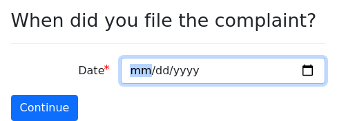
question: |
  When did you file the complaint?
fields:
  - Date: date_of_filing
    datatype: date
---
code: |
  response_deadline = date_of_filing.plus(days=20)
  christmas = response_deadline.replace(month=12, day=25)
---
mandatory: True
question: |
  % if christmas > response_deadline:
  Your response is due
  ${ int(date_difference(starting=date_of_filing, ending=christmas).weeks) }
  weeks before Christmas.
  % else:
  Your response is due soon after Christmas!
% endifNote that the field on the screen only asks for a date, but
DADateTime represents both a date and a time. The time portion of
the DADateTime object will be set to midnight of the date. If you
want a DADateTime with a time other than midnight, you can use the
.replace_time() or .replace() methods of DADateTime to
generate a new object with the same date but a different time.
For more information about working with date variables, see
the documentation for the date functions. These functions are
generally very flexible about formats, so you can pass a string like
'12/25/2018' or a date object, and the function will produce the
correct result either way.
In particular, if you want to format a date variable for inclusion in
a document or a question, you will probably want to use the
.format_date() method or the format_date() function.
To set a default value, you can set default to any value that can
be understood as a date.
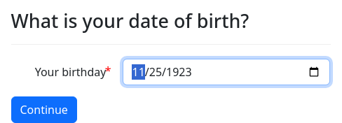
question: What is your date of birth?
fields:
  - Your birthday: birthdate
    datatype: date
    default: |
${ today().minus(years=100) }Likewise, to set limits, you can set min and/or max to a string
that can be recognized as a date.
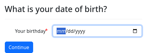
question: What is your date of birth?
fields:
  - Your birthday: birthdate
    datatype: date
max: ${ today() }Times
datatype: time provides an input box for times. The style of the
input box depends on the browser.
Validation is applied to ensure that the time can be parsed by
dateutil.parser.parse.
question: |
  What time is your appointment?
fields:
  - Time: target_variable
datatype: timeThe resulting variable will be an object of type datetime.time.
To indicate a default time, write a default value in the format
13:43:23. If you have a datetime.time variable called
meeting_start and you want the value of meeting_start to be the
default time for a field, you can set the default value to ${
meeting_start }. This has the same effect as str(meeting_start) or
meeting_start.strftime('%H:%M:%S').
If you want to format a time variable for inclusion in a document or a
question, see the .strftime() method or the format_time()
function.
If you want to gather both a date and a time from a user, and combine
the values together into a single DADateTime object, you can do so
with the .replace_time() method. For example:
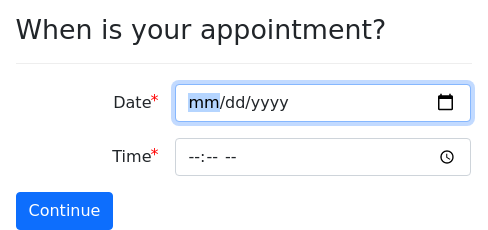
question: |
  When is your appointment?
fields:
  - Date: appt_date
    datatype: date
  - Time: appt_time
    datatype: time
---
code: |
appt_datetime = appt_date.replace_time(appt_time)If you want to format a date and time for inclusion in a document or a
question, see the .format_datetime() method or the
format_datetime() function.
Combined dates and times
datatype: datetime provides an input box for dates and times
together in one field. The style of the input box depends on the
browser. Note: not all browsers have a “widget” for combined date and
times, and users might be confused if they are presented with a plain
text box. For this reason, use of datatype: datetime is not
recommended until browser support for the
datetime-local
becomes more widespread.
Validation is applied to ensure that the time can be parsed by
dateutil.parser.parse.
question: |
  When is your appointment?
fields:
  - Date and time: target_variable
datatype: datetimeThe resulting variable will be an object of type DADateTime. The
object can be formatted using the .format_datetime() method or the
format_datetime() function.
E-mail addresses
datatype: email provides an e-mail address input box.
question: |
  What is your e-mail address?
fields:
  - E-mail: target_variable
    datatype: email
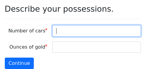
required: FalseNumbers
datatype: integer indicates that the input
should be a valid whole number.
datatype: number indicates that the input
should be a valid numeric value.
question: |
  Describe your possessions.
fields:
  - Number of cars: number_cars
    datatype: integer
  - Ounces of gold: gold_ounces
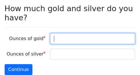
datatype: numberYou can use the optional field modifier step to limit the number to a
certain number of decimal places:
question: |
  How much gold and silver do you have?
fields:
  - Ounces of gold: gold_ounces
    datatype: number
  - Ounces of silver: silver_ounces
    datatype: number
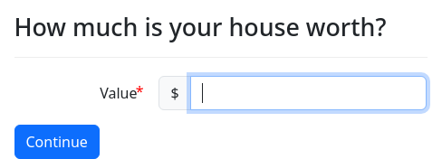
step: 0.001Currency
datatype: currency indicates that the input should be a valid
numeric value. In addition, the input box shows a currency symbol
based the locale defined in the configuration.
question: |
  How much is your house worth?
fields:
  - Value: target_variable
    datatype: currency
min: 0The variable will be set to a number, just as if datatype: number
was used. For information about how to display currency values, see
the currency() function.
If the locale convention places the currency symbol after the number, the currency symbol will be placed before the field; otherwise it will be placed after the field.
If the currency symbol defined by the locale is not the currency you
want to use, you can include an initial block that calls
set_locale() with the currency_symbol keyword parameter set to
the symbol you want to use. This will set a default value for
datatype: currency fields and for the currency() function.
Keep in mind that the variable stored by a datatype: currency field
is just a number, so it is not aware of the currency denomination that
was presented to the user when the information was collected.
You can also override the currency symbol on a field-by-field basis by
setting the currency symbol field modifier.
question: |
  How much is your house worth?
fields:
  - Value: house_value
    datatype: currency
    min: 0
    currency symbol: €
---
question: Your home value
subquestion: |
  Your house is worth
  ${ currency(house_value, symbol=u'€') }.
mandatory: TrueAs this interview demonstrates, the currency() function accepts an
optional keyword parameter symbol that allows you to override the
symbol that is displayed.
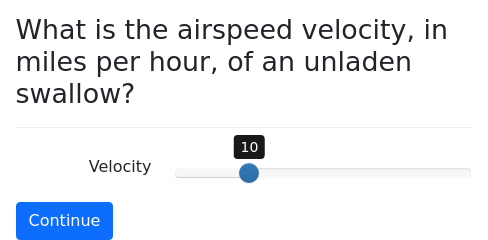
Sliders
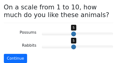
datatype: range shows a slider that the user can use to select a
number within a given range. The range must be supplied by providing
min and max values. An option step value can also be provided,
the default of which is 1.
question: |
  On a scale from 1 to 10, how
  much do you like these animals?
fields:
  - Possums: possum_preference
    datatype: range
    min: 1
    max: 10
    step: 0.5
  - Rabbits: rabbit_preference
    datatype: range
    min: 1
max: 10You can also include an optional scale, which you can set to
logarithmic.
question: |
  What is the airspeed velocity,
  in miles per hour, of an
  unladen swallow?
fields:
  - Velocity: velocity
    datatype: range
    min: 1
    max: 10000
    step: 10
    default: 10
scale: logarithmicFile uploads
Using the file or files datatypes within a fields list, you can
allow users to upload one or more files.
datatype: file indicates that the user can upload a single file.
The variable is set to a DAFileList object containing the
necessary information about the uploaded file.
question: |
  Please upload a picture of yourself.
fields:
  - Picture: user_picture
    datatype: file
---
question: |
  You're so adorable, François!
subquestion: |
  ${ user_picture }
mandatory: Truedatatype: files indicates that the user can upload one or more
files. The variable is set to a DAFileList object containing the
necessary information about the uploaded files.
question: |
  Please upload pictures of yourself.
fields:
  - Pictures: user_pictures
    datatype: files
---
question: |
  Look at all those adorable photos!
subquestion: |
  ${ user_pictures }
mandatory: TrueIf you want to limit uploads to particular file
types, you can use accept to specify Python code that returns a
custom accept attribute. The value of accept is passed directly
into the accept attribute in the HTML and into the accept method
of the jQuery Validation Plugin.
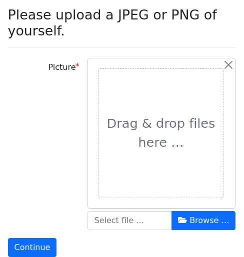
question: |
  Please upload a JPEG or PNG of yourself.
fields:
  - Picture: user_picture
    datatype: file
    accept: |
"image/jpeg, image/png"Note that the syntax is very specific: the double quotation marks are part of the string itself.
Since the accept method of the jQuery Validation Plugin only
works with MIME types, you can only specify MIME types here, not file
extensions.
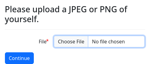
By default, docassemble styles the
upload using the Bootstrap File Input plugin. If you do not want the
Bootstrap File Input plugin to be used, you can set file css class
to None.
question: |
  Please upload a JPEG or PNG of yourself.
fields:
  - File: user_file
    datatype: file
file css class: NoneIf you set file css class to None, then the class of the <input
type="file"> element will be form-control, which is the standard
class that Bootstrap uses to style file input elements. You can set
file css class to any other class of your choosing if you want to
use a different class than form-control. The file css class
modifier can use Mako templating.
If no file css class is specified, the class of the input element
will be dafile, which causes the Bootstrap File Input plugin to
be activated.
Note that file css class is different from css class; the css
class modifier simply adds additional classes to the class
attribute of the input element, whereas file css class replaces the
default class, which is dafile.
If your users upload digital photos
into your interviews, the uploads may take a long time. You can
configure an upload field so that images are reduced in size before
they are uploaded by modifying your field definition with a
maximum image size. The image will be reduced in size so that is
no taller than or wider than the number of pixels designated by
maximum image size.
In this example, images will be reduced in size to no more than 100 pixels in height or width:
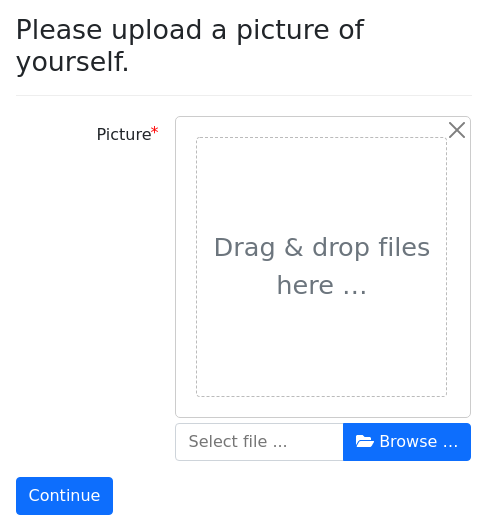
question: |
Please upload a picture of yourself.
fields:
- Picture: user_picture
datatype: file
maximum image size: 100
---
question: |
You're so small!
subquestion: |
${ user_picture }
mandatory: TrueNote that the image file type of the uploaded file may be changed to PNG during the conversion process. Different browsers behave differently.
If you have a lot of document upload fields, you can set a default
maximum image size on an interview-wide basis with the
maximum image size interview feature and on a site-wide basis with
the maximum image size configuration directive. If you have a
default set up, but you want to override it for a particular field,
you can set the maximum image size field modifier to None.
If you are using maximum image size,
you can also cause images to be converted to PNG, JPEG, or BMP
by the browser during the upload process by setting the image upload
type to png, jpeg, or bmp.
question: |
Please upload a picture of yourself.
fields:
- Picture: user_picture
datatype: file
maximum image size: 100
image upload type: jpeg
---
question: |
You're so small!
subquestion: |
${ user_picture }
mandatory: TrueBy default, any file that a user uploads
during a session will be deleted when that session is deleted. If you
want the file to continue to exist after the session is deleted, you
can set the field modifier persistent to True. The modifier also
accepts Python code; if the code evaluates to a true value, the file
will persist. This has the same effect as calling the
.set_attributes() method on the file variable using the keyword
attribute persistent.
By default, any file that a user uploads will
only be downloadable by the user or by an administrator. If you want
the file to be accessible to anyone, set the field modifier private
to False. The modifier also accepts Python code; if the code
evaluates to a false value, the file will be available to anyone.
This has the same effect as calling the .set_attributes() method
on the file variable using the keyword attribute persistent.
If you set private: False, then the file
is available to anyone, including non-logged in users. Even a bot
that guesses URLs could download the file. If you want to share with
particular users, you can indicate specific users using the allow
users modifier.
fields:
- Your file: file_variable
datatype: file
allow users:
- [email protected]
- [email protected]fields:
- Your file: file_variable
datatype: file
allow users:
- 1
- 2If allow users refers to a YAML list, the list is expected to be a
list of e-mail addresses of users or integers indicating the numeric
user IDs of users. If allow users refers to text, the text is
treated as a single item.
fields:
- Your file: file_variable
datatype: file
allow users: [email protected]Mako is not available; however, if allow users refers to a YAML
dictionary, the single key of which is code, you can specify users
with Python code. The code is expected to evalute to an e-mail
address, an integer user ID, an Individual with the email
attribute set, or a list or DAList of any of the above.
fields:
- Your file: file_variable
datatype: file
allow users:
code: |
[advocate] + ([user_info().id] if user_logged_in() else [])You can also use the .user_access() method to control which users
have access to a file.
Instead of granting access to specific
other users, you can use the allow privileges field modifier to
grant access to categories of users by referencing privileges by
name, such as user, developer, or advocate. The
allow privileges modifier works much like the allow users
modifier. If the allow privileges modifier refers to a YAML list,
the list items are expected to be text items like user or
developer. If allow privileges refers to a string, it is treated
as a single item. Mako is not allowed. If allow privileges refers
to a YAML dictionary, the single key of which is code, you can
define the privileges using Python code, which is expected to
evaluate to text (e.g., 'user') or a list of text strings (e.g.,
['user', 'developer']). You can also use the
.privilege_access() method to control which users have access to a
file.
There are a few other data types that result in file uploads:
datatype: camera is just like file, except
it limits the allowable file types to image files.
datatype: user is just like camera, except with
an HTML5 input type that suggests using the device’s front
(user-facing) camera.
datatype: environment is just like
camera, except with an HTML5 input type that suggests using the
device’s rear (environment-facing) camera.
datatype: camcorder is just like file,
except it limits the allowable file types to video files.
datatype: microphone is just like file,
except it limits the allowable file types to audio files.
For more information about uploading files, and for instructions on uploading signature images, see the Uploads subsection.
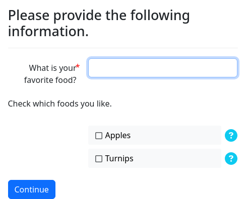
Yes/no fields
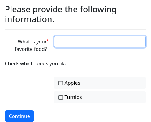
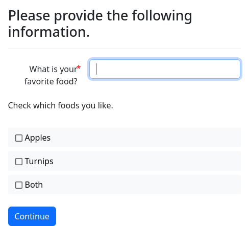
datatype: yesno will show a checkbox with a label, aligned with
labeled fields. datatype: noyes is like datatype: yesno, except
with True and False inverted.
question: |
Please provide the following information.
fields:
- "What is your favorite food?": favorite_food
- note: Check which foods you like.
- Apples: likes_apples
datatype: yesno
- Turnips: dislikes_turnips
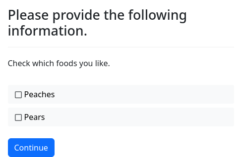
datatype: noyesdatatype: yesnowide will show a checkbox with a label
that fills the full width of area. datatype: noyeswide is like
datatype: yesnowide, except with True and False inverted.
question: |
Please provide the following information.
fields:
- note: Check which foods you like.
- Peaches: likes_peaches
datatype: yesnowide
- Pears: dislikes_pears
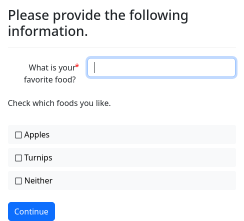
datatype: noyeswideSometimes, when you are using a series of
these checkboxes, you might want to have a “none of the above”
selection. To do this, add a field for the selection, and associate
it with a variable. (Your interview does not need to use the
variable.) Then modify the field with uncheck others: True.
question: |
Please provide the following information.
fields:
- "What is your favorite food?": favorite_food
- note: Check which foods you like.
- Apples: likes_apples
datatype: yesnowide
- Turnips: likes_turnips
datatype: yesnowide
- Neither: dislikes_both_foods
datatype: yesnowide
uncheck others: TrueThis will cause the field to act as a “none of the above” field for
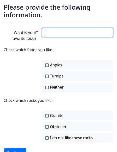
all the other yes/no checkbox fields on the page. If you want the
field to only relate to specific other fields, use a list of the
variable names of those fields instead of True.
question: |
Please provide the following information.
fields:
- "What is your favorite food?": favorite_food
- note: Check which foods you like.
- Apples: likes_apples
datatype: yesno
- Turnips: likes_turnips
datatype: yesno
- Neither: dislikes_both_foods
datatype: yesno
uncheck others:
- likes_turnips
- likes_apples
- note: Check which rocks you like.
- Granite: likes_granite
datatype: yesno
- Obsidian: likes_obsidian
datatype: yesno
- I do not like these rocks: dislikes_both_rocks
datatype: yesno
uncheck others:
- likes_granite
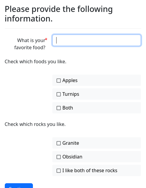
- likes_obsidianOther times, when you are using a series of
these checkboxes, you might want to have an “all of the above”
selection. To do this, add a field for the selection, and associate
it with a variable. (Your interview does not need to use the
variable.) Then modify the field with check others: True.
question: |
Please provide the following information.
fields:
- "What is your favorite food?": favorite_food
- note: Check which foods you like.
- Apples: likes_apples
datatype: yesnowide
- Turnips: likes_turnips
datatype: yesnowide
- Both: likes_both_foods
datatype: yesnowide
check others: TrueThis will cause the field to act as an “all of the above” field for
all the other yes/no checkbox fields on the page. If you want the
field to only relate to specific other fields, use a list of the
variable names of those fields instead of True.
question: |
Please provide the following information.
fields:
- "What is your favorite food?": favorite_food
- note: Check which foods you like.
- Apples: likes_apples
datatype: yesno
- Turnips: likes_turnips
datatype: yesno
- Both: likes_both_foods
datatype: yesno
check others:
- likes_turnips
- likes_apples
- note: Check which rocks you like.
- Granite: likes_granite
datatype: yesno
- Obsidian: likes_obsidian
datatype: yesno
- I like both of these rocks: likes_both_rocks
datatype: yesno
check others:
- likes_granite
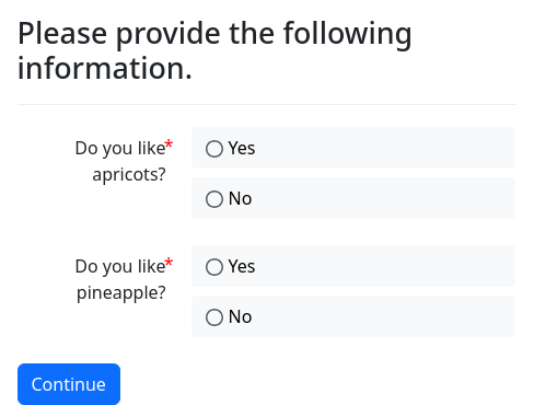
- likes_obsidiandatatype: yesnoradio will show radio
buttons offering choices “Yes” and “No.”
datatype: noyesradio is like
datatype: yesnoradio, except with True and False inverted.
question: |
Please provide the following information.
fields:
- "Do you like apricots?": likes_apricots
datatype: yesnoradio
- "Do you like pineapple?": dislikes_pineapple
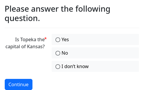
datatype: noyesradiodatatype: yesnomaybe will show radio
buttons offering choices “Yes,” “No,” and “I don’t know.” The
resulting Python values are True, False, and None.
question: |
Please answer the following question.
fields:
- "Is Topeka the capital of Kansas?": topeka_is_capital_of_kansas
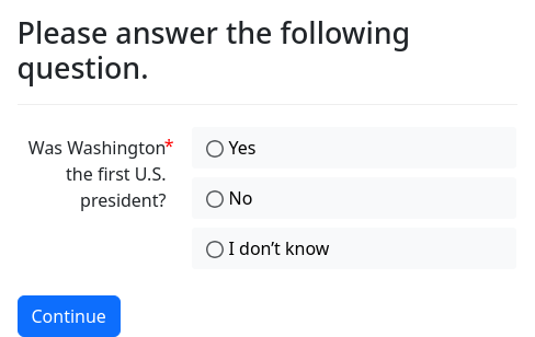
datatype: yesnomaybedatatype: noyesmaybe is like
datatype: yesnomaybe, except with True and False inverted.
question: |
Please answer the following question.
fields:
- "Was Washington the first U.S. president?": washington_not_the_first_president
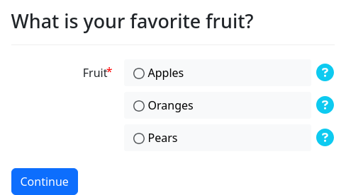
datatype: noyesmaybeWhen you provide help text for a yesno field, the help
will be available as a popup accessible from a button located to the
right of the field.
question: |
Please provide the following information.
fields:
- "What is your favorite food?": favorite_food
- note: Check which foods you like.
- Apples: likes_apples
datatype: yesno
help: Round fruit of a tree of the rose family
- Turnips: dislikes_turnips
datatype: noyes
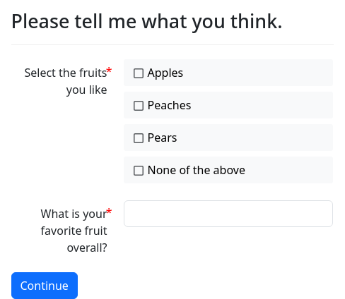
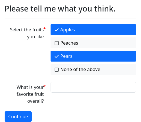
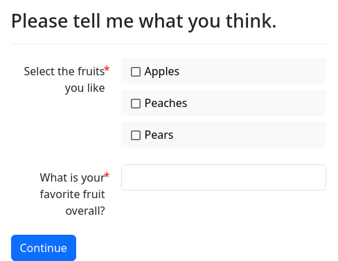
help: Round root with white fleshCheckboxes
datatype: checkboxes will show the choices list as
checkboxes. The variable will be a DADict (a type of dictionary
specific to docassemble) with items set to True or False
depending on whether the option was checked.
question: |
Please tell me what you think.
fields:
- "Select the fruits you like": likes_fruit
datatype: checkboxes
choices:
- apple
- peach
- pear
- "What is your favorite fruit overall?": favorite_fruit
---
question: |
Thank you for your thoughts.
subquestion: |
% if likes_fruit['apple']:
You like apples.
% endif
% if likes_fruit['peach']:
You like peaches.
% endif
% if likes_fruit['pear']:
You like pears.
% endif
Your favorite, though, is ${ favorite_fruit }.
In other words, you like
${ likes_fruit.true_values() }.
Your favorite, though, is ${ favorite_fruit }.
In Python, `likes_fruit` is a `DADict`:
`${ repr(likes_fruit) }`.
mandatory: TrueAs you can see in this example, the keys of the resulting dictionary
are the names of fruit, the values that are checked are True, and
the values that were not checked are False.
In the example above, the keys of the dictionary are the same as the labels displayed to the user. If you want labels to be different from the keys, you can specify the choices in the following manner:
question: |
Please tell me what you think.
fields:
- "Select the fruits you like": likes_fruit
datatype: checkboxes
choices:
- Apples: apple
- Peaches: peach
- Pears: pear
- "What is your favorite fruit overall?": favorite_fruitYou can also express the checkboxes as a list of dictionaries where
each dictionary has the keys label and value.
question: |
Please tell me what you think.
fields:
- "Select the fruits you like": likes_fruit
datatype: checkboxes
choices:
- label: Apples
value: apple
- label: Peaches
value: peach
- label: Pears
value: pear
- "What is your favorite fruit overall?": favorite_fruitThe all_true(), all_false(), any_true(), any_false(),
true_values(), and false_values() methods of DADict can be
used to analyze the values set by a checkboxes field. For example:
mandatory: True
question: |
Your fruit preferences
subquestion: |
% if likes_fruit.all_true():
You like all the fruit.
% elif likes_fruit.all_false():
You don't like any of the fruit.
% elif likes_fruit.any_true():
You like at least one fruit.
% endif
% if likes_fruit.any_false():
There is at least one fruit you don't like.
% endifIf you want to require the user to select a minimum or maximum number
of checkboxes, you can use the minlength and/or maxlength field
modifiers.
You can generate checkbox choices with code:
question: |
Please tell me what you think.
fields:
- "Select the fruits you like": likes_fruit
datatype: checkboxes
code: |
[
{'apple': 'Apples'},
{'peach': 'Peaches'},
{'pear': 'Pears'}
]
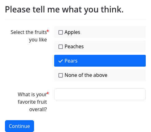
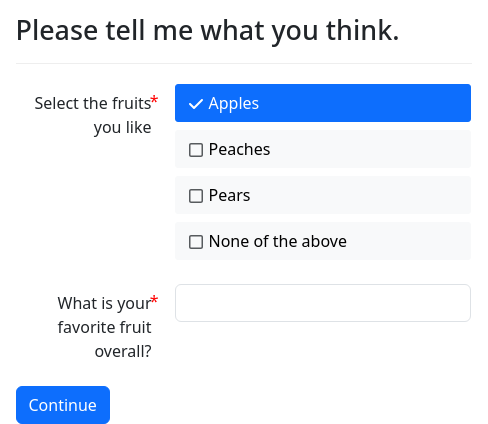
- "What is your favorite fruit overall?": favorite_fruitDefault values for checkboxes
To set default values in a checkbox list, you have a few options.
If you want to select just one option, just indicate the name of the option:
question: |
Please tell me what you think.
fields:
- "Select the fruits you like": likes_fruit
datatype: checkboxes
choices:
- Apples
- Peaches
- Pears
default: Pears
- "What is your favorite fruit overall?": favorite_fruitIf you want to select multiple options, indicate a YAML list:
question: |
Please tell me what you think.
fields:
- "Select the fruits you like": likes_fruit
datatype: checkboxes
choices:
- Apples
- Peaches
- Pears
default:
- Pears
- Apples
- "What is your favorite fruit overall?": favorite_fruitYou can also indicate your defaults in the form of a YAML dictionary:
question: |
Please tell me what you think.
fields:
- "Select the fruits you like": likes_fruit
datatype: checkboxes
choices:
- Apples
- Peaches
- Pears
default:
Pears: True
Apples: True
Peaches: False
- "What is your favorite fruit overall?": favorite_fruitYou can also use Python code to generate the defaults:
question: |
Please tell me what you think.
fields:
- "Select the fruits you like": likes_fruit
datatype: checkboxes
choices:
- Apples
- Peaches
- Pears
default:
code: |
['Pears', 'Apples']
- "What is your favorite fruit overall?": favorite_fruitYour Python code can also return a dictionary:
question: |
Please tell me what you think.
fields:
- "Select the fruits you like": likes_fruit
datatype: checkboxes
choices:
- Apples
- Peaches
- Pears
default:
code: |
{'Pears': False, 'Peaches': False, 'Apples': True}
- "What is your favorite fruit overall?": favorite_fruitIf you generate the checkbox options with code, you can include
defaults directly within your code when you use a list of
dictionaries:
question: |
Please tell me what you think.
fields:
- "Select the fruits you like": likes_fruit
datatype: checkboxes
code: |
[
{'apple': 'Apples', 'default': True},
{'peach': 'Peaches'},
{'pear': 'Pears'}
]
- "What is your favorite fruit overall?": favorite_fruitThis also works if your code returns a list of lists:
question: |
Please tell me what you think.
fields:
- "Select the fruits you like": likes_fruit
datatype: checkboxes
code: |
[
['apple', 'Apples', True],
['peach', 'Peaches'],
['pear', 'Pears']
]
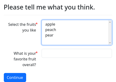
- "What is your favorite fruit overall?": favorite_fruitMultiselect
datatype: multiselect works much like datatype: checkboxes, except
it uses the HTML <select> element with the multiple flag set.
On desktop browsers, multiple items can be selected by clicking items
while holding down the Ctrl or Command key and clicking each item.
question: |
Please tell me what you think.
fields:
- "Select the fruits you like": likes_fruit
datatype: multiselect
choices:
- apple
- peach
- pear
- "What is your favorite fruit overall?": favorite_fruit
---
question: |
Thank you for your thoughts.
subquestion: |
% if likes_fruit['apple']:
You like apples.
% endif
% if likes_fruit['peach']:
You like peaches.
% endif
% if likes_fruit['pear']:
You like pears.
% endif
Your favorite, though, is ${ favorite_fruit }.
In Python, `likes_fruit` is
`${ repr(likes_fruit) }`.
mandatory: TrueUnlike datatype: checkboxes, the datatype: multiselect field does
not support the use of a “None of the above” option.
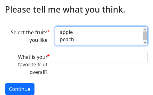
You can use the rows specifier to indicate how many rows tall the
multiselect box should be:
question: |
Please tell me what you think.
fields:
- "Select the fruits you like": likes_fruit
datatype: multiselect
choices:
- apple
- peach
- pear
rows: 2
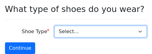
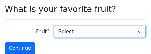
- "What is your favorite fruit overall?": favorite_fruitMultiple-choice dropdown
If you provide a list of choices or some
choice-generating code for a field within a list of
fields, the user will see a dropdown. The variable will be set to
the value of the selected choice.
question: |
What type of shoes do you wear?
fields:
- Shoe Type: target_variable
choices:
- Sneakers
- Sandals
- Clogs
- OtherYou can also include input type: dropdown:
question: |
What type of shoes do you wear?
fields:
- Shoe Type: target_variable
input type: dropdown
choices:
- Sneakers
- Sandals
- Clogs
- OtherThe input type: dropdown does not actually have any effect, since
dropdown is the default input type. (The other options for input
type are radio, combobox, and
datalist.)
The code option, which uses Python code to generate the
list of choices, is often used in combination with
exclude, which excludes one or more items from the list
of choices.
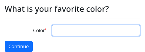
Multiple-choice combobox
input type: combobox shows a choices list as a
combobox instead of as a dropdown select element (which is
the default).
question: |
What is your favorite color?
fields:
- Color: favorite_color
input type: combobox
choices:
- Red
- Green
- Purple
---
mandatory: True
question: All done
subquestion: |
Your favorite color is
${ favorite_color }.The “combobox” selector allows users to choose a selection from a list or enter a value of their own.
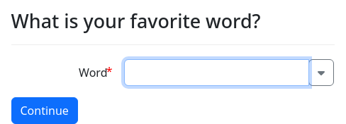
Combobox that fetches choices from the server
input type: ajax looks like a combobox, but is really a dropdown
selector that retrieves its choices from the server using Ajax,
based on what the user types. It is useful when the number of possible
values in the dropdown is too large to send to the browser all at
once, and you want to allow the user to find the item they want to
select by typing the start of a word or phrase.
To use input type: ajax, you also need to supply an action
specifier. The browser will use the JavaScript function
url_action_call() to call the given action. The text that the user
types into the field will be passed to the action as the wordstart
argument. The action needs to return a JSON list of items.
The following example uses the words file (from the wamerican package) as a data source for the combobox options.
question: |
What is your favorite word?
fields:
- Word: favorite_word
input type: ajax
action: wordlist
---
event: wordlist
code: |
set_save_status('ignore')
wordstart = action_argument('wordstart').lower()
results = list()
with open('/usr/share/dict/words', mode='r', encoding='utf-8') as words_file:
for line in words_file:
lower_line = line.lower()
if lower_line.startswith(wordstart):
results.append(line.rstrip())
json_response(results)The code block that carries out the action should always begin
with set_save_status('ignore'). If you leave this out, then a step
will be added to the interview each time the results are fetched. The
code block should always end by calling json_response() that
returns the relevant choice or choices.
The data that you pass to json_response() can be in one of three
forms:
- A
listof pieces of text; - A
dictin which the keys are the underlying values (what the variable will be set to) and the values are labels (what the user sees and types); or - A
listoflists, where the first item in each sub-list is the underlying value and the second item is the label.
If you use the second or third option, note that docassemble will
only store the underlying value in the variable, even though the user
typed the label. In order for your datatype: ajax field to function
properly if the question is revisited during a review process or the
use of the Back button, your action needs to be able to accept as
input either the underlying value or the label. In the following
example, note the special return value if the wordstart argument
matches a key in the dictionary.
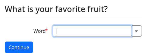
question: |
What is your favorite fruit?
fields:
- Word: favorite_fruit
input type: ajax
action: fruitlist
---
event: fruitlist
code: |
set_save_status('ignore')
original = action_argument('wordstart')
wordstart = original.lower()
results = []
for key, val in {'x234': 'Apple', 'y432': 'Orange', 'h293': 'Peach'}.items():
if key == original:
json_response([[key, val]])
if val.lower().startswith(wordstart):
results.append([key, val])
json_response(results)If you press the Back button to return to the datatype: ajax field,
the initial value of the field will be 'x234', 'y432', or
'h293'. This value will be sent to the action to be looked up, and
then the screen will show the label rather than the value.
In order to avoid sending too many requests to the system, the requests are throttled so that they happen no more than once every two seconds.
The list will not start showing results until the user types at least
four characters. If you want to use a different number of characters
as the minimum, set trigger at. For example:
question: |
What is your favorite word?
fields:
- Word: favorite_word
input type: ajax
action: wordlist
trigger at: 3Multiple-choice datalist
Similar to the combobox, input type: datalist provides a text
box into which the user can type any value they want, while drop-down
selections appear when the user starts typing. The user is not
required to enter a value from the list of choices.
question: |
What is your favorite color?
fields:
- Color: favorite_color
input type: datalist
choices:
- Red
- Green
- Purple
---
mandatory: True
question: All done
subquestion: |
Your favorite color is
${ favorite_color }.Unlike the combobox, there is no button in the UI that can be
clicked to show the entire drop-down list; a selection of dropdown
values is only shown when the user presses the down arrow key or
starts typing. The browser filters the list of dropdown values based
on what the user has typed. The dropdown list shows not only the list
of choices, but also values that the browser suggests, based on
values that the user has entered in the past.
While the combobox is built from JavaScript, the datalist uses
the HTML5 datalist element, so the functionality is entirely
determined by how the user’s browser implements datalist. Although
datalist has been part of the HTML5 specification for many years,
its implementation in browsers has been incomplete, and many
developers have chosen not to use datalist. However, the datalist
element could have superior accessibility because screen readers may
have a built-in method for presenting the datalist choices to the
user.
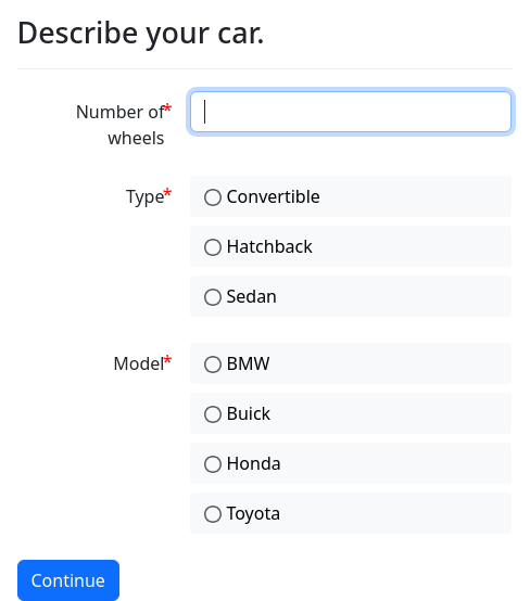
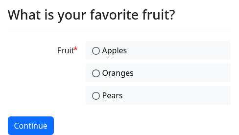
Radio buttons
input type: radio shows a choices list as a list of
radio buttons instead of as a dropdown select element (which is
the default). The variable will be set to the value of the
selected choice.
question: |
Describe your car.
fields:
- Number of wheels: wheels_on_car
datatype: integer
- Type: car_type
input type: radio
choices:
- Convertible
- Hatchback
- Sedan
- Model: car_country
input type: radio
choices:
- BMW: Germany
- Buick: United States
- Honda: Japan
- Toyota: JapanMultiple-choice with objects
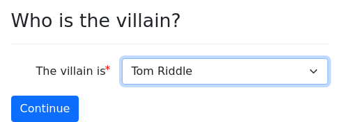
datatype: object is used when you would like to use a variable to
refer to an existing object. You need to include
choices, which can be a list of objects.
objects:
protagonist: Individual
antagonist: Individual
---
code: |
protagonist.name.first = "Harry"
protagonist.name.last = "Potter"
antagonist.name.first = "Tom"
antagonist.name.last = "Riddle"
---
question: Who is the villain?
fields:
- The villain is: villain
datatype: object
default: antagonist
choices:
- protagonist
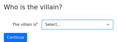
- antagonistIf choices refers to a variable that is a list of
things, the list will be unpacked and used as the list of items from
which the user can select. If choices refers to a
string, that string is expected to be a Python expression that
returns a list of objects. If choices refers to a YAML
list, then each item in the list is expected to be a Python
expression that returns either an object or a list of objects.
objects:
protagonist: Individual
antagonist: Individual
actors: PartyList
---
mandatory: True
code: |
protagonist.name.first = "Harry"
protagonist.name.last = "Potter"
antagonist.name.first = "Tom"
antagonist.name.last = "Riddle"
actors.append(protagonist)
actors.append(antagonist)
actors.auto_gather = False
actors.gathered = True
---
question: Who is the villain?
fields:
- The villain is: villain
datatype: object
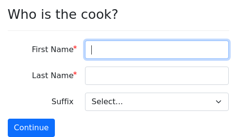
choices: actorsBy using datatype: object in combination with disable others,
you can create questions that either set the attributes of an object
or set the object equal to another object.
objects:
cook: Individual
gardener: Individual
maid: Individual
---
question: |
Who is the cook?
fields:
- Somebody already mentioned: cook
datatype: object
disable others: True
choices: |
[person for person in [cook, gardener, maid] if person.name.defined()]
- First Name: cook.name.first
- Last Name: cook.name.last
- Suffix: cook.name.suffix
required: False
code: name_suffix()
---
question: |
Who is the gardener?
fields:
- Somebody already mentioned: gardener
datatype: object
disable others: True
choices: |
[person for person in [cook, gardener, maid] if person.name.defined()]
- First Name: gardener.name.first
- Last Name: gardener.name.last
- Suffix: gardener.name.suffix
required: False
code: name_suffix()In this example, if the gardener and the cook are the same person, the interview effectively does the following in Python:
gardener = cookPlease note that datatype: object cannot be used with
the generic object modifier if the variable being set is
x.
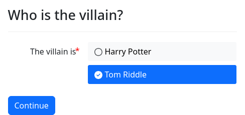
datatype: object_radio is like datatype:
object, except the user interface uses radio buttons rather than a
pull-down list.
objects:
protagonist: Individual
antagonist: Individual
---
code: |
protagonist.name.first = "Harry"
protagonist.name.last = "Potter"
antagonist.name.first = "Tom"
antagonist.name.last = "Riddle"
---
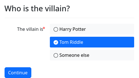
question: Who is the villain?
fields:
- The villain is: villain
datatype: object_radio
default: antagonist
choices:
- protagonist
- antagonistFor a fuller discussion on using multiple-choice object selectors, see the section on selecting objects, below.
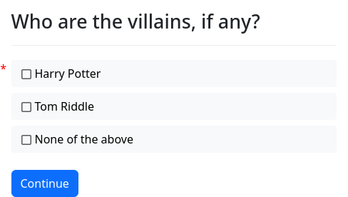
datatype: object_checkboxes is
similar to datatype: object, except it results in an object of type
DAList (or a subtype thereof) consisting of zero or more items
selected by the user. The choices specified in choices
(optionally modified by exclude) will be presented to the user as
checkboxes. The .gathered attribute of the variable will be set to
True after the elements are set. See groups for more information.
objects:
protagonist: Individual
antagonist: Individual
---
mandatory: True
code: |
protagonist.name.first = "Harry"
protagonist.name.last = "Potter"
antagonist.name.first = "Tom"
antagonist.name.last = "Riddle"
---
question: Who are the villains, if any?
fields:
no label: villain
datatype: object_checkboxes
choices:
- protagonist
- antagonistYou can use datatype: object_checkboxes on variables that already
exist in your interview. You would need to do this if you wanted the
variable to be a subtype of DAList. If you use a variable name
that already exists, note that the question will only be used when
the .gathered attribute is needed. To avoid questions asking for
.there_are_any and .there_is_another, set .auto_gather to
False. For example:
modules:
- docassemble.base.legal
---
objects:
protagonist: Individual
antagonist: Individual
---
mandatory: True
code: |
protagonist.name.first = "Harry"
protagonist.name.last = "Potter"
antagonist.name.first = "Tom"
antagonist.name.last = "Riddle"
---
question: Who are the villains, if any?
fields:
no label: villain
datatype: object_checkboxes
choices:
- protagonist
- antagonist
---
objects:
villain: PartyList.using(auto_gather=False)
---
question: |
% if villain.number() == 0:
There are no villains here.
% else:
The ${ villain.as_noun() }
${ villain.does_verb("include") }
${ villain }.
% endif
subquestion: |
The class name of `villain` is
`${ villain.__class__.__name__ }`.
mandatory: TrueNote the placement of the objects block that defines villain as a
PartyList. If this objects block came before the question
that defines villain, then the question block would take
precedence over the objects block and define villain as a plain
DAList. Since the objects block is placed after the question,
it supersedes the question, and defines villain as a PartyList.
The question will still be asked, however, because even if
villain is defined, it is not yet gathered; the question will be
asked when a definition of villain.gathered is needed.
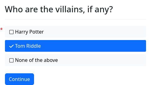
When you use an already-existing DAList, you can set default values
of the checkboxes in the object_checkboxes list. In this example,
we use the .append() method to initialize the list of villains.
mandatory: True
objects:
protagonist: Individual
antagonist: Individual
villain: PartyList.using(auto_gather=False)
---
mandatory: True
code: |
protagonist.name.first = "Harry"
protagonist.name.last = "Potter"
antagonist.name.first = "Tom"
antagonist.name.last = "Riddle"
villain.append(antagonist)
---
mandatory: True
question: Who are the villains, if any?
fields:
no label: villain
datatype: object_checkboxes
choices:
- protagonist
- antagonistThis example illustrates a second method of making sure that villain
gets defined as a PartyList: marking the objects block with
mandatory: True. This causes each variable in the objects list to
be defined as an object before the rest of the interview logic is
evaluated.
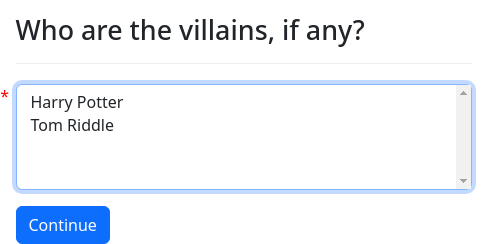
datatype: object_multiselect is
similar to datatype: object_checkboxes, except it uses the HTML
<select> element with the multiple flag set. On desktop browsers,
multiple items can be selected by clicking items while holding down
the Ctrl or Command key and clicking each item.
question: Who are the villains, if any?
fields:
no label: villain
datatype: object_multiselect
choices:
- protagonist
- antagonistMachine learning
From the user’s perspective, datatype: ml works just like datatype:
text (which is the default if no datatype is indicated), and
datatype: mlarea works just like datatype: area.
From the interview developer’s perspective, however, the variable that is set is not a piece of text, but an object representing a classification of the user’s input, based on a machine learning model that is “trained” to classify user input.
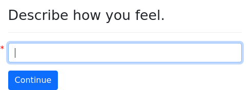
question: |
Describe how you feel.
fields:
- no label: mood
datatype: ml
---
mandatory: True
question: |
You sound ${ mood }.For more information about how to use machine learning variables, see the machine learning section.
Hidden field
input type: hidden results in an invisible field that can only be
changed from its default value by JavaScript.
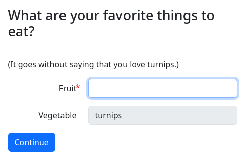
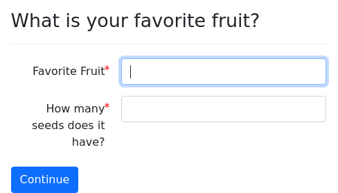
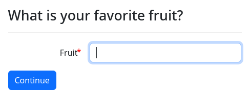
question: |
What is your favorite fruit?
fields:
- Fruit: favorite_fruit
- field: favorite_vegetable
input type: hidden
default: turnipThis can be useful if you want fields to be populated by the address autocomplete feature but you do not want the fields to be shown to the user.
If you think you need to use input type: hidden, but you are not
using the address autocomplete feature and you have not written your
own JavaScript code to populate the field, then you most likely
should not use input type: hidden, and should perhaps use a code
block instead. The input type: hidden feature exists solely for
interacting with JavaScript and is not part of docassemble’s
logic system.
No browser-based input validation is performed on a field with input
type: hidden. If you need input validation on a input type: hidden
field, use validation code. An error message cannot be displayed
next to a hidden field.
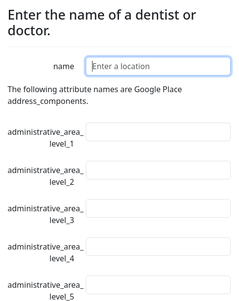
objects:
- doctor: Person
---
question: |
Who is your doctor?
fields:
- Name: doctor.address.name
address autocomplete:
types:
- doctor
fields:
- address_components
- geometry
- name
- place_id
- Address: doctor.address.address
- Unit: doctor.address.unit
required: False
- City: doctor.address.city
- State: doctor.address.state
code: states_list()
- Zip: doctor.address.zip
- field: doctor.address.place_id
input type: hidden
- field: doctor.address.latitude
datatype: number
input type: hidden
- field: doctor.address.longitude
datatype: number
input type: hidden
validation code: |
if not doctor.address.place_id:
validation_error('You need to choose a doctor from the drop-down list.')
---
depends on:
- doctor.address.name
code: |
doctor.name.text = doctor.address.name
---
mandatory: True
question: |
The `place_id` of ${ doctor } is
`${ doctor.address.place_id }`.
subquestion: |
The office is located at
`${ repr((doctor.address.latitude, doctor.address.longitude)) }`.Raw data
By default, inputs with the datatype of text (which is the
default) will be sanitized of any HTML. If you want to allow users to
include HTML, set the datatype to raw.
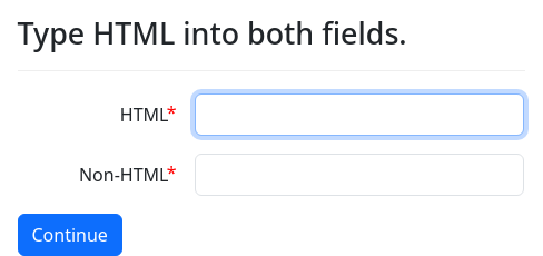
question: |
Type HTML into both fields.
fields:
- HTML: html_input
datatype: raw
- Non-HTML: text_input
---
mandatory: True
question: |
Result
subquestion: |
HTML:
${ html_input }
Non-HTML:
${ text_input }Custom data types
You can use custom data types by declaring a subclass of
CustomDataType in a Python module with class attributes that
describe the data type. For example, here is an example that defines
a Social Security number (SSN) as a data type:
from docassemble.base.util import CustomDataType, DAValidationError, word
import re
class SSN(CustomDataType):
name = 'ssn'
container_class = 'da-ssn-container'
input_class = 'da-ssn'
javascript = """\
$.validator.addMethod('ssn', function(value, element, params){
return value == '' || /^[0-9]{3}-?[0-9]{2}-?[0-9]{4}$/.test(value);
});
"""
jq_rule = 'ssn'
jq_message = 'You need to enter a valid SSN.'
@classmethod
def validate(cls, item, variable_name, data):
item = str(item).strip()
m = re.search(r'^[0-9]{3}-?[0-9]{2}-?[0-9]{4}$', item)
if item == '' or m:
return True
raise DAValidationError("A SSN needs to be in the form xxx-xx-xxxx")
@classmethod
def transform(cls, item, variable_name, data):
item = str(item).strip()
m = re.search(r'^([0-9]{3})-?([0-9]{2})-?([0-9]{4})$', item)
if m:
return m.group(1) + '-' + m.group(2) + '-' + m.group(3)
else:
return itemThis will allow you to write:
question: |
What is your Social Security Number?
fields:
- SSN: user.ssn
datatype: ssnThe user will not be able to proceed without entering a valid SSN, and
if the user enters an SSN without hyphens, the input will be accepted,
but hyphens will be added to the variable user.ssn.
The available class attributes are:
name(required) - thedatatypename. The only valid characters are alphanumeric characters, the hyphen, and the underscore.container_class- a CSS class for the parent container. By default, this will be set toda-field-container-datatype-followed by thename.input_class- a CSS class for the<input>element. By default, this will be set todafollowed by thename.input_type- thetypefor the<input>element. By default, this will be set totext.javascript- JavaScript code related to the data type. By default, this will beNone. If notNone, the attribute is treated as JavaScript code that is run when every interview on your server first loads. This is typically used to extend the capabilities of the jQuery Validation Plugin. In the example above, thejavascriptdefines a new validation rule. For more information on how to extend the jQuery Validation Plugin, see the documentation for jQuery.validator.addMethod(). Thejavascriptcode can be used to initialize any fields on the screen that have the custom datatype. For example, if yourcontainer_classisda-ssn, yourjavascriptcould be:
$(document).on('daPageLoad', function(){
$(".da-ssn").each(function(){
$(this).after("<div>You better get this right!</div>");
});
});jq_rule- the name of the jQuery Validation Plugin rule to enable on the field, if any. This is typically used to refer to a rule you define in thejavascriptattribute. If you want to enable multiple jQuery Validation Plugin rules, you can set this to a list of rule names.jq_message- the message to display to the user when thejq_ruleis not satisfied. The message will pass through theword()function to support multiple languages, and it can be overridden withvalidation messages. Instead of settingjq_messageto a string, you can set it to a dictionary in which the keys are jQuery Validation Plugin rule names and the values are error messages. For example, if you want a custom message to display when the user leaves the field blank, you can setjq_messageto something likejq_message = {'ssn': 'You need to enter a valid SSN.', 'required': 'We really need your SSN.'}. If no message is provided for a rule, a generic message is used. Ifjq_ruleis a list of rules,jq_messagemust be expressed in dictionary format.skip_if_empty- the default isTrue. This is rarely used, so you can probably ignore it. This is relevant when thedatatypeis used on a multiple-choice question and there are zero choices to present to the user. Ifskip_if_emptyisTrue, then the variable is not set to any value. Ifskip_if_emptyisFalse, then the variable will be set to the output of the.empty()class method.is_object- the default isFalse. If you have atransform()class method that returns something that cannot be defined withrepr(), set this toTrue.parameters- the default is[]. If you want to pass parameters from the YAML todataattributes of the resulting<input>, you can list the parameter names here. For example, ifparametersis set to['kind'], and you includekind: basicas a field modifier in the YAML of the field, then the HTML of the<input>element will containdata-kind="basic". You can extract these data values using JavaScript.code_parameters- the default is[]. This is just likeparameters, except the values in the YAML are treated as a Python expression, and thedatavalue is set to the output of this evaluation. Make sure that the Python expression evaluates to something sensible, like a string.mako_parameters- the default is[]. This is just likeparameters, except the values in the YAML are treated as Mako, and thedatavalue is set to the rendered text.
The available class methods are:
validate()- thevalidate()class method is used for server-side input validation. The raw value from the POST request is passed to this method as the first positional parameter. The second positional parameter is the name of the variable, as a string. The third positional parameter is a dictionary containing the parameters specified in the YAML (seeparameters, etc., above). The method should returnTrueif the value is valid. If the value is invalid, the method should raise aDAValidationErrorexception with a message. The message given toDAValidationErrorwill pass through theword()function before it is presented to the user, so you can use thewordsdirective in the Configuration to support multiple languages. If the method returns a false value, the error message will be “You need to enter a valid value.” If avalidate()class method is not provided, no input validation will be performed.transform- thetransform()class method is used to perform any necessary transformations on the data received from the browser. The raw value from the POST request is passed to this method as the first positional parameter. The second positional parameter is the name of the variable, as a string. The third positional parameter is a dictionary containing the parameters specified in the YAML (seeparameters, etc., above). The method should return the transformed value. In the example above, thetransform()class method ensures that Social Security numbers that are entered without hyphens (which are accepted) will contain hyphens when the variableuser.ssnis actually defined. If atransform()class method is not provided, the variable will be set to the raw value from the POST request (a string).default_for- thedefault_for()method is used when the user visits aquestionwhen the variable is already defined. If the output of yourtransformmethod is not suitable for placing into the field as the default value, you can define adefault_for()class method that returns the text that should be inserted into the field. The first positional parameter for thedefault_for()class method is the value of the variable. The second positional parameter is the name of the variable, as a string. The third positional parameter is a dictionary containing the parameters specified in the YAML (seeparameters, etc., above). If yourtransform()method returns a Python object, you can write adefault_for()class method that takes the object as the first positional parameter and returns plain text (anstr) that is a suitable default value to use for the HTML field. If you do not define adefault_for()class method, an attempt will be made to obtain a default value by runningstr()on the variable.empty- this is rarely used, so you can probably ignore it. Theemptyclass method is used whenskip_if_emptyisFalse. Instead of not defining the variable, docassemble will set the value of the variable to the output of this method. If noempty()method is provided, the valueNoneis used.
Here is an example that demonstrates the use of the transform(),
validate(), and default_for() methods.
from docassemble.base.util import CustomDataType, Thing, DAValidationError, word
class CustomFruit(CustomDataType):
name = 'customfruit'
container_class = 'da-fruit-container'
input_class = 'da-fruit'
is_object = True
parameters = ['seeds']
code_parameters = ['max words']
@classmethod
def transform(cls, item, variable_name, data):
new_object = Thing(variable_name)
new_object.name.text = item
new_object.seeds = data.get('seeds', 0)
return new_object
@classmethod
def validate(cls, item, variable_name, data):
max_words = data.get('max words', 2)
if len(item.split()) <= max_words:
return True
raise DAValidationError(word("You cannot write more than %d words") % (max_words, ))
@classmethod
def default_for(cls, item, variable_name, data):
if isinstance(item, Thing):
return item.name.text
return str(item)An example of using this data type would be:
question: |
Tell me about the fruit.
fields:
- Fruit name: favorite_fruit
datatype: customfruit
max words: 3
seeds: 10The favorite_fruit variable will become a Thing object. The value
of the HTML <input> element becomes the .name.text attribute of
the object. In addition, the .seeds attribute of the object is
defined using the custom parameter seeds. The validation method
limits the number of words that can be used, based on the parameter
max words, which can contain a Python expression.
Note that the default_for() and transform() objects are
complementary; the default_for() converts a Thing object to a
string, and transform() converts a string into a Thing object.
The default_for() method needs to be flexible because the default
value of the field that is passed to the default_for() method may be
plain text or a Thing object, depending on the circumstances. The
value will be a string if a default field modifier is used (which is
always treated as a Mako expression that returns a string), or if
there is a validation error, in which case the default value becomes
the string that was found invalid.
Python classes, when loaded into the Python web application, are
loaded globally across all threads of the server; they are not loaded
just for one interview or just for one session. Likewise, the name
attribute associated with a CustomDataType class is also global on
the server. For this reason, you may wish to “namespace” your
CustomDataType names, using a name like aag_ssn instead of of
ssn (e.g., if your company name is AAG). That way, if a number of
different packages are used together, it is less likely there will be
“name collision.”
By default, docassemble will load the JavaScript for any
CustomDataType data types that are used in the interview
YAML. However, if fields are created by Python code, docassemble
cannot detect what CustomDataType data types will be used. In this
circumstance, you can manually list them under custom datatypes to
load specifier under features, and the necessary JavaScript
will be loaded.
How custom data types work
When the server starts, it looks through all of the packages under the
docassemble namespace and loads every .py file that contains a
class definition (unless the line # do not pre-load is present). It
is during this initial loading time that CustomDataType class
definitions are processed and loaded. As a result, you do not need to
load the .py file in your interview with modules or imports
when you use a datatype from a CustomDataType class in your YAML.
When choosing a name for your CustomDataType, do not use a name
that someone else might use. Because CustomDataType class
definitions are processed when the server starts, all CustomDataType
definitions are global to the server; they are not specific to a
particular interview, session, or user. If another module is
installed on the system (including in the Playground of some other
user) that defines a CustomDataType with the same name as that
which you are trying to define, one definition will overwrite the
other and you may get confusing results.
Options for items in fields
The following are the keys that have special meaning within a list
item under fields.
datatype
datatype affects how the data will be collected, validated and
stored. For a full explanation of how this is used, see
above.
input type
The input type is similar to datatype. It is used in situations
where the datatype might be date, number, etc., but you want
the field to use a particular type of multiple-choice input element,
such as a list of radio buttons, a datalist, or
a combobox. For a full explanation of how this is used,
see above.
required
required affects whether the field will be optional or required. If
a field is required, it will be marked with a red asterisk, and input
validation will be enforced to make sure the user provides a value.
If the user skips a non-required field, the variable will be blank for
text-based fields, 0.0 for number and currency fields, 0 for
integer fields, and None for multiple-choice, yes/no, and file
fields.
Some datatypes are never marked with a red asterisk. For example,
range and yesno fields are set to real
values by default, so the user cannot actually skip the question.
The value of required can be True or False. By default, all
fields are required, so you never need to write required: True
unless you want to.
question: |
What are your favorite things to eat?
subquestion: |
You may not like any vegetables,
but at least tell me your favorite
fruit.
fields:
- Vegetable: target_variable
required: False
- Fruit: other_target_variableInstead of writing True or False, you can write a Python
expression. This expression will be evaluated for whether it turns
out to be true or false. For example, instead of True or False,
you could use the name of a variable that is defined by a yesno
question.
question: Do you like soda?
yesno: user_likes_soda
---
question: |
What are your favorite
things to drink?
fields:
- Favorite Beverage Overall: favorite_beverage
- Favorite Soda: favorite_soda
required: user_likes_sodaInstead of using a true/false variable, you could use a conditional
expression such as favorite_fruit == 'apple'.
Note that the Python expression is evaluated on the server, before the screen loads in the browser. Whether a field is required or not cannot be controlled in real time when the user is looking at the screen.
disabled
If the disabled field modifier is set to True or to a Python
expression that evaluates to a true value, the field will be displayed
as normal, but will be disabled.
question: |
What are your favorite things to eat?
subquestion: |
(It goes without saying that you love turnips.)
fields:
- Fruit: favorite_fruit
- Vegetable: favorite_vegetable
disabled: True
default: turnipsWhen the field is disabled, this also has the effect of required:
False.
When the user presses the Continue button, the variable associated with the field will be ignored; it will not be defined or changed.
Note that if the interview logic has arrived at the question because
it needs the value of a variable that is listed as a field under
fields in the question, but you have disabled the field, the
interview logic will ask the question again after the user presses
Continue. You can avoid this problem by defining the variable with a
different block, and using a different variable name for the disabled
field.
question: |
What is your favorite vegetable?
fields:
- Vegetable: favorite_vegetable
---
question: |
What are your favorite things to eat?
fields:
- Fruit: favorite_fruit
- Vegetable: favorite_vegetable_placeholder
disabled: True
default: |
${ favorite_vegetable }Note that the disabled modifier is unrelated to the disable if,
js disable if, and disable others modifiers.
under text
You can guide users as to how they should fill out a text field by
displaying text under the field. You can use Mako templates within
under text.
question: |
What are your favorite things to eat?
subquestion: |
Please be specific.
fields:
- Vegetable: target_variable
under text: E.g., eggplant, turnips
- Fruit: other_target_variable
under text: E.g., apples, orangeshint
You can guide users as to how they should fill out a text field by
showing greyed-out text in a text box that disappears when the user
starts typing in the information. In HTML, this text is known as the
placeholder. You can set this text for a text field by setting
hint. You can use Mako templates within hints.
question: |
What are your favorite things to eat?
subquestion: |
Please be specific.
fields:
- Vegetable: target_variable
hint: e.g., eggplant, turnips
- Fruit: other_target_variable
hint: e.g., apples, orangesThe hint is also used to provide the default text the user sees when
they fill out a multiple-choice dropdown, a datalist, or a
combobox input element within a fields question.
help
You can provide contextual help to the user regarding the meaning of a
field using the help field modifier. A question mark icon can be
clicked on to show the help text in a popup. You can use Mako
templates within help text.
question: |
What are your favorite things to eat?
subquestion: |
If you don't know what a vegetable or
fruit is, click the question mark icons.
fields:
- Vegetable: target_variable
help: |
A plant.
- Fruit: other_target_variable
help: |
The pulpy, edible seed vessels
of certain plants.default
You can provide a default value to a field using default. You can
use Mako templates in default text.
question: |
What are your favorite things to eat?
subquestion: |
Please be specific.
fields:
- Vegetable: target_variable
default: eggplant
- Fruit: other_target_variable
default: |
${ greatest_fruit }
---
code: |
greatest_fruit = "apples"choices
The choices field modifier is used with multiple-choice fields. It
must refer to a list of possible options. The list can be a list can
be a list of plain text items (in which case the label and the
variable value are the same) or a list of key/value pairs (in which the
key is the label seen by the user and the value is the value to which
the variable will be set).
question: |
What is your favorite fruit?
fields:
- Fruit: favorite_fruit
choices:
- "${ 'Apples' }": apple
- Oranges: orange
- Pears: pearWhen the datatype is object, object_radio, or
object_checkboxes, choices indicates a list of objects from
which the user will choose. For more information about using objects
in multiple choice questions, see the
section on selecting objects, below.
code
If you have a multiple-choice question (radio buttons, checkboxes,
dropdown) and you want to reuse the same selections several times, you
do not need to type in the whole list every time. You can define a
variable to contain the list and a code block that defines the
variable.
Adding code to a field makes it a multiple-choice question. The
code itself refers to Python code that generates a list of
possible options for a multiple choice field. The code field
modifier is used in place of a choices field modifer, which you
would use to specify the choices manually.
question: |
What is your favorite fruit?
fields:
- Fruit: favorite_fruit
datatype: radio
code: |
myoptions
---
question: |
What is your brother's favorite
fruit?
fields:
- Fruit: favorite_fruit_of_brother
datatype: radio
code: |
myoptions
---
code: |
myoptions = [
{'apple': "Apples"},
{'orange': "Oranges"},
{'pear': "Pears"}
]The Python code runs at the time the question is asked. Therefore,
you can use the code feature to create multiple-choice questions
that have dynamically-created lists of choices.
The Python code needs to be a single Python expression (which can be a simple variable, or something more complex, like a list comprehension). The result of the expression can take several forms.
It can be a list of single-item dictionaries, as in the example above.
It can be a dictionary (in which case you cannot control the order of items):
code: |
myoptions = {
'apple': "Apples",
'orange': "Oranges",
'pear': "Pears"
}It can be a list of text items (in which case the values and labels will be the same):
code: |
myoptions = ["Apples", "Oranges", "Pears"]It can be a list of two-element lists:
code: |
myoptions = [
['apple', 'Apples'],
['orange', 'Oranges'],
['pear', 'Pears']
]You can specify a default by including a three-element list where the
third element is True if the choice should be selected by default.
code: |
myoptions = [
['apple', 'Apples'],
['orange', 'Oranges', True],
['pear', 'Pears']
]You can include “help text” for a choice by including a fourth element in one of the lists, where the element contains the help text you want to be available. The user can see the help text by touching the question mark button.
code: |
myoptions = [
['apple', 'Apples', None, 'Apples are good in pies.'],
['orange', 'Oranges', None, 'Oranges are a type of citrus fruit.'],
['pear', 'Pears', None, 'Pears are an acquired taste.']
]If your code is a list of tuples, it will be treated the same as a list of lists.
If your code is a list of dictionaries, you can include a
'default' key in the dictionary indicating a true or false value
that represents whether the choice should be selected by default.
code: |
myoptions = [
{'apple': "Apples",
'default': True},
{'orange': "Oranges"},
{'pear': "Pears"}
]Similarly, you can include help text in a list of dictionaries by
including a 'help' key in the dictionary indicating the help text
that should be available to the user.
code: |
myoptions = [
{'apple': "Apples",
'default': True,
'help': "Apples are good in pies."},
{'orange': "Oranges",
'help': "Oranges are a type of citrus fruit."},
{'pear': "Pears",
'help': "Pears are an acquired taste."}
]Instead of specifying the choices using key-value pairs where the keys
are what the variable is set to and the values are the labels, you can
use keys label and value to reference the label and the
corresponding variable value.
code: |
myoptions = [
{'label': "Apples",
'value': 'apple'},
{'label': "Oranges",
'value': 'orange'},
{'label': "Pears",
'value': 'pear'}
]exclude
If you build the list of choices with code, you can exclude items
from the list using exclude, where the value of exclude is
Python code.
question: |
What is your favorite fruit?
fields:
- Fruit: favorite_fruit
datatype: radio
code: |
myoptions
---
question: |
What is your brother's favorite
fruit, assuming he does not like
${ favorite_fruit }?
fields:
- Fruit: favorite_fruit_of_brother
datatype: radio
code: |
myoptions
exclude: |
favorite_fruit
---
code: |
myoptions = [
{'apple': "Apples"},
{'orange': "Oranges"},
{'pear': "Pears"}
]In this example, the value of exclude is a single variable. If
given a list of things, it will exclude any items that are in the list.
none of the above
If you use datatype: checkboxes, then by
default a “None of the above” choice is added.
question: |
Please tell me what you think.
fields:
- "Select the fruits you like": likes_fruit
datatype: checkboxes
choices:
- Apples
- Peaches
- Pears
- "What is your favorite fruit overall?": favorite_fruitYou can turn off the “None of the above” choice by setting the
none of the above option to False.
question: |
Please tell me what you think.
fields:
- "Select the fruits you like": likes_fruit
datatype: checkboxes
choices:
- Apples
- Peaches
- Pears
none of the above: False
- "What is your favorite fruit overall?": favorite_fruitYou can also change the phrase from “None of the above” to something
else, even a Mako expression. Just set none of the above to the
text you want to be displayed.
question: |
Please fill in the following information.
fields:
- Requested options: car_options
datatype: checkboxes
choices:
- Sunroof
- Automatic transmission
- Heated seats
none of the above: |
Nothing ${ "at all" }If you use datatype: object_radio, you can use
none of the above in the same way. If the user selects the “none of
the above option,” the variable will not be defined when the user
presses Continue.
This option can be useful when you are using the disable others
feature:
question: |
Who is the trustee?
fields:
- no label: trustee
datatype: object_radio
disable others: True
none of the above: Someone else
choices:
- agent
- First name: trustee.name.first
- Middle name: trustee.name.middle
required: False
- Last name: trustee.name.last
- Suffix: trustee.name.suffix
required: False
code: name_suffix()You can also use datatype: object_radio and none
of the above in combination with show if:
question: Who is the villain?
fields:
- The villain is: villain
datatype: object_radio
default: antagonist
none of the above: Someone else
choices:
- protagonist
- antagonist
- First name: villain.name.first
show if:
variable: villain
is: null
- Last name: villain.name.last
show if:
variable: villain
is: nullall of the above
If you use datatype: checkboxes, you can
optionally include an “All of the above” option.
question: |
Please tell me what you think.
fields:
- "Select the fruits you like": likes_fruit
datatype: checkboxes
choices:
- Apples
- Peaches
- Pears
all of the above: True
none of the above: False
- "What is your favorite fruit overall?": favorite_fruitYou can change the phrase from “All of the above” to something else,
even a Mako expression. Just set all of the above to the text you
want to be displayed.
question: |
Please fill in the following information.
fields:
- Requested options: car_options
datatype: checkboxes
choices:
- Sunroof
- Automatic transmission
- Heated seats
all of the above: |
I want to pay a lot
none of the above: Falseshuffle
shuffle can be used on multiple-choice fields (defined with
code or choices). When True, it randomizes
the order of the list of choices; the default is not to “shuffle” the
list.
question: |
For which of the following obscure
candidates do you wish to vote?
fields:
- Candidate: candidate
datatype: radio
shuffle: True
choices:
- Aaron Aardvark
- Albert Arnold
- Felicia Fellowes
- Miranda Moore
- Zachariah Zephyrshow if
You can use the show if field modifier if you want the field to be
hidden under certain conditions. There are three methods of using
show if, which have different syntax.
Using the first method, the field will appear or disappear in the web
browser depending on the value of another field in the fields list
that is visible on the screen. Under this method, show if refers to
a YAML dictionary with two keys: variable and is, where
variable refers to the variable name of the other field, and is
refers to the value of the other field that will cause this field to
be shown.
This can be useful when you have a multiple-choice field that has an “other” option, where you want to capture a text field but only if the user selects the “other” option.
question: |
What kind of car do you drive?
fields:
- Make: car_make
choices:
- Honda
- Toyota
- Mazda
- Other
- Other make: car_make
show if:
variable: car_make
is: OtherNote that you can only use this syntax to refer to other fields on the
screen; you cannot refer to arbitrary Python variables in your
interview answers. This method of show if is JavaScript-based, and
takes place in the browser. The interview answers are in Python, on
the server. The web browser does not have access to all of the
Python variables in the interview answers; it only has access to the
values of fields that are displayed in the user interface.
The second method is like the first, but is a shorthand syntax for the
special case where the other field in fields is a yes/no variable.
Under this method, show if refers to the other field’s variable
name. If that yes/no input is set to a “yes” value, the field will be
shown, and otherwise the field will be hidden.
question: |
Please fill in the following information.
fields:
- "Do you like fruit?": likes_fruit
datatype: yesnoradio
- "What's your favorite fruit?": favorite_fruit
show if: likes_fruitAs with the first method, the variable name referred to by show if:
must be a variable name associated with a field on the screen (listed
under fields); it cannot refer to any arbitrary Python variable.
Note that if show if refers to a field that is itself hidden by a
show if, then the condition is considered to be false.
question: |
Please fill in the following information.
fields:
- "Do you like fruit?": likes_fruit
datatype: yesnoradio
- "Do you like apples?": likes_apples
datatype: yesnoradio
show if: likes_fruit
- "Why do you like apples?": reason_for_liking_apples
show if: likes_apples
- "Why do you hate apples?": reason_for_hating_apples
show if:
variable: likes_apples
is: False
- "Do you like Fuji apples?": likes_fuji
datatype: yesnoradio
show if: likes_apples
- "Why do you like Fuji apples?": reason_for_liking_fuji_apples
show if: likes_fujiUnder the third show if method, the field is either shown or not
shown on the screen when it loads, and it stays that way. You can use
Python code to control whether the field is shown or not. Unlike
the first method, you are not limited to using variables associated
with fields in the fields list; you can use any Python code;
however, you cannot refer to any of the variables that are defined by
the current question. Under this method, show if must refer to a
YAML dictionary with one key, code, where code contains Python
code. The code will be evaluated and if it evaluates to a positive
value, the field will be shown.
question: |
Please fill in the following information.
fields:
- Favorite fruit: fruit
- Favorite vegetable: vegetable
- Favorite fungus: mushroom
show if:
code: |
2 + 2 == 3With all of these methods, if any field is not visible on the screen
when the user presses the Continue button, no variable will be set to
anything for that field; it as if the field was never part of the
question. Therefore, you should always make sure that your
interview logic (including a document that your interview logic
assembles) does not expect these hidden fields to have a definition.
For example, suppose you have this question:
question: What is your favorite fruit?
fields:
- Fruit: favorite_fruit
choices:
- Apple
- Orange
- Peach
- Favorite apple: favorite_apple
show if:
variable: favorite_fruit
is: AppleSuppose your interview assembles a document that contains this content:
Favorite fruit: {{ favorite_fruit }}
Favorite apple: {{ favorite_apple }}
In this case, you may find that when favorite_fruit is Orange or
Peach and you press Continue, you will end up back at the same
screen again. This is because your document is requiring a definition
of favorite_apple. You may have assumed that favorite_apple will
be defined as the empty string, but that is not how it works.
The way to fix this is to put your logic into the document:
Favorite fruit: {{ favorite_fruit }}
Favorite apple: {% if favorite_fruit == ‘Apple’ %}{{ favorite_apple }}{% else %}N/A{% endif %}
This way, your interview logic will not include the value of
favorite_apple unless it is applicable.
You may be tempted to write something like this:
Favorite apple: {% if defined(‘favorite_apple’) %}{{ favorite_apple }}{% else %}N/A{% endif %}
However, this is a bad practice that will lead to problems. For
example, if your users revise their answers, the interview answers
could reach a state in which favorite_apple is defined but
favorite_fruit is not Apple, in which case it would be
inappropriate to display the favorite_apple in the document. Or,
the user might change favorite_fruit from Orange to Apple, in
which case favorite_apple would be undefined even though it should
be defined. If you weren’t using defined(), the assembly of your
document would have ensured that the favorite_apple question would
be asked. Always base your interview logic on actual facts, not the
defined-ness of variables.
If you need to set a default value of a field that could be hidden by
a show if, you can specify a code block following the question:
question: What is your favorite fruit?
fields:
- Fruit: favorite_fruit
choices:
- Apple
- Orange
- Peach
- Favorite apple: favorite_apple
show if:
variable: favorite_fruit
is: Apple
---
code: |
if favorite_fruit != 'Apple':
favorite_apple = 'N/A'
depends on:
- favorite_fruitThe depends on modifier will ensure that favorite_apple is
invalidated if and when the value of favorite_fruit changes.
Note that the first and second methods (as well as the js show if
methods discussed below) are JavaScript-based (“client side”), while
the third is Python-based (“server side”). The client-side
JavaScript code context is only aware of fields that exist on the
screen in the user’s web browser, not the variables in the interview
answers; the user’s browser does not know the values of all the Python
variables in the interview answers. Conversely, the server-side
Python context is only aware of the interview answers, and is not
aware of the values of fields on the screen.
The show if field modifer is not intended to be used as a primary
mechanism of controlling interview logic; it is more of a feature
for customizing the user interface. Thus whatever logic you express
in show if will probably have to be repeated elsewhere. If instead
of using show if you gathered the field in a separate question,
you would only need to specify the logic in one place.
hide if
This works just like show if, except that it hides the
field instead of showing it.
question: |
Please fill in the following information.
fields:
- "Do you have fruit?": has_fruit
datatype: yesnoradio
- "What fruit do you need?": fruit
hide if: has_fruithide if cannot be combined with show if.
enable if and disable if
The enable if and disable if field modifiers work just like show
if and hide if, except that instead of visibly hiding the fields
and labels, it disables the input elements.
The use of code inside of enable if and disable if is not
supported. The disabled modifier allows you to cause a field to be
disabled based on a Python expression.
enable if and disable if cannot be combined with show if or
hide if on the same field.
js show if
Sometimes you might want to do more complicated evaluations with
on-screen variables than you can do with show if and hide if.
When you use the show if and hide if field modifiers to refer to
fields that are on the screen, you are able to test whether the fields
are true, or have particular values, but you cannot do anything more
complex, such as test whether the value is one of two values, or the
values of two fields. You also can’t combine show if, hide if, and
disable if on the same field.
The js show if and js hide if features allow you to use any
arbitrary JavaScript expression to determine whether a field should
be shown or not. In these expressions, the special JavaScript
function val() is used to obtain the values of fields. Given the
name of an on-screen field as a string, the val() function
returns the current value of that field.
JavaScript is its own complete language with different syntax than Python, but with some similarities.
- Instead of
and, use&& - Instead of
or, use|| - Instead of
not, use! - Instead of
==, use===(==will often work as well but may have subtle differences) - Just like in Python, you can group expressions with parentheses
() - Instead of
True,FalseandNone, JavaScript hastrue,false, andnullas well asundefined
question: |
Please fill in the following information.
subquestion: |
Try setting "Favorite fruit" to
"apple" or "mango" (and unfocus the
field) to see what happens.
fields:
- Favorite fruit: fruit
- Favorite vegetable: vegetable
- Favorite fungus: mushroom
js show if: |
val("fruit") == "apple"
- Favorite spice: spice
js hide if: |
val("fruit") == "mango"
---
question: |
Please fill in the following information.
subquestion: |
See what happens when you set
"Favorite cuisine" to "Chinese food."
fields:
- Favorite cuisine: cuisine
choices:
- Chinese food
- French food
- Belgian food
- Favorite dish: dish
js show if: |
val('cuisine') == "Chinese food"
---
question: |
Please fill in the following information.
fields:
- "Do you watch TV?": watches_tv
datatype: yesnoradio
- Favorite TV show: tv_show
js show if: |
val('watches_tv') == true
- "I listen to the radio": listens_to_radio
datatype: yesno
- Favorite radio station: radio_station
js show if: |
val('listens_to_radio') == true
- Favorite modulation type: favorite_modulation
datatype: radio
choices:
- FM
- AM
js show if: |
val('listens_to_radio') == true
- Favorite antenna style: favorite_antenna
js show if: |
val('favorite_modulation') == 'FM'
---
question: |
Please fill in the following information.
subquestion: |
Try selecting Apple and Plum.
fields:
- Select the fruits you like: liked_fruits
datatype: checkboxes
choices:
- Apple
- Peach
- Pear
- Plum
- Favorite way to eat apples and plums: apple_plum_dish
js show if: |
val("liked_fruits['Apple']") && val("liked_fruits['Plum']")The string that is passed to val() must perfectly match the
variable name that is used in the underlying question.
You can use any JavaScript expression that evaluates to true or
false with the js show if feature, but your expression must
contain at least one val() reference to a field that is actually on
the screen. docassemble scans your expression for the use of
val("some_variable") in order to know which on-screen variables need
to be monitored for changes. If your expression does not use val()
to refer to a field that is actually on the screen, docassemble
will not be able to tie the field to the appropriate event triggers,
and the field will always be hidden.
The variable mentioned inside val() must be a literal string to tell
Docassemble to monitor it, and it must refer to a variable that is
defined on the screen. Your expression is parsed, but is not
evaluated, when determining what fields your expression references
with val(). Thus, if you pass something other than a literal
string to val(), you may find that the showing or hiding is not
triggered, even though val() would return the appropriate value.
It is possible to write a js show if that is not actually
conditional on the value of a variable on the screen, but you still
need to reference a field on the screen. For example, your condition
could be someCondition && (true || val("variable")) (where
variable is the name of a field on the screen). This JavaScript
expression will be evaluated when the screen loads and whenever the
value of the variable field changes.
While val() must refer to a variable defined on the same screen, you
can refer to a variable defined on the previous screen by using Mako
syntax. The Mako will be inserted literally into the JavaScript
expression. Note that Python’s built-in values True, False, and
None will need to be converted into JavaScript’s true, false,
and null. The json.dumps() method can be useful for converting
Python data into JSON.
For example:
js show if: |
val("on_screen_var") && ${ json.dumps(some_boolean_variable) }Or, for a string value:
js show if: |
val("on_screen_var") && ${ json.dumps(some_string_variable) } === "Literal value"js hide if
This works just like js show if, except that it hides
the field instead of showing it.
js enable if and js disable if
The js enable if and js disable if field modifiers work just like
js show if and js hide if, except that instead of visibly hiding
the fields and labels, it disables the input elements.
js enable if and js disable if cannot be combined with js show
if or js hide if on the same field.
disable others
If disable others is set to True, then when the user changes the
value of the field to something, all the other fields in the question
will be disabled.
question: |
What is your favorite color?
fields:
- Favorite color: favorite_color
choices:
- Red
- Blue
- Green
- Purple
disable others: True
- note: |
If your favorite color is
not listed, enter your
favorite color here.
- Other: favorite_color
---
question: |
Your favorite color is
${ favorite_color }.
mandatory: TrueAlternatively, disable others can be set to a list of variables on
the same screen that should be disabled.
question: |
What is your favorite color?
fields:
- Favorite color: favorite_color
choices:
- Red
- Blue
- Green
- Purple
disable others:
- favorite_color
- second_favorite_color
- note: |
If your favorite color is
not listed, enter your
favorite color here.
- Other: favorite_color
- Second favorite color: second_favorite_color
- Explain your reasoning: reason
input type: area
---
question: |
Your favorite color is
${ favorite_color }.
subquestion: |
Your reasoning is:
${ reason }
mandatory: Truenote
The value of note is Markdown text that will appear on the screen.
This is useful for providing guidance to the user on how to enter
information.
If the note is by itself as its own “field” in the list of fields,
the text appears along with the other fields:
question: |
Please fill in the following information.
fields:
- Favorite fruit: fruit
- Favorite vegetable: vegetable
- note: |
In case you did not know, a
mushroom is a fungus, not a
vegetable.
- Favorite fungus: mushroomHowever, if the note is used as a field modifier, the note will
appear to the right of field on wide screens. On small screens, the
note will appear after the field:
question: |
What is 2+2?
fields:
Answer: answer
choices:
- 3
- 4
- 5
note: |
Hint: 2 + 2 = 4.On wide screens, the location of each notes is based on the location
of the field itself. This means that if you have notes on two
adjacent fields, and one of the notes is lengthy, the notes could
overlap on the screen. Therefore, make sure to keep your notes short.
html
html is like note, except the format is expected to be
raw HTML. It can be used in combination with the css and
script question modifiers.
If html is by itself as its own “field” in the list of fields, the
HTML will appear along with the other fields:
question: |
I was thinking about your birthday.
fields:
- html: |
The date and time today is
<span class="mytime" id="today_time"></span>.
- "When is your next birthday?": birth_date
datatype: date
css: |
<style>
.mytime {
color: green;
}
</style>
script: |
<script>
$("#today_time").html(Date());
</script>However, if the html is used as a modifier for a field, the HTML
will appear to the right of field on wide screens. On small screens,
the HTML will appear after the field:
question: |
What is 2+2?
fields:
Answer: answer
choices:
- 3
- 4
- 5
html: |
<span style="color: green;">Hint: 2 + 2 = 4.</span>raw html
raw html is like html, except that the HTML is not placed
into a <div>; it is simply inserted into the page without any
enclosing elements. This allows you to alter the structure of the HTML
in the list of fields.
question: |
What is your favorite fruit?
fields:
- raw html: |
<div class="p-4 mb-3 rounded bg-danger">
- Favorite fruit: favorite_fruit
- raw html: |
</div>The help and under text modifiers have no effect on a raw html
field. If raw html is used as a modifier for a field, it will act
just like html.
Note that when using the tabular form of a review list, the raw
html will go into the <tbody> of the <table>, where a <tr>
would normally be placed. Otherwise, the raw html will be inserted
into the <form> element.
no label
If you use no label as the label for your variable, the label will
be omitted. On wide screens, the field will fill more of the width of
the screen if the label is set to no label.
question: |
What is your Zodiac sign?
fields:
- no label: target_variableTo keep the width of the field normal, but have a blank label, use
"" as the label.
question: |
What is your Zodiac sign?
fields:
- "": target_variableIt is generally a good idea to always use a label for every field,
especially if some of your users may be using screen readers. If you
are inclined to use no label because you want the field to be wider,
consider using label above field.
css
class
If you specify a css class, then the HTML input element will have
the specified class, and the <div> containing the field will have the same
class, except with -container appended to it.
features:
css: fruit.css
---
question: |
What is your favorite fruit?
fields:
- Fruit: favorite_fruit
css class: fruitIn this example, the contents of fruit.css are:
.fruit-container {
background-color: #aa88ff;
padding-top: 2rem;
padding-bottom: 2rem;
border-radius: 1rem;
}
.fruit {
background-color: #000000;
color: #00dd00;
}Mako can be used inside css class.
label above field
If you set label above field to True, then the label will be
positioned above the field and not to the left of it. (By default, on
larger screens, the label is positioned to the left of the field.)
question: |
Your sign
fields:
- "What is your Zodiac sign?": target_variable
label above field: TrueYou can set label above field to True, False, or a Python
expression.
You can use the labels above fields feature to make this the
default setting for all fields in your interview.
floating label
If you set floating label to True, then the label will be
formatted using Bootstrap’s floating labels style.
question: |
Your sign
fields:
- "What is your Zodiac sign?": target_variable
floating label: TrueYou can set floating label to True, False, or a Python
expression.
You can use the floating labels feature to make this the default
setting for all fields in your interview.
grid
Using the grid field modifier, you can place fields side-by-side on
the screen. docassemble uses the grid system of Bootstrap,
which is based on flexbox, to implement this. Instead of
representing widths as percentages between 0 and 100, the grid
system uses numbers from 1 to 12.
features:
labels above fields: True
---
question: |
Tell me about yourself.
fields:
- Name: user_name
grid: 7
- Age: user_age
datatype: integer
min: 0
grid: 5
- Life story: user_life_story
input type: areaIn the above example, grid: 7 means 7/12ths of the width of the
enclosing HTML element, and grid: 5 means 5/12ths of the width of
the enclosing HTML element. The enclosing element here is the central
column on the screen. Since 7+5=12, the two fields together fill the
width of the central column.
If you specify grid values for adjacent fields, the fields will be
placed together in the same Bootstrap “row.” If the sum of grid
widths of adjacent fields add up to a value greater then 12, the items
will wrap.
features:
labels above fields: True
---
question: |
Let's pick some numbers.
fields:
- "Are you afraid of odd numbers?": no_odd
datatype: yesnoradio
- "1": number_one
datatype: yesno
grid: 2
hide if: no_odd
- "2": number_two
datatype: yesnowide
grid: 2
- "3": number_three
datatype: yesnowide
grid: 2
hide if: no_odd
- "4": number_four
datatype: yesnowide
grid: 2
- "5": number_five
datatype: yesnowide
grid: 2
hide if: no_odd
- "6": number_six
datatype: yesnowide
grid: 2
- "7": number_seven
datatype: yesnowide
grid: 2
hide if: no_odd
- "8": number_eight
datatype: yesnowide
grid: 2
- "9": number_nine
datatype: yesnowide
grid: 2
hide if: no_odd
- "10": number_ten
datatype: yesnowide
grid: 2If you are using the grid field modifier, it is recommended that you
use labels above fields in features or the label above
field field modifier. The default labeling style, where the label is
to the left of the field, can work with grid, but the label takes up a
width of 4, which does not leave a lot of room for the field.
question: |
Tell me about your numerical tastes.
fields:
- Best number: favorite_number
datatype: integer
grid: 2
- Worst number: least_favorite_number
datatype: integer
grid: 2It is possible to use a different width for the label. To do this,
use grid to specify a YAML dictionary instead of an integer.
question: |
Tell me about your numerical tastes.
fields:
- Best number: favorite_number
datatype: integer
grid:
width: 3
label width: 3
- Worst number: least_favorite_number
datatype: integer
grid:
width: 3
label width: 3Inside this dictionary, width is the width of the field itself, and
label width is the width of the label. Note that writing:
grid:
width: 3is equivalent to writing:
grid: 3By default, any adjacent fields that specify a grid will be joined
together in the same “row.” If you want adjacent fields to be in
separate rows even though they both specify a grid, you can specify
start: True or end: True to indicate that a “row” should start or
end with the given field.
This interview uses start: True to indicate that the fields A,
B, C, etc. should start on a new row:
features:
labels above fields: True
---
question: |
Let's pick some numbers and letters.
fields:
- "1": number_one
datatype: yesno
grid: 2
- "2": number_two
datatype: yesnowide
grid: 2
- "3": number_three
datatype: yesnowide
grid: 2
- "4": number_four
datatype: yesnowide
grid: 2
- "5": number_five
datatype: yesnowide
grid: 2
- "6": number_six
datatype: yesnowide
grid: 2
- "7": number_seven
datatype: yesnowide
grid: 2
- "8": number_eight
datatype: yesnowide
grid: 2
- "9": number_nine
datatype: yesnowide
grid: 2
- "10": number_ten
datatype: yesnowide
grid: 2
- "A": letter_a
datatype: yesno
grid:
width: 2
start: True
- "B": letter_b
datatype: yesnowide
grid: 2
- "C": letter_c
datatype: yesnowide
grid: 2
- "D": letter_d
datatype: yesnowide
grid: 2
- "E": letter_e
datatype: yesnowide
grid: 2
- "F": letter_f
datatype: yesnowide
grid: 2
- "G": letter_g
datatype: yesnowide
grid: 2
- "H": letter_h
datatype: yesnowide
grid: 2
- "I": letter_i
datatype: yesnowide
grid: 2
- "J": letter_j
datatype: yesnowide
grid: 2The following interview has the same appearance, but uses end: True
to indicate that the row of fields 1 through 10 should end at
field 10.
features:
labels above fields: True
---
question: |
Let's pick some numbers and letters.
fields:
- "1": number_one
datatype: yesno
grid: 2
- "2": number_two
datatype: yesnowide
grid: 2
- "3": number_three
datatype: yesnowide
grid: 2
- "4": number_four
datatype: yesnowide
grid: 2
- "5": number_five
datatype: yesnowide
grid: 2
- "6": number_six
datatype: yesnowide
grid: 2
- "7": number_seven
datatype: yesnowide
grid: 2
- "8": number_eight
datatype: yesnowide
grid: 2
- "9": number_nine
datatype: yesnowide
grid: 2
- "10": number_ten
datatype: yesnowide
grid:
width: 2
end: True
- "A": letter_a
datatype: yesno
grid: 2
- "B": letter_b
datatype: yesnowide
grid: 2
- "C": letter_c
datatype: yesnowide
grid: 2
- "D": letter_d
datatype: yesnowide
grid: 2
- "E": letter_e
datatype: yesnowide
grid: 2
- "F": letter_f
datatype: yesnowide
grid: 2
- "G": letter_g
datatype: yesnowide
grid: 2
- "H": letter_h
datatype: yesnowide
grid: 2
- "I": letter_i
datatype: yesnowide
grid: 2
- "J": letter_j
datatype: yesnowide
grid: 2Bootstrap’s grid system is responsive. On screens that are less
than 768 pixels wide, grid fields are arranged vertically. The
threshold of 768 pixels is based on Bootstrap’s “medium”
breakpoint, which uses the code md.
The breakpoint of 768 pixels can be changed globally for the server by
setting the grid breakpoint setting of the grid classes
directive in the Configuration. The available values are:
xssmmdlgxlxxl
If xs is used as the grid breakpoint, that means that grid
fields will be side-by-side no matter how small the screen is.
The breakpoint can also be configured on a field-by-field basis by
setting the breakpoint option under grid:
features:
labels above fields: True
---
question: |
Tell me your address.
fields:
- Address: address.address
- City: address.city
grid:
width: 6
breakpoint: sm
- State: address.state
code: states_list(abbreviate=True)
grid:
width: 3
breakpoint: sm
hint: ""
- Zip: address.zip
grid:
width: 3
breakpoint: smIn the above example, the fields for gathering the address will be
side-by-side as long as the screen is at least 576 pixels wide (the
sm threshold).
If you want to insert horizontal space before a field, set the
offset under grid:
features:
labels above fields: True
---
question: |
How many fingers do you have?
fields:
- Left hand: fingers_left
datatype: integer
grid:
width: 4
- Right hand: fingers_right
datatype: integer
grid:
width: 4
offset: 4
- A: a_field
datatype: yesnowide
grid:
offset: 1
width: 2
- B: b_field
datatype: yesnowide
grid:
offset: 1
width: 2
- C: c_field
datatype: yesnowide
grid:
offset: 1
width: 2
- D: d_field
datatype: yesnowide
grid:
offset: 1
width: 2This will indent the field by the given amount of space.
You can specify the width, label width, offset, start, and
end as Python expressions, and you can specify the breakpoint
using Mako.
features:
labels above fields: True
---
code: |
address_width = 6
state_width = 3
breakpoint = "sm"
---
question: |
Tell me your address.
fields:
- Address: address.address
- City: address.city
grid:
width: address_width
breakpoint: ${ breakpoint }
- State: address.state
code: states_list(abbreviate=True)
grid:
width: state_width
breakpoint: ${ breakpoint }
hint: ""
- Zip: address.zip
grid:
width: 12 - (state_width + address_width)
breakpoint: ${ breakpoint }If grid refers to a string, the string is expected to be a Python
expression that evaluates to an integer between 1 and 12.
item grid
The item grid field modifier is similar to the grid field
modifier, but it only applies to fields that contain a list of radio
buttons or a list of checkboxes.
question: |
Select your favorite fruit.
fields:
- Favorite fruit: favorite_fruit
item grid: 6
input type: radio
choices:
- Apple
- Orange
- Peach
- Pear
- Banana
- GrapesThe default breakpoint is the md screen size. You can change this
globally for the server using the item grid breakpoint setting
under the grid classes Configuration directive. You can change
this for a particular field by setting item grid to a YAML
dictionary with values width and breakpoint.
question: |
Select your favorite number.
fields:
- Favorite number: favorite_number
input type: radio
item grid:
width: 3
breakpoint: sm
choices:
- 1
- 2
- 3
- 4
- 5
- 6
- 7
- 8
- 9
- 10
- 11
- 12label and field
Instead of expressing your labels and variable names in the form of -
Label: variable_name, you can specify a label using the label key
and the variable name using the field key.
question: |
What are your favorite things to eat?
fields:
- label: Vegetable
field: favorite_vegetable
- label: Fruit
field: favorite_fruitfield metadata
The field metadata field modifier allows you to associate custom
metadata with a field. You can use any format YAML will accept, and
you can use Mako in text. The metadata will appear within the JSON
representation of the question.
question: |
What is your favorite fruit?
fields:
- Fruit: favorite_fruit
field metadata:
importance: extreme
accomplices:
- vegetables
- legumes
description: |
This is critical for
national security.
quota: ${ fruit_limit - 4 }Special features
When the list of choices is empty
If the list of choices for a multiple choice question is empty,
docassemble will try to deal with the situation gracefully. If
there is only a single field listed under fields, or the question is
a standalone multiple choice question, then the
variable that will be set by the user’s selection will be set to
None, and the question (or the field, if there are other fields
listed under fields) will be skipped.
If the datatype is checkboxes, the variable will be set to an
empty DADict (a type of dictionary specific to docassemble).
If the datatype is object_checkboxes, the variable will be set to
an empty DAList (a type of list specific to docassemble).
Input validation
Some datatypes, such as numbers, dates, and e-mail addresses, have validation features that prevent the user from moving to the next page if the input value does not meet the requirements of the data type. The jQuery Validation Plugin is used.
For some field types, you can require additional input validation by adding the following to the definition of a field:
min: forcurrencyandnumberdata types, require a minimum value. This is passed directly to the jQuery Validation Plugin.max: forcurrencyandnumberdata types, require a maximum value. This is passed directly to the jQuery Validation Plugin.
question: |
What percentage of your friends
are turnips?
fields:
- Percent: percent
datatype: number
min: 0
max: 100minlength: require a minimum number of characters in a textbox, number of checkboxes checked, etc. This uses the jQuery Validation Plugin.maxlength: require a maximum number of characters in a textbox, number of checkboxes checked, etc. This uses the jQuery Validation Plugin.
question: |
What is the nuclear launch code?
fields:
- Code: launch_code
minlength: 5
maxlength: 15The min, max, minlength, and maxlength specifiers accept
Mako, so you can use Mako templating if you need computable
validation limits.
fields:
- Year insurance will expire: insurance_year_end
min: |
${ today().year }You can customize the standard
validation messages that users see. If you want to customize these
messages on a server-wide basis, you can edit the words directive
in the Configuration. If you want to customize these messages on an
interview-wide basis, you can add a default validation messages
block to your interview. For more information on how to do this, see
the documentation for the default validation messages block.
You can also customize the messages for a particular field using the
validation messages field modifier.
question: |
What is your favorite fruit?
fields:
- "Favorite Fruit": favorite_fruit
validation messages:
required: |
Come on, everyone has a favorite
fruit.
- "How many seeds does it have?": number_of_seeds
datatype: integer
max: 100
validation messages:
max: |
No fruit has that many seeds!
required: |
I really need to know this.Each validation error message has a special code. In the example
above, the codes were required and max. A full list of these
codes is available in the documentation for the default validation
messages block.
In a validation messages field modifier, you can use an abbreviated
version of many of these codes. For example, instead of using the
code combobox required, you can use required. Instead of using
date min, you can use min. Either will work in the context of a
validation messages field modifier. The last word in the code is
sufficient.
You can also use Python code to validate an
input field. To do so, add a validate field modifier that refers to
the name of a function that returns True (or something that
Python considers “true”) if the value is valid, and False (or
something that Python considers “not true”) if the value is invalid.
modules:
- docassemble.demo.validationfuncs
---
mandatory: True
question: |
There were ${ number_of_tires }
tires in the garage.
---
question: |
How many car tires are in the
garage?
fields:
- Tires: number_of_tires
datatype: integer
validate: is_multiple_of_fourIn this example, the function is_multiple_of_four is defined as
follows:
def is_multiple_of_four(x):
return x/4 == int(x/4)This Python code is in the validationfuncs.py file. The
modules block includes this code. The function returns True if 4
divides the input value into a whole number
The error message that the user will see is a generic error message,
“Please enter a valid value.” In most cases you will want to explain
to the user why the input did not validate. To provide a more
descriptive error message, your function can call the
validation_error() function with the error message the user should
see.
modules:
docassemble.demo.validationfuncstwo
---
mandatory: True
question: |
There were ${ number_of_tires }
tires in the garage.
---
question: |
How many car tires are in the
garage?
fields:
- Tires: number_of_tires
datatype: integer
validate: is_multiple_of_fourIn this example, the function is_multiple_of_four is defined as
follows:
from docassemble.base.util import *
def is_multiple_of_four(x):
if x/4 != int(x/4):
validation_error("The number must be a multiple of four")
return TrueThis Python code is in the validationfuncstwo.py file. If 4
does not divide the input value into a whole number, then
validation_error() is called. The validation_error() function
raises an exception, which means that code stops processing once
the validation_error() function is called. That is, if
validation_error() is called, the return True statement will not
be executed.
The text passed to validation_error() is the text the user will
see if the value does not validate. If 4 does divide the input value
by a whole number, the function returns True, which indicates that
the input is valid.
Instead of creating a separate module file, you can also use an anonymous
(Lambda)
function as the value of the validate field modifier. This may be useful if your
validate function is very simple. It is common to use x as the variable name in
a Lambda expression, but note that this is a reserved name in docassemble, so you
should use a different variable name, such as y.
---
question: |
Tell us some vital statistics
fields:
- Weight: weight
validate: |
lambda y: True if not y.isnumeric() else validation_error("Please include a unit. E.g., 180 pounds")
- Height: height
validate: |
lambda y: True if not y.isnumeric() else validation_error("Please include a unit. E.g., 6 feet 1 inch")Note that the validate field modifier is not available for use with
fields having datatype: checkboxes. (However, note that you can use
minlength and maxlength to require a certain number of
checkboxes to be checked when none of the above is disabled.)
A more general limitation of these validation functions is that they can only test for characteristics inherent in the variable being validated; they cannot compare the variable to other variables.
You can get around this restriction
using validation code. Rather than showing an inline validation
error, validation code will create a pop-up error for the question
as a whole.
question: |
There are 10 fruit in all.
subquestion: |
How many apples and oranges
are there?
fields:
- Apples: number_of_apples
datatype: integer
- Oranges: number_of_oranges
datatype: integer
validation code: |
if number_of_oranges + number_of_apples != 10:
validation_error("The number of fruit must add up to 10!")Note that the code under validation code is not within a function,
so it should not try to return any values. If the code runs through
to the end, this indicates that the input for the question is valid.
If validation_error() is called, or an exception is raised, the
input for the question is considered invalid.
If the input is invalid, the user will see a message at the top of the
screen containing the error message passed to validation_error(),
or the error message for the error that was otherwise raised.
In addition to validating user input by raising an exception if
something is wrong, you can use validation code to transform values
before they are saved in the interview answers.
For example, this validation code normalizes the formatting of a
phone number.
question: |
What is your phone number?
fields:
- Phone number: phone_number
validation code: |
if not phone_number_is_valid(phone_number):
validation_error("Please enter a phone number in the format (xxx) xxx-xxxx", field="phone_number")
phone_number = phone_number_formatted(phone_number)The following validation code makes adjustments to object attributes if a
user’s income is less than zero.
validation code: |
if user.income < 0:
user.has_negative_income = True
user.income = 0By default, an error message raised by validation code is placed at
the top of the screen. If you want the message to be placed next to a
specific field on the screen, you can call validation_error() with
the optional keyword argument field set to the name of the field.
objects:
- user: Individual
---
question: |
What is your phone number?
fields:
- label: |
Is your mobile phone number
based in the United States
or Canada?
field: user.phone_international
datatype: noyesradio
default: False
- label: |
What country is associated
with your mobile phone number?
field: user.phone_country
code: countries_list()
show if: user.phone_international
- label: |
Enter your phone number
field: user.mobile_number
validation code: |
if user.phone_international:
if not phone_number_is_valid(user.mobile_number, country=user.phone_country):
validation_error('Please enter a valid phone number for ' + country_name(user.phone_country) + '.', field='user.mobile_number')
else:
if not phone_number_is_valid(user.mobile_number):
validation_error('Please enter a valid phone number.', field='user.mobile_number')
---
code: |
if not user.phone_international:
user.phone_country = 'US'
---
mandatory: True
question: |
I will text you at
`${ user.sms_number(country=user.phone_country) }`.Code under validation code is very different from code in a code
block. It is not interview logic and cannot function as interview
logic; it can only be used to validate or transform user input before
the interview answers are updated. If you refer to an undefined
variable in validation code, docassemble will not try to fetch
the definition for you, as it normally does; instead, the user will
see an error. You cannot use functions like force_ask() or
command(), which operate by raising exceptions. If you try to make
validation code do the work of interview logic, you will be
disappointed.
Address autocomplete
If you have defined a google maps api key in the Configuration,
you can use the Place Autocomplete feature of the
Google Places API to help your users enter addresses. Address
suggestions will be provided as the user begins to type. To use this
feature, modify the street address (.address) field by setting
address autocomplete to True.
question: |
What is the address of the adverse
party?
fields:
- Address: defendant.address.address
address autocomplete: True
- City: defendant.address.city
- State: defendant.address.state
code: |
states_list()
- Zip: defendant.address.zip
required: False
- County: defendant.address.countyYou can set address autocomplete to True, False, or a Python
expression that returns True or False.
For this feature to work, make sure that in your Google Cloud console,
you have enabled the following APIs for your google maps api key:
- Places API (New)
- Maps JavaScript API
Also make sure that use places api new: True is present under
google in your Configuration.
This feature can be used internationally with a variety of address
types. Here is an example that illustrates all of the possible
attributes of the Address object that can be set by Place Autocomplete.
question: |
Test address autocomplete
fields:
- address: the_address.address
address autocomplete: True
- note: |
The following attribute names are Google Place components.
- "administrative_area_​level_1": the_address.administrative_area_level_1
required: False
- "administrative_area_​level_2": the_address.administrative_area_level_2
required: False
- "administrative_area_​level_3": the_address.administrative_area_level_3
required: False
- "administrative_area_​level_4": the_address.administrative_area_level_4
required: False
- "administrative_area_​level_5": the_address.administrative_area_level_5
required: False
- "administrative_area_​level_6": the_address.administrative_area_level_6
required: False
- "administrative_area_​level_7": the_address.administrative_area_level_7
required: False
- colloquial_area: the_address.colloquial_area
required: False
- country: the_address.country
required: False
- floor: the_address.floor
required: False
- intersection: the_address.intersection
required: False
- locality: the_address.locality
required: False
- neighborhood: the_address.neighborhood
required: False
- post_box: the_address.post_box
required: False
- postal_code: the_address.postal_code
required: False
- postal_code_prefix: the_address.postal_code_prefix
required: False
- postal_code_suffix: the_address.postal_code_suffix
required: False
- postal_town: the_address.postal_town
required: False
- premise: the_address.premise
required: False
- room: the_address.room
required: False
- route: the_address.route
required: False
- street_number: the_address.street_number
required: False
- sublocality: the_address.sublocality
required: False
- sublocality_level_1: the_address.sublocality_level_1
required: False
- sublocality_level_2: the_address.sublocality_level_2
required: False
- sublocality_level_3: the_address.sublocality_level_3
required: False
- sublocality_level_4: the_address.sublocality_level_4
required: False
- sublocality_level_5: the_address.sublocality_level_5
required: False
- subpremise: the_address.subpremise
required: False
- note: |
The following attribute names are built in to **docassemble**.
They have different names than Google Place component names.
- unit: the_address.unit
required: False
- city: the_address.city
required: False
- state: the_address.state
required: False
- zip: the_address.zip
required: FalseFor more information on using this feature, see the documentation for
the Address object.
Advanced usage
If you want to use additional features of the Place Autocomplete
JavaScript API, you can set address autocomplete to a dictionary of
options that will be passed directly to the Place Autocomplete API.
You will need to set the types and fields items within the
dictionary to values that the Place Autocomplete API considers
valid. Consult the API documentation for the list of valid types and
fields. docassemble will pass the dictionary of options directly
to the .fetchFields() method without checking if the options are
valid. You need to monitor the JavaScript console and consult Google’s
documentation if there is an error.
The following example demonstrates conducting a query on “establishments” of all types.
question: |
Enter the name of a business.
fields:
- name: the_address.name
required: False
address autocomplete:
types:
- establishment
fields:
- accessibility_options
- address_components
- adr_format_address
- business_status
- display_name
- display_name_language_code
- formatted_address
- google_maps_links
- id
- international_phone_number
- location
- national_phone_number
- plus_code
- price_level
- primary_type
- primary_type_display_name
- primary_type_display_name_language_code
- rating
- types
- utc_offset_minutes
- note: |
The following attribute names are Google Places `addressComponents`.
- "administrative_area_​level_1": the_address.administrative_area_level_1
required: False
- "administrative_area_​level_2": the_address.administrative_area_level_2
required: False
- "administrative_area_​level_3": the_address.administrative_area_level_3
required: False
- "administrative_area_​level_4": the_address.administrative_area_level_4
required: False
- "administrative_area_​level_5": the_address.administrative_area_level_5
required: False
- "administrative_area_​level_6": the_address.administrative_area_level_6
required: False
- "administrative_area_​level_7": the_address.administrative_area_level_7
required: False
- colloquial_area: the_address.colloquial_area
required: False
- country: the_address.country
required: False
- floor: the_address.floor
required: False
- intersection: the_address.intersection
required: False
- locality: the_address.locality
required: False
- neighborhood: the_address.neighborhood
required: False
- post_box: the_address.post_box
required: False
- postal_code: the_address.postal_code
required: False
- postal_code_prefix: the_address.postal_code_prefix
required: False
- postal_code_suffix: the_address.postal_code_suffix
required: False
- postal_town: the_address.postal_town
required: False
- premise: the_address.premise
required: False
- room: the_address.room
required: False
- route: the_address.route
required: False
- suite: the_address.suite
required: False
- street_number: the_address.street_number
required: False
- sublocality: the_address.sublocality
required: False
- sublocality_level_1: the_address.sublocality_level_1
required: False
- sublocality_level_2: the_address.sublocality_level_2
required: False
- sublocality_level_3: the_address.sublocality_level_3
required: False
- sublocality_level_4: the_address.sublocality_level_4
required: False
- sublocality_level_5: the_address.sublocality_level_5
required: False
- subpremise: the_address.subpremise
required: False
- note: |
The following attribute names are Google Places fields other
than `addressComponents`. Note that some are HTML and some are
JSON, so they require `datatype: raw`.
- "has_wheelchair_​accessible_entrance": the_address.has_wheelchair_accessible_entrance
required: False
- "has_wheelchair_​accessible_parking": the_address.has_wheelchair_accessible_parking
required: False
- "has_wheelchair_​accessible_restroom": the_address.has_wheelchair_accessible_restroom
required: False
- "has_wheelchair_​accessible_seating": the_address.has_wheelchair_accessible_seating
required: False
- adr_format_address: the_address.adr_format_address
datatype: raw
required: False
- business_status: the_address.business_status
required: False
- display_name: the_address.display_name
required: False
- "display_name_​language_code": the_address.display_name_language_code
required: False
- formatted_address: the_address.formatted_address
required: False
- directions_uri: the_address.directions_uri
required: False
- photos_uri: the_address.photos_uri
required: False
- place_uri: the_address.place_uri
required: False
- reviews_uri: the_address.reviews_uri
required: False
- write_a_review_uri: the_address.write_a_review_uri
required: False
- id: the_address.id
required: False
- "international_​phone_number": the_address.international_phone_number
required: False
- "national_​phone_number": the_address.national_phone_number
required: False
- compound_code: the_address.compound_code
required: False
- global_code: the_address.global_code
required: False
- price_level: the_address.price_level
required: False
- primary_type: the_address.primary_type
required: False
- "primary_type_​display_name": the_address.primary_type_display_name
required: False
- "primary_type_​display_name_language_code": the_address.primary_type_display_name_language_code
required: False
- rating: the_address.rating
required: False
- types: the_address.types
required: False
datatype: raw
- utc_offset_minutes: the_address.utc_offset_minutes
required: False
- note: |
The following attribute names are built in to **docassemble**.
They have different names than Google Places field names. The
`latitude` and `longitude` fields come from the Google Places
`location` field.
- address: the_address.address
required: False
- unit: the_address.unit
required: False
- city: the_address.city
required: False
- state: the_address.state
required: False
- zip: the_address.zip
required: False
- latitude: the_address.latitude
required: False
- longitude: the_address.longitude
required: FalseThe fields should be specified in lowercase underscore
format (e.g., adr_format_address). These will be converted into
camel case (e.g., adrFormatAddress) and passed directly to
.fetchFields().
When .fetchFields() method returns information, attributes of the
Address object will be populated, if the attribute name corresponds
to the name of the field requested. However, there are some exceptions:
- If you request
address_components, theaddress_componentsfield is broken out into its numerous components, includingadministrative_area_level_1,street_number, etc. Attributes of theAddressobject are populated as follows:addressis populated withstreet_numberandroute, separated by a space.cityis populated withlocality,sublocality_level_1,neighborhood,administrative_area_level_3, orcolloquial_area, whichever is first available.stateis popuated with theshortTextversion ofadministrative_area_level_1.countryis popuated with theshortTextversion ofcountry.sublocalityis populated withsublocality_level_1,sublocality_level_2,sublocality_level_3,sublocality_level_4,sublocality_level_5, whichever is first available.zipis populated withpostal_code, and if there is apostal_code_suffix, it is appended to thezip, separated by a hyphen.
- If you request
address_componentsand yourquestionpopulates attributes of theAddressobject that correspond with Google’s address components, those fields will be populated with thelongTextversion of the component. For example, you can capture Google’sstreet_numberandroutefields by usingstreet_numberandrouteas attributes of yourAddressobject in yourquestion. - If any of the other fields you request is an object, the components
of the object are broken out and the individual components of the
object are populated.
- If you request
accessibility_options, the fields that are populated arehas_wheelchair_accessible_entrance,has_wheelchair_accessible_parking,has_wheelchair_accessible_restroom, andhas_wheelchair_accessible_seating. - If you request
plus_code, the fields that are populated arecompound_codeandglobal_code. - If you request
google_maps_links, the fields that are populated aredirections_uri,photos_uri,place_uri,reviews_uri, andwrite_a_review_uri. - If you request
location, the fields that are populated arelatitudeandlongitude.
- If you request
Some of the options may contain HTML, or may be a JSON array. You may
wish to set datatype: raw to avoid input validation errors. You may
also wish to set input type: hidden so that the user does not see
the codes. You may also want to use the .geocode() method to
retrieve this information using the server, rather than retrieving it
through the user’s browser.
Note that in the above example, address autocomplete is attached to
the name attribute of the Address rather than the address
attribute. You can attach address autocomplete to any text field,
whether or not it corresponds to a field that is re-written by
JavaScript. However, you must attach address autocomplete to an
attribute of the object whose attributes you wish to populate
(typically this is an Address object).
Setting address autocomplete to True passes the following options
to the Place Autocomplete API:
types:
- street_address
fields:
- address_componentsThe following example demonstrates conducting a query on establishments of particular types.
question: |
Enter the name of a dentist or doctor.
fields:
- name: the_address.name
required: False
address autocomplete:
types:
- dentist
- doctor
fields:
- address_components
- national_phone_number
- note: |
The following attribute names are Google Places `addressComponents`.
- "administrative_area_​level_1": the_address.administrative_area_level_1
required: False
- "administrative_area_​level_2": the_address.administrative_area_level_2
required: False
- "administrative_area_​level_3": the_address.administrative_area_level_3
required: False
- "administrative_area_​level_4": the_address.administrative_area_level_4
required: False
- "administrative_area_​level_5": the_address.administrative_area_level_5
required: False
- "administrative_area_​level_6": the_address.administrative_area_level_6
required: False
- "administrative_area_​level_7": the_address.administrative_area_level_7
required: False
- colloquial_area: the_address.colloquial_area
required: False
- country: the_address.country
required: False
- floor: the_address.floor
required: False
- intersection: the_address.intersection
required: False
- locality: the_address.locality
required: False
- neighborhood: the_address.neighborhood
required: False
- post_box: the_address.post_box
required: False
- postal_code: the_address.postal_code
required: False
- postal_code_prefix: the_address.postal_code_prefix
required: False
- postal_code_suffix: the_address.postal_code_suffix
required: False
- postal_town: the_address.postal_town
required: False
- premise: the_address.premise
required: False
- room: the_address.room
required: False
- route: the_address.route
required: False
- street_number: the_address.street_number
required: False
- sublocality: the_address.sublocality
required: False
- sublocality_level_1: the_address.sublocality_level_1
required: False
- sublocality_level_2: the_address.sublocality_level_2
required: False
- sublocality_level_3: the_address.sublocality_level_3
required: False
- sublocality_level_4: the_address.sublocality_level_4
required: False
- sublocality_level_5: the_address.sublocality_level_5
required: False
- subpremise: the_address.subpremise
required: False
- note: |
The following attribute names are Google Places fields other
than `addressComponents`.
- "national_​phone_number": the_address.national_phone_number
required: False
- note: |
The following attribute names are built in to **docassemble**.
They have different names than Google Places field names.
- address: the_address.address
required: False
- unit: the_address.unit
required: False
- city: the_address.city
required: False
- state: the_address.state
required: False
- zip: the_address.zip
required: FalseThe following example demonstrates using the (cities) type.
question: |
Enter the name of a city.
fields:
- name: the_address.name
required: False
address autocomplete:
types:
- "(cities)"
fields:
- address_components
- location
- note: |
The following attribute names are Google Places `addressComponents`.
- "administrative_area_​level_1": the_address.administrative_area_level_1
required: False
- "administrative_area_​level_2": the_address.administrative_area_level_2
required: False
- "administrative_area_​level_3": the_address.administrative_area_level_3
required: False
- "administrative_area_​level_4": the_address.administrative_area_level_4
required: False
- "administrative_area_​level_5": the_address.administrative_area_level_5
required: False
- "administrative_area_​level_6": the_address.administrative_area_level_6
required: False
- "administrative_area_​level_7": the_address.administrative_area_level_7
required: False
- colloquial_area: the_address.colloquial_area
required: False
- country: the_address.country
required: False
- locality: the_address.locality
required: False
- neighborhood: the_address.neighborhood
required: False
- postal_code: the_address.postal_code
required: False
- postal_code_prefix: the_address.postal_code_prefix
required: False
- postal_code_suffix: the_address.postal_code_suffix
required: False
- postal_town: the_address.postal_town
required: False
- sublocality: the_address.sublocality
required: False
- sublocality_level_1: the_address.sublocality_level_1
required: False
- sublocality_level_2: the_address.sublocality_level_2
required: False
- sublocality_level_3: the_address.sublocality_level_3
required: False
- sublocality_level_4: the_address.sublocality_level_4
required: False
- sublocality_level_5: the_address.sublocality_level_5
required: False
- note: |
The following attribute names are built in to **docassemble**.
They have different names than Google Places field names. The
`latitude` and `longitude` fields come from the Google Places
`location` field.
- city: the_address.city
required: False
- state: the_address.state
required: False
- zip: the_address.zip
required: False
- latitude: the_address.latitude
required: False
- longitude: the_address.longitude
required: FalseThe following example demonstrates using the (regions) type.
question: |
Enter the name of a region.
fields:
- name: the_address.name
required: False
address autocomplete:
types:
- "(regions)"
fields:
- address_components
- location
- note: |
The following attribute names are Google Places `addressComponents`.
- "administrative_area_​level_1": the_address.administrative_area_level_1
required: False
- "administrative_area_​level_2": the_address.administrative_area_level_2
required: False
- "administrative_area_​level_3": the_address.administrative_area_level_3
required: False
- "administrative_area_​level_4": the_address.administrative_area_level_4
required: False
- "administrative_area_​level_5": the_address.administrative_area_level_5
required: False
- "administrative_area_​level_6": the_address.administrative_area_level_6
required: False
- "administrative_area_​level_7": the_address.administrative_area_level_7
required: False
- colloquial_area: the_address.colloquial_area
required: False
- country: the_address.country
required: False
- locality: the_address.locality
required: False
- neighborhood: the_address.neighborhood
required: False
- postal_code: the_address.postal_code
required: False
- postal_code_prefix: the_address.postal_code_prefix
required: False
- postal_code_suffix: the_address.postal_code_suffix
required: False
- postal_town: the_address.postal_town
required: False
- sublocality: the_address.sublocality
required: False
- sublocality_level_1: the_address.sublocality_level_1
required: False
- sublocality_level_2: the_address.sublocality_level_2
required: False
- sublocality_level_3: the_address.sublocality_level_3
required: False
- sublocality_level_4: the_address.sublocality_level_4
required: False
- sublocality_level_5: the_address.sublocality_level_5
required: False
- note: |
The following attribute names are built in to **docassemble**.
They have different names than Google Places field names. The
`latitude` and `longitude` fields come from the Google Places
`location` field.
- city: the_address.city
required: False
- state: the_address.state
required: False
- zip: the_address.zip
required: False
- latitude: the_address.latitude
required: False
- longitude: the_address.longitude
required: FalseInstead of specifying the dictionary of options in YAML, you can set
address autocomplete to a Python expression that returns a
dictionary of options.
Note that API calls to the Place Autocomplete API are more expensive depending on the type of search done and the fields that are returned.
Setting a variable with the Continue button
Sometimes, it is useful for a question to set a single variable to
True, along with the other variables it sets, much like the simple
“continue” button that sets a variable question does.
If you want your question to set a variable to True when the user
presses “Continue,” add a continue button field line to the
question indicating the variable that should be set to True.
question: |
Welcome to the interview!
subquestion: |
Your participation means a lot to us.
fields:
- Your phone number: phone_number
continue button field: user_saw_intro
---
question: Result of question
subquestion: |
`user_saw_intro` is
`${ user_saw_intro }`
mandatory: TrueAssigning existing objects to variables
Using Mako template expressions (Python code enclosed in ${ }), you can
present users with multiple-choice questions for which choices are
based on information gathered from the user. For example:
include: basic-questions.yml
---
question: |
What is your favorite date?
fields:
- Greatest Date Ever: favorite_date
datatype: date
choices:
- ${ client.birthdate }
- ${ advocate.birthdate }
---
question: |
The best day in the history of
the world was ${ favorite_date }.
mandatory: TrueBut what if you wanted to use a variable to refer to an object, such as a person? You could try something like this:
question: |
Who is the tallest?
fields:
- Tallest person: tallest_person
choices:
- ${ client }
- ${ advocate }In this case, tallest_person would be set to the name of the
client or the name of the advocate. But what if you wanted to
then look at the birthdate of the tallest person, or some other
attribute of the person? If all you had was the person’s name, you
would not be able to do that. Instead, you would want
tallest_person to be defined as the object client or the object
advocate, so that you can refer to tallest_person.birthdate just
as you would refer to client.birthdate.
You can accomplish this by setting datatype to object within a
fields list, where the choices are the names of the
objects from which to choose. (Optionally, you can set a default
value, which is also the name of a variable.)
For example:
include: basic-questions.yml
---
question: Who is the villain?
fields:
no label: villain
datatype:
object
default: client
choices:
- client
- advocate
---
question: |
The villain, ${ villain }, was
born on
${ format_date(villain.birthdate) }.
mandatory: TrueNote that this interview incorporates the basic-questions.yml file
which defines objects that are commonly used in legal applications,
including client and advocate. It also contains questions for
asking for the names of these people.
The interview above presents the names of the client and the
advocate and asks which of these people is the villain.
If the user clicks the name of the advocate, then docassemble will
define the variable villain and set it equal to advocate.
Note that because advocate is an object, villain will be an
alias for advocate, not a copy of advocate. If you
subsequently set advocate.birthdate, you will immediately be able
retrieve that value by looking at villain.birthdate, and vice-versa.
Also because villain is an alias, if you refer to
villain.favorite_food and it is not yet defined, docassemble
will go searching for a question that offers to define
advocate.favorite_food. This is because docassemble objects
have an intrinsic identity, a unique name given to them at the time
they are created. (You can inspect this by referring to
villain.instanceName in a question and will see that it returns
advocate.) For more information about this, see the discussion in
the documenation for DAObject. (All docassemble objects are
subtypes of DAObject.)
If any of the objects listed under choices represent
lists of objects, such as case.defendant or client.child (objects
of type PartyList, those lists will be expanded and every item will
be included. You can also include under choices Python code, such
as case.parties() or case.all_known_people().
The datatype of object presents the list of choices as a
pull-down. If you prefer to present the user with radio buttons, set
the datatype to object_radio. The object_radio data type
allows the use of a none of the above option.
By default, the objects listed in the
user interface are labeled by their textual representations. For
example, if the object in a choices list is an Individual, the
label for the object will be the textual representation for an
Individual, which is the individual’s name. To use an alternate
label, provide a object labeler. The object labeler must be a
Python expression that evaluates to a function.
For example:
question: Who is the villain?
fields:
- The villain is: villain
datatype: object
default: antagonist
object labeler: |
lambda y: y.nickname
choices:
- protagonist
- antagonistIn this case, the protagonist and the antagonist will be labeled
using the nickname attribute. The object labeler in this example
is a Python lambda function, which is a shorthand way of creating a
function. You could also used a named function, if you wrote one in a
module. For example, suppose you had some code in a module that
defined the function my_labeling_function:
def my_labeling_function(obj):
return obj.nicknameSuppose also that you imported this function into your interview using
a modules block. Then, in your fields item you could simply
write object labeler: my_labeling_function.
Here is an example that uses object labeler to label a datatype:
object list of addresses.
objects:
- shipping: Address
- billing: Address
---
question: |
What is your shipping address?
fields:
- no label: shipping
datatype: object_radio
choices:
- billing
object labeler: |
lambda y: y.on_one_line()
none of the above: A new address
- show if:
variable: shipping
is: null
Address: shipping.address
- show if:
variable: shipping
is: null
Unit: shipping.unit
required:
False
- show if:
variable: shipping
is: null
City: shipping.city
- show if:
variable: shipping
is: null
State: shipping.state
code:
states_list()
- show if:
variable: shipping
is: null
Zip: shipping.zip
---
question: |
What is your billing address?
fields:
- Address: billing.address
- Unit: billing.unit
required: False
- City: billing.city
- State: billing.state
code:
states_list()
- Zip: billing.zip
---
mandatory: True
question: |
Your order
subquestion: |
I will send your bill to
${ billing.on_one_line() }.
I will ship your order to
${ shipping.on_one_line() }.Instead of writing:
object labeler: |
lambda y: y.on_one_line()you could instead write:
object labeler: Address.on_one_lineAddress.on_one_line (note the lack of parentheses at the end) is a
reference to the .on_one_line() method of the Address class. In
Python, a method is like a function where the first parameter is the
object. So you can call Address.on_one_line like a function,
passing it the object instance as a parameter.
Using a reference to a method in place of a lambda function only works
if the method has no other required parameters. For example, if your
objects were Individuals and you wanted the the choices to
display as “John Smith’s house,” “Jane Doe’s house,” and “Harry
Morgan’s house,” you could write:
object labeler: |
lambda y: y.possessive('house')but there would be no way to call this method successfully using a mere method reference like
object labeler: Individual.possessivebecause there is no place to put the 'house' parameter.
Similar to
the way object labeler works, you can specify a help generator
lambda function that takes the object as its argument and returns help
text associated with a choice. You can also specify an image
generator lambda function that generates the image that should be
associated with the choice.
objects:
- bus: Thing
- car: Thing
---
code: |
bus.name.text = 'bus'
car.name.text = 'car'
bus.help_text = 'An inexpensive form of public transportation.'
car.help_text = 'A vehicle you can have all to yourself.'
bus.image = 'bus-alt'
car.image = 'car-side'
---
question: |
How would you prefer to travel?
fields:
- no label: transportation_method
datatype: object_radio
choices:
- bus
- car
object labeler: |
lambda y: capitalize(y)
help generator: |
lambda y: y.help_text
image generator: |
lambda y: y.imageEmbedding fields within a paragraph
Within a fields question, you can include fill-in fields within
the text of the subquestion using markup of the form
[FIELD variable_name].
question: |
Fill in the blanks.
subquestion: |
I went downtown to get some
[FIELD grocery_item].
I slipped on the ice and
fell in the
[FIELD unfortunate_place].
fields:
- Grocery item: grocery_item
- no label: unfortunate_place
choices:
- storm drain
- gutter
- mineshaftAny variable name referenced in [FIELD ...] must be one of the
variable names listed in the fields: list. If a field is referenced
this way in the subquestion, it will not be displayed the way that
fields are ordinarily displayed, but will be moved into the
subquestion, where it will be formatted differently. Any fields
in the fields: list that are not referenced in the subquestion
will appear on the screen in the normal fashion.
The label of an embedded field is used as the tooltip of the field.
When you are using embedded fields, you can
add the field modifier inline width to change the initial width of
the field. For example, if you include inline width: 15em, the
CSS will be altered so that the field is 15em wide. This field
modifier has no effect when embedded fields are not being used.
Generating fields with code
You can use Python code to generate items inside a fields. To do
so, simply add an entry under fields that contains code (and
nothing more). The contents of code will be evaluated as a Python
expression.
The expression must evaluate to a list of dictionaries, and the format
must be the Python equivalent of a regular fields item, which you
would normally express in YAML.
For example, if you want the fields to be like this:
question: |
How many of each fruit?
fields:
- Apples: num_apples
datatype: integer
- Oranges: num_oranges
datatype: integeryou would write this:
question: |
How many of each fruit?
fields:
- code: |
[{'Apples': 'num_apples', 'datatype': 'integer'},
{'Oranges': 'num_oranges', 'datatype': 'integer'}]Here is an example that asks for the names of a number of people on a single screen:
objects:
- people: DAList.using(object_type=Individual, ask_number=True)
---
question: |
How many people are there?
fields:
- Number: people.target_number
datatype: integer
min: 1
max: 10
---
sets:
- people[i].name.first
question: |
What are the peoples' names?
fields:
code: name_list
---
code: |
name_list = list()
for index in range(people.number()):
name_list.append(
{"label": ordinal(index, capitalize=True) + " person's given name",
"field": "people[" + str(index) + "].name.first"
})
name_list.append(
{"label": ordinal(index, capitalize=True) + " person's surname",
"field": "people[" + str(index) + "].name.last"
})
---
mandatory: True
question: |
List of people
subquestion: |
The people include:
% for person in people:
* ${ person }
% endforNote that it is necessary to use the sets modifier on the question
to manually indicate that the question will define
people[i].name.first. Normally, docassemble automatically
detects what variables a question is capable of defining, but when the
fields are dynamically generated with code, it is not able to do so.
Note also that this example uses the label and field method for
indicating the label and the variable name for each field. This is
not required, but it may make field-generating code more readable.
Dynamically-created lists of fields can be paired with
dynamically-created subquestion text that embeds the fields.
objects:
- people: DAList.using(object_type=Individual, ask_number=True)
---
question: |
How many people are there?
fields:
- Number: people.target_number
datatype: integer
min: 1
max: 10
---
sets:
- people[i].name.first
question: |
What are the peoples' names?
subquestion: |
${ name_display }
fields:
code: name_list
---
code: |
name_list = list()
name_display = ""
for index in range(people.number()):
name_list.append(
{"label": ordinal(index, capitalize=True) + " person's given name",
"field": "people[" + str(index) + "].name.first"
})
name_list.append(
{"label": ordinal(index, capitalize=True) + " person's surname",
"field": "people[" + str(index) + "].name.last"
})
name_display += "The " + ordinal(index) + " person's name is "\
+ "[FIELD people[" + str(index) + "].name.first] "\
+ "[FIELD people[" + str(index) + "].name.last].\n\n"
---
mandatory: True
question: |
List of people
subquestion: |
The people include:
% for person in people:
* ${ person }
% endforIt is also possible to mix dynamic fields with non-dynamic fields:
question: |
Tell me about your food preferences.
fields:
- Favorite fruit: favorite_fruit
- code: food_list
- Favorite vegetable: favorite_vegetable
---
reconsider: True
code: |
food_list = [{'Favorite candy': 'favorite_candy'}]
if likes_legumes:
food_list.append({'Favorite legume': 'favorite_legume'})Writing Python code that generates a list of fields can be pretty
complex. This should be considered an advanced feature. Note that
the code above uses the Python function str() to reduce the
index of a list (which is an integer) into a string, for purposes of
constructing variable names like people[0].name.first and
people[1].name.first.
If you work with dictionaries (DADict objects) instead of lists
(DAList objects), a useful function is the Python function
repr(), which returns a string containing a string with quotation
marks around it.
For example, suppose you want to replicate this:
question: |
Tell me about the seeds.
fields:
- label: Seeds of a kiwi
field: fruit['kiwi'].seeds
- label: Seeds of a tomato
field: fruit['tomato'].seedsYou could do something like the following:
question: |
Tell me about the seeds.
fields:
- code: field_list
---
code: |
field_list = list()
for key in fruit:
field_list.append({"label": "Seeds of a " + key,
"field": "fruit[" + repr(key) + "].seeds"})The alternative is to try to provide the quotation marks manually,
which can look messier, and then you have to worry about what to do if
the key string contains an apostrophe; will that cause a syntax
error? The repr() function takes care of this problem by
producing a robust Python representation of the string.
A comprehensive example
Here is a lengthy example that illustrates many of the features of
fields.
question: Tell me more about yourself
fields:
- Description: user_description
input type: area
hint: |
E.g., you can describe your
hair color, eye color,
favorite movies, etc.
- Annual income: user_annual_income
datatype: currency
min: 100
- E-mail address: user_email_address
datatype: email
- Been vaccinated: user_vaccinated
datatype: yesno
- Seen Mount Rushmore: mount_rushmore_visited
datatype: yesnowide
- Opinion of turnips: turnip_rating
datatype: range
min: 1
max: 10
- Belly button type: belly_button
datatype: radio
choices:
- Innie
- Outie
- html: |
The date and time is
<span class="mytime"
id="today_time"></span>.
- Number of friends: num_friends
datatype: radio
choices:
- One: 1
- Two: 2
- Three: 3
- Degrees obtained: degrees
datatype: checkboxes
choices:
- High school
- College
- Graduate school
- State you grew up in: home_state
code: |
us.states.mapping('abbr', 'name')
- note: |
#### Politics
- label: Tell me about your political views.
field: political_views
label above field: True
default: I have no political views
maxlength: 30
- Party: political_party
datatype: radio
shuffle: True
choices:
- Republican
- Democrat
- Independent
css: |
<style>
.mytime {
color: green;
}
</style>
script: |
<script>
$("#today_time").html(Date());
</script>Questions that upload files
Storing files as variables
Users can upload files, and the files are stored as a variable in docassemble.
question: |
Please upload a picture of yourself.
fields:
- Picture: user_picture
datatype: file
---
question: |
You're so adorable, François!
subquestion: |
${ user_picture }
mandatory: TrueNote that this question uses fields, which is explained in more
detail above. Specifically, it uses the file
data type.
When set, the variable user_picture will be a special object of
type DAFileList. For more information about how to make use of
uploaded files, see inserting images.
Note that after a file is uploaded, if you send the user back to the
same question again, the user might expect to see the file that they
had already uploaded. However, they will instead be required to upload
a new file. This new upload will replace the DAFileList they had
created early.
To see an example of providing the user with an interface for editing a list of files that were upload (including deleting specific files, reordering files, and adding additional files), see this recipe.
Gathering the user’s signature into a file variable
The signature block presents a special screen in which the user can
sign his or her name with the trackpad or other pointing device. When
the user presses “Continue,” the signature image will be uploaded to
the docassemble server as a transparent PNG file.
question: |
Sign your name
subquestion: |
By signing your name, you agree to
our terms and conditions.
signature: target_variable
under: |
${ user }On the screen, the question text appears first, then the
subquestion text, then the signature area appears, and then the
under text appears.
In this example, the user_signature variable will be set to an
object of type DAFile. This variable can be included in the same
way that a document upload can be included. For example:
---
question: |
Is this your signature?
subquestion: |
${ user_signature }
yesno: user_signature_verified
---or, if you want to control the width of the image:
---
question: |
Is this your signature?
subquestion: |
${ user_signature.show(width='1in') }
yesno: user_signature_verified
---Signatures can be also be inserted into assembled documents in the same way. They can also be inserted into DOCX fill-in forms and PDF fill-in forms.
On a small screen, users need as much of the screen as possible to
write their signature. For this reason, docassemble will reduce
the size of the navigation bar and put the question text into the
navigation bar. For this reason, you should make sure your
question text is very brief – no longer than “Sign your name.”
You should also make the subquestion text as brief as possible.
Although you may be developing your app on a desktop or laptop
monitor, your users are probably using smartphones, so test your app
on a small smartphone.
By default, the signature screen will not let the user continue if
the signature box is empty. If you want to allow users to submit
blank signatures, set required to False:
question: Sign here
signature: client.signature
under: |
${ client }
required: FalseBy default, the color of the signature is
black. To use a different color, set pen color to a valid CSS
color. This example uses a blue color.
question: |
Sign your name
subquestion: |
By signing your name, you agree to
our terms and conditions.
signature: target_variable
pen color: "#33f"
under: |
${ user }Mako can be used when specifying a pen color.
Generalizing questions
docassemble lets you write a single question that can be re-used throughout an interview.
For example, suppose you want to gather the following variables:
spouse.birthdatemother.birthdatefather.birthdate
or:
plaintiff[0].servedplaintiff[1].servedplaintiff[2].served
It would be tedious to have to write separate questions for each of these variables.
Luckily, there are two features in docassemble that allow you to
write questions (and other blocks that set a variable) in a
generalized way: the generic object modifier, and index
variables.
The generic object modifier
The generic object modifier is explained more fully in the
section on question modifiers, but here is an example:
generic object: Individual
question: |
Does ${ x } like cats?
yesno: x.likes_catsThe special variable x stands in for any object of type
Individual.
If you are not yet familiar with the concept of “objects,” see the objects section.
The generic object modifier can be used with question blocks,
code blocks, and any other blocks that set variables
(template, table, attachment, and objects, objects
from file, data, data from code).
Index variables
If you have an object that is a type or subtype of DAList or
DADict, you can refer generically to any item within the object
using an index variable.
question: |
What is the ${ ordinal(i) }
person's name?
fields:
- First: people[i].name.first
- Last: people[i].name.lastThe special variable i will stand in for the index
of whichever list member your interview asks about.
You can nest iterators up to six levels, using the variables i,
j, k, l, m, and n, but you have to use them in this order.
mandatory: True
code: |
veggies.object_type = DAList
veggies.new('potato', 'turnip')
veggies.gathered = True
for item in veggies:
veggies[item].there_are_any = True
---
question: |
Is there another ${ i }?
yesno: veggies[i].there_is_another
---
question: |
How much does the
${ ordinal(j) }
${ i }
weigh?
fields:
- Grams: veggies[i][j]
datatype: numberFor more information about populating groups of things, see the groups section.
For more information about how docassemble identifies what question to ask in order to define a given variable, see the interview logic section.
Index variables can be used with question blocks, code blocks,
and any other blocks that set variables (template, table,
attachment, and objects, objects from file, data,
data from code).
Tips on using generalized questions
If you use generic object variable x, or index variables like i,
j, k, etc., it is important that you do not use them in blocks
that you have marked as mandatory.
Suppose you have a block that defines fruit[i].seeds. When
docassemble needs a specific value, like fruit[2].seeds, it will
find your block automatically, no matter where it is in the interview
source file. docassemble will take care of setting i = 2 before
“running” your block. Your block will only work correctly if i is
set to the right value.
If you mark the block as mandatory in order to force it to be run,
you will be forcing the running of Python code in a context where
the value of i could be anything; it might be a number like 0 or
5, or it might be a string like 'income'. The variable i might
not even be defined at all.
Thus, you should only use x, i, j, k, etc. when you are
letting docassemble choose which block to use.
Catchall questions
By default, if a reference is made to a variable and no block that defines that variable is available, an error message will appear saying “Interview has an error. There was a reference to a variable ‘variable_name’ that could not be looked up in the question file.”
Typically, you should always have a question or code block
that defines any variable your interview might encounter. But if you
want to have a fallback option, you can set use catchall: True in
the features.
features:
use catchall: True
---
generic object: DACatchAll
question: |
What is ${ x.object_name() }?
fields:
- no label: x.value
validation code: |
define(x.instanceName, x.value)
---
if: |
x.context == 'float'
generic object: DACatchAll
question: |
How much is ${ x.object_name() }?
fields:
- Amount: x.value
datatype: currency
validation code: |
define(x.instanceName, x.value)
---
mandatory: True
question: Summary
subquestion: |
Your name is ${ user_name }.
You earn ${ currency(salary) } each year.This interview uses the variable names user_name and salary, but
there are no blocks that define user_name or salary. However,
use catchall: True is part of the features. This means that
when the variable user_name is encountered, user_name is defined
as a DACatchAll object. The DACatchAll class is a subclass of
DAObject. The instanceName attribute of the object is set to
'user_name'. When the interview tries to place user_name into
Mako text, this has the effect of calling str(user_name). Because
of the way DACatchAll objects work, this results in a call to
str(user_name.value); thus docassemble will seek the value of
user_name.value. The interview provides a generic
object block that sets x.value where x is a
DACatchAll object.
Thus, with use catchall, you can have a single question in your
interview that can define any single variable, no matter what its name
is. In the example above, the first question uses the
.object_name() method to present a user-friendly representation of
the variable name based on the .instanceName attribute of the
object.
One problem with such “catchall” questions is that the data type of
the variable is not known. The DACatchAll object provides a hint
about the data type where possible. If the variable user_name.value
is sought because str() is called on user_name, then
user_name.context is set to 'str'. This attribute is available to
your question block.
In the above example, a second variable is salary. When the
interview calls currency(salary), this has the effect of calling
float(salary). This means that when salary.value is sought,
salary.context will be 'float'. The second question block in
the interview asks the question a different way based on this context,
using an if specifier.
If user_name + '@example.com' or currency(salary + 10000.0) triggers
the seeking of the value attribute, then the context attribute
will be 'add'. This is ambiguous because the + operator can refer
to string concatenation as well as numeric addition. Luckily, in the
scenario where the catchall variable is followed by an operator like
+, the operand attribute is set to the value on the other side of
the operator. You can test for the data type on the other side of the
operator and infer what the data type of the catchall variable should be.
if: |
x.context == 'float' or (x.context == 'add' and isinstance(x.operand, float))
generic object: DACatchAll
question: |
How much is ${ x.object_name() }?
fields:
- Amount: x.value
datatype: currencyThe .context values are based on whichever of the Python special
methods was called on the variable. The possible values of
.context are 'abs', 'add', 'and', 'bool', 'complex',
'contains', dir', 'div', 'divmod', 'eq', 'float',
'floordiv', 'ge', 'getitem', gt', 'hash', 'hex',
'index', 'int', 'invert', 'iter', 'le', 'len', 'long',
'lshift', 'lt', 'mod', 'mul', 'ne', 'neg', 'oct',
'or', 'pos', 'pow', 'radd', 'rand', 'rdiv', 'rdivmod',
'repr', 'reversed', 'rfloordiv', 'rlshift', 'rmod',
'rmul', 'ror', 'rpow', 'rrshift', 'rshift', 'rsub',
'rtruediv', 'str', 'sub', 'truediv', and 'xor'. Since dates
are not a built-in Python data type, whether the variable is a date
cannot be detected based on the context in which the variable was
accessed. If the .context is 'bool', it is likely that the
variable was used in the context of an if statement.
If you call .data_type_guess() on a DACatchAll object, it will
return 'str', 'int', 'float', 'bool', or 'complex', based on
what the .context is and what the .operand is (if applicable).
if: |
x.data_type_guess() in ('float', 'int')
generic object: DACatchAll
question: |
How much is ${ x.object_name() }?
fields:
- Amount: x.value
datatype: currency
validation code: |
define(x.instanceName, x.value)The .data_type_guess() method will likely work correctly most of the
time, but what it returns is just an opinion. In particular, whether
a number should be an int or a float is highly debatable.
You may want to implement a convention of embedding the data type in
the variable name, so that you can identify the data type in
situations where the Python special methods do not provide a
reliable answer. For example, you household_size_int instead of
household_size, deadline_date instead of deadline, or
salary_currency instead of salary.
Since it is better for variables to be set to their natural types
rather than as the artificial object DACatchAll, you will probably
want to use validation code to overwrite the DACatchAll object
with a different value. The example above does this by using the
define() function, obtaining the name of the variable from the
instanceName. Thus, at the end of the interview, user_name is a
string, salary is a floating-point number, and there are no
DACatchAll objects.
It is possible to use validation code to try to transform data types
once you know what input the user has provided. For example, if the
user types a valid date into a text box, you can set the variable to a
DADateTime object:
validation_code: |
try:
define(x.instanceName, as_datetime(x.value))
except:
define(x.instanceName, x.value)This works because as_datetime() will raise an exception if it is
given text that does not contain a valid date. Python’s
try/except intercepts the error and sets the variable to the plain
value of the date is not valid.
Note that the utility of the use catchall feature is very limited.
They are not a replacement for interview YAML.
Special screens
Performing special actions requested by the user
You can allow users to click links or menu items that take the user to
a special screen that the user would not ordinarily encounter in the
course of the interview. You can create such a screen using an
event specifier.
An event specifier acts much like sets: it advertises that the
question will potentially define a variable (although it actually doesn’t).
In the following example, the variable show_date is never defined;
it is simply sought. The task_not_yet_performed() function is
used to make sure that the dialog box only appears once.
mandatory: True
code: |
if task_not_yet_performed('show current date'):
mark_task_as_performed('show current date')
force_ask('show_date')
---
event: show_date
question: |
The current date is ${ format_date(current_datetime()) }.
buttons:
- Ok: continueThe event specifier is important if you use the roles feature to
conduct multi-user interviews.
event: role_event
question: All done for now.
subquestion: |
Someone else needs to answer
questions now. You will be notified
when you can resume the interview.
buttons:
- Exit: leaveIn the example above, the event line tells docassemble that this
question should be displayed to the user if docassemble
encounters the role_event, which is a special “event” that can
happen in multi-user interviews. The event is triggered when the
interview reaches a point when a person other than the current user
needs to answer a question. For example, while a client is filling
out an interview, the interview logic might call for a variable that
can only be set by an advocate who reviews the client’s answers. In
this scenario, a role_event will be triggered. When this happens,
docassemble will look for a question or code block that
defines the variable role_event, and it will find the example
question above.
event can also be used to create screens that the user can reach
from the menu or from hyperlinks embedded in question text. For
information and examples, see url_action(), process_action(),
action_menu_item(), and menu_items.
However, event is not appropriate for questions that set variables
(e.g., that use yesno, noyes, field, continue button field,
fields, signature, etc.). If you want to take the user to a
screen that sets a variable, refer to an undefined variable so that
docassemble will seek out the definition of the variable and show
the question that defines the variable. Or, if the variable is
already defined, use force_ask(). The interview logic system in
docassemble is not like a flow chart, where you “go to” question 1
and then “go to” question 2; it is based on seeking definitions of
variables and satisfying prerequisites.
The event modifier can also be used on code blocks, where the
meaning is similar, but the purpose is not necessarily to show a
special screen.
Creating a special screen where the user can review his or her answers
The review specifier allows interview developers to create a
review screen. A review screen is type of question that allows
users to review and edit their answers, whether the user is part of the
way through the interview or all the way through the interview.
Typically, the user will get to this screen by selecting an option
from the web app menu (e.g., “Review Answers”), or by clicking on a
hyperlink within subquestion text (e.g., “to review the answers you
have provided so far, click here”).
Here is an example of a review screen that is launched from the
menu:
event: review_answers
question: |
Revisit questions
subquestion: |
These are the questions you have
answered so far. Click to revisit.
review:
- Favorite fruit: fruit
- Favorite vegetable: vegetable
- Favorite fungus: fungi
---
mandatory: True
code: |
menu_items = [ action_menu_item('Review Answers', 'review_answers') ]If you click “Favorite fruit,” you are taken to a question where
you can edit the value of fruit. This has the same effect as
calling force_ask() on 'fruit' or running an action on
'fruit'; whatever block in your interview offers to define fruit
will be used. After the user edits the value of the variable, the
user will return to the review screen again.
Note that the review screen does not show a link for “Favorite
fungus” because the variable fungi has not been defined yet.
However, once fungi is defined, the review screen would show it.
This behavior is different from the typical behavior of
docassemble blocks. Normally, referring to a variable that has
not yet been defined will trigger the asking of a question that will
define that variable. In the review screen, however, the presence of
an undefined variable simply causes the item to be omitted from the
display.
For more information about adding menu items, see the sections on special variables and functions.
In the above example, note that the question with the review
specifier is tagged with event: review_answers. For more
information about how events work, see above. The
interview will show this screen whenever it seeks out the definition
of the variable review_answers. Since the screen is displayed based
on an event, it can be called as many times during the interview
session as the user likes. Depending on which variables have been
defined, the user will see different things.
Customizing the display of review options
You can provide the user with a list of answers the user has provided with buttons that the user can press to revisit an answer:
event: review_answers
question: |
Revisit your answers
review:
- Revisit fruit: fruit
button: |
You said your favorite fruit was
${ fruit }.
- Revisit vegetable: vegetable
button: |
You said your favorite vegetable
was ${ vegetable }.
- Revisit fungus: fungi
button: |
You said your favorite fungus
was ${ fungi }.The review specifier, like the fields specifier, allows you
to use note and html entries.
If these are modified with the optional show if field modifier, they
will only be displayed if the variable referenced by the show if
field modifier has been defined. In addition, if any of these entries
refer to a variable that has not been defined yet, they will be
omitted.
event: review_answers
question: |
Revisit your answers
review:
- note: |
Revisit your food preferences.
show if: fruit
- Favorite fruit: fruit
- Favorite vegetable: vegetable
- Favorite fungus: fungiBy default, items in a review list have the CSS class of
bg-secondary-subtle so that each item is distinguishable from its
neighbors. However, note and html items do not have a class. Using
the css class modifier on an item, you can change the CSS class of
an item.
mandatory: True
question: |
Review your answers
review:
- note: |
Please review your favorite fruits
and vegetables.
- Edit:
- favorite_fruit
button: |
#### Favorite fruit
You said your favorite
fruit was **${ favorite_fruit }**.
- Edit:
- favorite_vegetable
button: |
#### Favorite vegetable
You said your favorite
fruit was **${ favorite_vegetable }**.
css class: bg-warning-subtle
- note: |
#### Best fruits
${ fruit_list.table }
${ fruit_list.add_action() }
css class: bg-secondary-subtle
continue button field: show_review_screenIn this example, the favorite_vegetable item has been given a
different background color, and the note, which by default is
colorless, is given the color bg-secondary-subtle so that it matches
the other items.
If you want an item to have no background color, set the css class
to the name of a class that does not exist or that does not define a
background color.
If you include note and html as modifiers of an item under the
review specifier, the text will appear to the right of the item on
wide screens. On small screens, the HTML will appear after the item.
question: |
Review your answers
review:
- note: |
Welcome to the review of answers.
- note: |
#### Your identity
show if: user.name.first
- Change your name: user.name.first
help: |
You said your name was
**${ user.name }**.
note: |
Do not use a pseudonym, please.
- note: |
#### Your favorite foods
show if: fruit
- Revisit Fruit: fruit
button: |
You said you liked ${ fruit }.
note: |
This should be a tasty fruit.
- Revisit Vegetable: vegetable
button: |
You said you liked ${ vegetable }.
- Revisit Fungus: fungi
button: |
You said you liked ${ fungi }.
- note: |
We suspect you prefer
${ fruit } to ${ vegetable }.
continue button field: answers_reviewedYou can add help text to an item, in which case the text is shown
underneath the hyperlink. If this text expects a variable to be
defined that has not actually been defined, the item will not be
shown. Note: this is not available with the button display format.
event: review_answers
question: |
Revisit your answers
review:
- Favorite fruit: fruit
help: |
You indicated you liked
${ fruit }.
- Favorite vegetable: vegetable
help: |
You indicated you liked
${ vegetable }.
- Favorite fungus: fungi
help: |
You indicated you liked
${ fungi }.If you want the list of review items to be formatted as an HTML
<table>, set the tabular modifier on the question to True.
event: review_answers
question: |
Revisit your answers
review:
- Revisit fruit: fruit
button: |
You said your favorite fruit was
${ fruit }.
- Revisit vegetable: vegetable
button: |
You said your favorite vegetable
was ${ vegetable }.
- Revisit fungus: fungi
button: |
You said your favorite fungus
was ${ fungi }.
tabular: TrueThe tabular modifier can also be used to specify a particular CSS
class for the <table>.
event: review_answers
question: |
Revisit your answers
review:
- Revisit fruit: fruit
button: |
You said your favorite fruit was
${ fruit }.
- Revisit vegetable: vegetable
button: |
You said your favorite vegetable
was ${ vegetable }.
- Revisit fungus: fungi
button: |
You said your favorite fungus
was ${ fungi }.
tabular: table table-stripedMako can be used with tabular.
By referring to a list of variables instead of a single variable, you
can indicate that more than one variable should be sought. The fields
mentioned will not appear on the review screen until all have been
gathered.
event: review_answers
question: |
Revisit your answers
review:
- Edit:
- fruit
- vegetable
- fungi
button: |
Your favorite fruit is ${ fruit }.
Your favorite vegetable is ${ vegetable }.
Your favorite fungus is ${ fungi }.If there is a follow-up question that might need to come after the
changing of a variable, you can list the follow-up variable in the
fields under follow up.
question: |
What is your favorite fruit?
field: favorite_fruit
choices:
- Apple
- Orange
- Pear
- Peach
---
if: |
favorite_fruit == 'Apple'
question: |
What is your favorite apple?
fields:
- Favorite apple variety: favorite_apple
---
question: |
Result
subquestion: |
Your favorite fruit is ${ favorite_fruit }.
% if favorite_fruit == 'Apple':
Your favorite apple is ${ favorite_apple }.
% endif
field: results_shown
---
question: |
Please review the results.
review:
- label: Edit
fields:
- favorite_fruit
- follow up:
- favorite_apple
button: |
Your favorite fruit is ${ favorite_fruit }.
% if favorite_fruit == 'Apple':
Your favorite apple is ${ favorite_apple }.
% endif
field: results_reviewedYou will need to tag the follow-up question with an if modifier;
in order for the review screen to skip the field when it is not
required, it needs to find no questions that will define the
variable. If the follow-up question is set up in this way, you can
list its variable under follow up, and docassemble will ask the
question if the if condition is true, but will ignore the follow
up variable if the if condition is false.
You can also indicate more than one variable when using show if:
event: review_answers
question: |
Revisit your answers
review:
- note: |
Thank you for telling me
about your food preferences.
show if:
- fruit
- vegetable
- fungi
- Favorite fruit: fruit
- Favorite vegetable: vegetable
- Favorite fungus: fungiSome of the variables that you use in your interview might be computed
by code based on answers to questions, rather than defined
directly by asking the user a question. Thus, if the user changes the
answers to these underlying questions, you may want your interview to
recompute the values of these variables. This recalculation does not
happen automatically; however, you can cause it to happen in your
review screen by including recompute in the list of variables to
be re-asked.
event: review_answers
question: |
Revisit your answers
review:
- Edit:
- fruit
- vegetable
- recompute:
- salad
- fungi
button: |
Your favorite fruit is ${ fruit }.
Your favorite vegetable is ${ vegetable }.
Your favorite fungus is ${ fungi }.
We expect you would enjoy a ${ salad }.
---
question: |
What is your favorite fruit?
fields:
- no label: fruit
---
question: |
What is your favorite vegetable?
fields:
- no label: vegetable
---
code: |
salad = fruit + "-" + vegetable + " salad"
---
question: |
What is your favorite fungi?
fields:
- no label: fungiIn this example, it would not have worked to merely include the
variable salad in the list of variables, as follows:
- Edit:
- fruit
- vegetable
- salad
- fungiHere, the presence of salad in this list means “ask a question
to redefine the variable salad.” If there is no question that
defines salad, the interview will generate an error. Including
salad in a recompute list, as in the above interview, indicates
that it is ok if the variable is defined by code.
You might also want to use recompute with variables that are defined
by code in some circumstances but are defined by questions in
other circumstances.
When you write lists of operations to be performed when a user clicks
a link on a review page, you will probably want to make sure that at
least one of the variables in the list will trigger the asking of a
question. Otherwise, the user might click the link and be
returned back to the same page again, and when that happens they may
assume that clicking the link didn’t do anything, and the app is
broken.
There are three other special commands that you can use in a list of
variables in a review item: set, undefine, and invalidate.
The following example illustrates set:
objects:
address: Address
---
event: review_answers
question: |
Revisit your answers
review:
- label: Edit
fields:
- address.address
- recompute:
- address.geocoding_reset
- address.county
- set:
- address.manually_edited: True
button: |
Your address is:
${ address }
This address is located in
${ address.county }.
---
question: |
What is your address?
fields:
- "Street address": address.address
address autocomplete: True
- 'Apt/Unit': address.unit
required: False
- 'City': address.city
- 'State': address.state
code: states_list()
- 'Zip': address.zip
---
question: |
In which county in
${ state_name(address.state) }
do you live?
fields:
- County: address.county
---
sets: address.county
code: |
address.geocode()
---
code: |
address.reset_geocoding()
address.geocoding_reset = True
---
mandatory: True
question: All done
subquestion: |
You live in ${ address.county }.
[Review your answers](${ url_action('review_answers')})In this interview, the set command sets
address.manually_edited to True after the user edits the address.
The undefine specifier causes the values to be undefined. The
invalidate specifier works like undefine, except that the original
values (if any) will be remembered and offered up as default values
when a question defining the variable is asked again.
Placing a review screen within the interview logic
In the examples above, the question containing the review
specifier is identified with an event specifier like event:
review_answers, meaning that the variable review_answers does not
actually get defined, though it gets sought.
As a result, a review screen identified with an event can only be
shown when triggered by a user action (e.g., clicking a link,
selecting an item from the menu), or with code.
If you would like to insert a review screen into the normal course
of an interview, so that it appears to the user one time, you can use
continue button field instead of event.
question: |
Revisit your answers
review:
- Revisit fruit: fruit
button: |
You said your favorite fruit was
${ fruit }.
- Revisit vegetable: vegetable
button: |
You said your favorite vegetable
was ${ vegetable }.
- Revisit fungus: fungi
button: |
You said your favorite fungus
was ${ fungi }.
continue button field: answers_reviewed
---
mandatory: True
code: |
fruit
vegetable
fungi
answers_reviewed
final_screenIn this example, the variable answers_reviewed actually gets
defined; it gets set to True when the user clicks “Continue.” It
works much like a standard question with a “Continue” button that sets a
variable to True.
The interview flow in this interview is set by the code block.
First the interview asks about the user’s favorite fruit, vegetable,
and fungus. Then the review screen is shown. Then the final
screen is shown.
Ensuring variables are defined first
By default, when a review screen encounters and undefined variable,
it does not seek out its definition. This is so you can have a single
review screen that is used throughout an interview (or a section of
an interview), where the user only sees the fields that have already
been asked about.
If you would like to use the functionality of a review screen, but
you want all the variables to be defined first, set skip undefined
to False:
skip undefined: False
question: |
Review your answers
review:
...This enables you to use tables in your review screen. Ordinarily,
tables are always undefined (so that their contents always reflect the
current state of the list), so a review screen would never display them.
Customizing the Resume button
By default, the review screen puts a “Resume” button at the bottom of
the screen. If you want the label on the button to be something other
than the word “Resume,” add a resume button label modifier.
event: review_answers
question: |
Revisit your answers
review:
- Revisit fruit: fruit
button: |
You indicated you liked
${ fruit }.
- Revisit vegetable: vegetable
button: |
You indicated you liked
${ vegetable }.
- Revisit fungus: fungi
button: |
You indicated you liked
${ fungi }.
resume button label: Keep goingHowever, if review is used with continue button field, a
“Continue” button is used. The “Continue” button can be customized
using the modifier continue button label.
For information about other ways to set a default value for the Continue button label, see the screen parts section.
Why can’t review screens be automatically generated?
The list of variables to display to the user in a review screen needs
to be specified by the interview developer. There are several reasons
why this needs to be done manually as opposed to automatically:
- Variables in your interview may be interdependent. You do not
necessarily want to allow the interviewee to edit any past answer
at will because this may result in internal inconsistencies or
violations of the logic of your interview. For example, if your
interview has a variable called
eligible_for_medicare, which is set after the user answers a series of questions, you would not want the user to be able to go back and set his or her age to 30, at least not without a reconsideration of the definition ofeligible_for_medicare. Therefore, it is important that the interview developer control what the user can edit. - A list of answers already provided might not be user-friendly unless the interview developer presents it in a logically organized fashion. The order in which the questions were asked is not necessarily the most logical way to present the information for editing.


