This section discusses blocks that will typically appear at the beginning of the YAML of your interview.
If you are new to docassemble, you probably will not need to use “initial blocks” until you attempt something more advanced, so you can skip this section and proceed to the section on questions.
Interview title and other metadata
---
metadata:
  title: |
    Advice on Divorce
  short title: |
    Divorce
  description: |
    A divorce advice interview
  authors:
    - name: John Doe
      organization: Example, Inc.
  revision_date: 2015-09-28
---
A metadata block contains information about the interview, such as
the name of the author. It must be a YAML dictionary, but each the
dictionary items can contain any arbitrary YAML structure.
If a title is defined, it will be displayed in
the main navigation bar in the web app.
If a short title is provided, it will be
displayed in place of the title when the size of the screen is
small. It is important to specify a short title if your title is
more than a few words long, because otherwise the navigation bar may
not look good on small screens.
If a logo is defined, it will be displayed in the
navigation bar in the web app in place of the title and short
title. The content of the logo should be raw HTML. The HTML
will be placed inside of a <span> element, so make sure you only use
“inline” HTML elements that are compatible with being placed inside of
a <span>. You can provide CSS to the interview and reference
CSS classes in your logo. If you include an image, you should
size it to be about 20 pixels in height. If the logo is too tall, the
navigation bar will expand to fit, and you will need to adjust the
CSS to specify different values for .da-pad-for-navbar and
.da-top-for-navbar. If you include a logo that is much wider than
100 pixels, you should also specify a short logo that is not as
wide, so your navigation bar will look good on small screens. Make
sure that your raw HTML does not contain any errors, or else the
formatting of the page will become corrupted.
If a short logo is defined, it will be used
in place of the logo on small screens. Although you may develop and
test your interview on a monitor, many of your users will likely use
your interviews on a smartphone, so it is important that you keep the
needs of smartphone users in mind. Smartphone users want to use the
interview you developed and they don’t want your logo taking up half
of their screen.
If navigation bar html is
provided, the contents will be inserted into the main navigation bar.
It will be inserted into a <ul class="nav navbar-nav"> element, so
for best results, the HTML should consist of one or more items in a
form like <li class="nav-item"><a class="nav-link"
href="/some_link">Label</a></li>. For more information about how
these CSS classes work, see the documentation for the Bootstrap
Navbar. On small screens, the HTML is shown in the menu when the user
clicks the toggler icon. You may wish to use d-none d-md-block
classes to hide the HTML when the screen is small. Make sure your HTML
does not contain any errors, or else the HTML of the entire screen
could be affected.
If a tab title is provided, it will be
displayed as the title of the browser tab. Otherwise, the title
will be used.
If a subtitle is provided, it will be
displayed as the subtitle of the interview in the “Interviews” list
available to a logged-in user at /interviews.
If a title url is provided, clicking on the
title will open the given URL. Otherwise, the default behavior is
that clicking the title does nothing except that when the user is on a
help screen, clicking the title takes the user back to the question.
If you provide a title
url and you do not want the URL to open in another browser window or
tab, set title url opens in other window to False. The default is
that the link does open another window or tab.
If a date format is provided, this will be
used as the default date format when the format_date() function is
called, or the .format_date() method of the DADateTime object
is called (which is used when DADateTime objects are reduced to
text).
If a datetime format is provided, this
will be used as the default date/time format when the
format_datetime() function is called, or the
.format_datetime() method of the DADateTime object is called.
If a time format is provided, this will be
used as the default time format when the format_time() function is
called, or the .format_time() method of the DADateTime object
is called.
These values can be overridden using the set_parts() function.
The metadata block and the set_parts() function can be used to
modify other aspects of the main navigation bar.
If an exit link is provided, the behavior of
the “Exit” link can be modified. (The “Exit” menu option is displayed
when the show login configuration directive is set to False or
the show login metadata specifier in an interview is set to
False.) The value can be either exit, leave, or logout. If
it is exit, then when the user clicks the link, their interview
answers will be deleted from the server, and the user will be
redirected to the exit url (see below). If exit link is leave,
the user will be redirected to the exit url, and their interview
answers will remain intact. (It can be important to keep the interview
answers on the server if background tasks are still running.) If
exit link is logout, then if the user is logged in, the user will
be logged out and then redirected to the exit url, but if the user
is not logged in, this will have the same effect as leave. If exit
link is exit_logout, the user’s interview answers will be deleted,
they will be logged out if they are logged in, and they will be
redirected to the exit url.
If an exit url is provided, the user will be
redirected to the given URL when they click the “Exit” link. If no
exit url is provided, the user will be directed to the exitpage.
The exit url also functions as an interview-level default value in
place of the system-wide exitpage, which is used by the
command() function and used on special pages that show buttons
or choices that allows users to exit or leave.
If exit label is provided, the given text
will be used in place of the word “Exit” on the “Exit” menu option.
If you set unlisted: True for an interview
that has an entry in the dispatch list in your configuration,
the interview will be exempted from display in the list of interviews
available at /list. For more information about this, see the
documentation for the dispatch configuration directive.
If you set hidden: True, then interview
sessions for this interview will be omitted from the “My Interviews”
listing of sessions. (They will still be deleted by the “Delete All”
button, though.)
You can set tags to a list of one or more “tags”
as a way of categorizing the interview.
metadata:
title: Write your will
tags:
- estates
- willsThe list of available interviews at /list and the list of interview
sessions at /interviews make use of the metadata tags for
filtering purposes. Note that the metadata of an interview are
static, while the tags of a particular session of an interview are
dynamic, and can be changed with session_tags().
If you set sessions are unique to
True, then docassemble will resume an existing session for the
user, if the user already has an existing session. This requires that
the user be logged in, so the user will be redirected to the login
screen if they try to access an interview for which sessions are
unique is set to True. You can also set sessions are unique to a
list of roles, in which case uniqueness will be enforced only if the
user has one of the listed roles.
If you set temporary session to to
True, then docassemble will delete any existing sessions that the
user already has and start a new session.
If you set required privileges to
a list of one or more privileges, then a user will only be able to use
the interview if they have one of the given privileges. If
anonymous is included as one of the required privileges, then users
who are not logged in will be able to use the interview. However,
note that anonymous is not actually a privilege in
docassemble’s privilege management system; only logged-in users
actually have privileges. If no required privileges are listed,
then the default is that the interview can be used by anybody.
metadata:
title: Administrative interview
short title: Admin
description: |
A management dashboard
sessions are unique: True
required privileges:
- admin
- developer
- advocateIf there are multiple metadata blocks in the YAML of an
interview that set required privileges, the required privileges
settings of later metadata blocks will override the required
privileges settings of earlier metadata blocks. Setting
required privileges: [] will ensure that the interview can be used,
notwithstanding the required privileges settings of any earlier
metadata blocks.
The required privileges
for listing metadata specifier is like required privileges, except
it only controls whether the interview will be shown in the list of
interviews available at /list. The required privileges metadata
specifier also controls whether the interview will be listed. For
more information about the /list page, see the documentation for the
dispatch configuration directive.
The required
privileges for initiating metadata specifier controls whether the
user is allowed to initiate a new session. If you set required
privileges for initiating: admin, then only users with the admin
privilege will be able to start a new session by visiting the URL for
the interview. You may want to use this if you use the API to
initiate sessions and you want the API to be the exclusive means of
initiating a new session. If you set required privileges for
initiating: None, then not even the administrator will be able to
initiate a session of the interview (except by using the API).
If you set require login to True, then
a non-logged-in user will be denied access to the interview. However,
if anonymous is one of the required privileges, a non-logged-in
user will be able to access the interview regardless of this setting.
You can set an error action if you want
your interview to do something substantive in the event that your
interview encounters an error that it would otherwise show to the
user.
A simple application of error action would be to replace the error
screen with a question:
metadata:
error action: on_error
---
event: on_error
question: |
Sorry, we have encountered an error.
buttons:
- Exit: exit
url: https://docassemble.orgWhen the interview encounters an error, the interview will run the
action given by error action. In this case, error action is
on_error, and calling this action shows a question to the
user. If you would like to use the error message in the action, you
can access it by calling action_argument('error_message'). The “How
question came to be asked” explanation can be obtained by calling
action_argument('error_history'). The result will be None if the
server is not a development server, or if the history is unavailable
for some reason. The error trace can be obtained by calling
action_argument('error_trace').
An action can also run code that changes the interview logic. For
example, an error action could skip through the remainder of the
questions and present a final screen:
metadata:
error action: on_error
---
event: on_error
code: |
healthy = False
---
mandatory: True
code: |
if not healthy:
fail_safe
favorite_fruit
favorite_vegetable
favorite_number
final_screen
---
event: fail_safe
code: |
if not defined('favorite_fruit'):
favorite_fruit = '_________'
if not defined('favorite_vegetable'):
favorite_vegetable = '_________'
if not defined('favorite_number'):
favorite_number = '____'
final_screenIf the attempt to run the error action also results in an error, the latter error is shown on the screen in the usual fashion.
See error help and verbose error messages for other ways to
customize error messages.
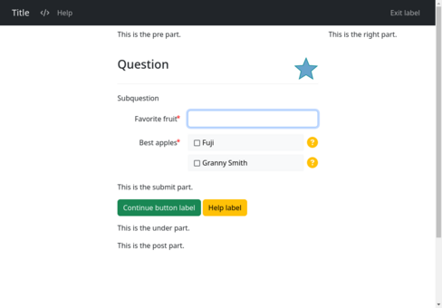
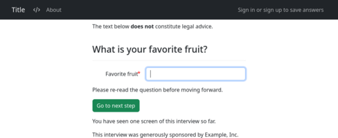
The
metadata block also accepts specifiers for default content to be
inserted into various parts of the screen.
metadata:
title: Title
short title: Short title
subtitle: |
This is the subtitle part.
pre: |
This is the pre part.
submit: |
This is the submit part.
post: |
This is the post part.
under: |
This is the under part.
right: |
This is the right part.
exit link: leave
exit label: |
Exit label
help label: |
Help label
help button color: warning
continue button label: |
Continue button label
continue button color: success
resume button label: |
Resume button label
resume button color: info
back button label: |
Back button label
back button color: danger
footer: |
This is the footer part.You can provide different values for different languages by setting each directive to a dictionary in which the keys are languages and the values are content.
metadata:
  post:
    "*": |
      This interview was sponsored in part by a grant from the Example Foundation.
    "es": |
      Esta entrevista fue patrocinada en parte por una beca de la Fundación Ejemplo.
In this example, the text indicated by "*" will be used as the
post screen part with question blocks that have no language. The
text indicated by "es" will will be used as the post screen part
with question blocks that are modified with language: es.
For information about other ways to set defaults for different parts of the screens during interviews, see the screen parts section.
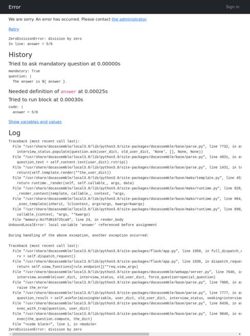
The metadata block also accepts the specifier
error help. This is Markdown-formatted text that will be included
on any error screen that appears to the user during the interview.
You can also provide this text on a server-wide basis using the
error help directive in the Configuration.
metadata:
  error help: |
    We are sorry.
    An error has occurred.
    Please contact
[the administrator](mailto:[email protected]).To support multiple languages, you can set error help to a
dictionary where the keys are language codes and the values are the
error text to be shown:
metadata:
  error help:
    en: |
      We are sorry.
      An error has occurred.
      Please contact
      [the administrator](mailto:[email protected]).
    es: |
      Lo sentimos.
      Se ha producido un error.
      Por favor, póngase en contacto con
[el administrador](mailto:[email protected]).This will not always be reliable, because an error might happen before the user’s language is known.
The metadata block also accepts the specifier
show login, which can be true or false. This controls whether
the user sees a “Sign in or sign up to save answers” link in the upper
right-hand corner during the interview. If show login is not
specified in the metadata, the Configuration directive show
login determines whether this link is available.
metadata:
show login: FalseBy default, all of the functions
and classes of docassemble.base.util are imported into the
namespace of a docassemble interview. If you want to load names
manually using a modules block, you can set suppress loading
util to True:
metadata:
suppress loading util: TrueIf suppress loading util is True, the only name that will be
imported into your interview is process_action.
You can control the meta tags returned by an
interview by setting social.
metadata:
  title: Social meta tags
  short: Social
  social:
    description: |
      A demonstration of meta tags.
    image: court.png
    og:
      image: docassemble.demo:data/static/crown.png
      description: A one-page guided interview demonstrating meta tags.
    twitter:
      title: Social meta tag demo
      site: "@docassemble"
      description: |
        An interview that demonstrates meta tags.
      image: https://docassemble.org/img/docassemble-logo-sq-125.jpg
"image:alt": Docassemble logoThis results in the following HTML inside of the <head> tag:
<meta name="image" content="https://demo.docassemble.org/packagestatic/docassemble.base/court.png?v=1.1.5">
<meta name="description" content="A demonstration of meta tags.">
<meta itemprop="description" content="A demonstration of meta tags.">
<meta itemprop="image" content="https://demo.docassemble.org/packagestatic/docassemble.base/court.png?v=1.1.5">
<meta itemprop="name" content="Social meta tags">
<meta name="twitter:card" content="summary">
<meta name="twitter:title" content="Social meta tag demo">
<meta name="twitter:site" content="@docassemble">
<meta name="twitter:description" content="An interview that demonstrates meta tags.">
<meta name="twitter:image" content="https://docassemble.org/img/docassemble-logo-sq-125.jpg">
<meta name="twitter:image:alt" content="Docassemble logo">
<meta name="og:image" content="https://demo.docassemble.org/packagestatic/docassemble.demo/crown.png?v=1.1.5">
<meta name="og:description" content="A one-page guided interview demonstrating meta tags.">
<meta name="og:title" content="Social meta tags">
<meta name="og:url" content="https://demo.docassemble.org/interview?i=docassemble.base%3Adata%2Fquestions%2Fexamples%2Fsocial.yml">
<meta name="og:site_name" content="docassemble">
<meta name="og:locale" content="en_US">
<meta name="og:type" content="website">
In this example, the docassemble server is
https://demo.docassemble.org, the version of the docassemble.demo
package is 1.1.5, the brandname of the server is docassemble,
and the locale of the server is en_US.utf8.
The image references are special because if you set them to a
reference to a static file, they will be replaced with a full URL to
that file. Alternatively, you can provide a full URL. The example
contains references to a file within the same package (court.png), a
file in a different package
(docassemble.demo:data/static/crown.png), and an external URL
(https://docassemble.org/img/docassemble-logo-sq-125.jpg).
Note that the itemprop="name", twitter: title, and og:title are
all set to the title of the page. This can be overridden by setting
the top-level name, title under twitter, and title under og.
By default, twitter:card is set to summary, og:url is set to the
URL for the interview, og:site_name is set to the value of
brandname, og:locale is determined from the locale, and
og:type is set to website. These defaults can be specifically
overridden.
Server-wide default values for meta tags can be set using the
social Configuration directive.
Note that by default, the docassemble server disallows web
crawling by returning a restrictive /robots.txt file. That means
that as a practical matter, sites will not be able to consume your
meta tags. The /robots.txt file can be customized using the
allow robots directive so that your meta tags are accessible.
If you look at
example interviews that are used in the documentation, you will see
example start and example end in the metadata. These indicate
the YAML blocks that should be excerpted and included in the
documentation. There is a script in the GitHub repository called
make-screenshots.sh, which calls get_yaml_from_example.py, which
scans the YAML files in a directory and outputs YAML containing
the excerpts, which is then processed by the Jekyll documentation
site that is hosted on GitHub Pages.
If you are using the translation
files system for translating an interview into multiple languages,
you should specify a default language in the metadata. If you
wrote the question blocks in English and your translation files
translate questions from English into other languages, set default
language: en in the metadata. The default language block will
override the default language in the metadata, and the language
modifier will override the default language block. If you don’t
specify a default language in the metadata, docassemble will
assume the default language is the language indicated by the
language directive in the Configuration. Setting a default
language in the metadata ensures that your interview can be
installed on a server that uses a different system-wide default
language.
It is important to put your metadata directive at the top of your
interview YAML (i.e. before question blocks and include
directives). The default language in the metadata is only
effective for blocks that follow the metadata directive. This means
that another default language directive can change the default
language of your interview. For example, if your interview starts out
with a metadata block that sets the default language to de, but
then you have an include block that brings in a YAML file containing
a metadata block that sets the default language to es, then all
blocks processed afterward will be considered to be written in Spanish
(assuming no default language block or language modifier is
used). Although this may be what you want, in general, the best way to
indicate the default language of a YAML file is the default
language block, rather than metadata; the purpose of the
metadata is to specify an interview-wide default.
If you have more than one e-mail configuration
under mail, you can specify an email config to use in the interview.
metadata:
email config: abcThis will affect the functioning of the attachment block’s e-mail
feature, as well as the send_email() function.
Effect of multiple metadata blocks
An interview can contain multiple metadata blocks. Values in later
blocks override earlier blocks. The values over later metadata
blocks are effectively superimposed on top of earlier metadata
blocks.
If you write YAML files to be included into other interviews, it
is a best practice not to include metadata in YAML files that
will be included into other interviews.
Creating objects
---
objects:
- spouse: Individual
- user.case: Case
---An objects block creates objects that may be referenced in your
interview. See objects for more information about objects in
docassemble.
If your interview references the variable spouse, docassemble
will find the above objects block and process it. It will define
spouse as an instance of the object class Individual and define
user.case as an instance of the object class Case.
The use of objects in docassemble interviews is highly encouraged.
However, the objects you use as variables need to inherit from the
class DAObject. Otherwise, docassemble might not be able to
find the appopriate code blocks or questions necessary to define
them. This is because of the way docassemble keeps track of the
names of variables.
A code block like this would effectively do the same thing as the
objects block above:
---
code: |
spouse = Individual('spouse')
user.initializeAttribute('case', Case)
---This code is more complicated than normal Python code for object
initialization because the full name of the variable needs to be
supplied to the function that creates and initializes the object. The
base class DAObject keeps track of variable names.
In some situations, running spouse = Individual() will correctly
detect the variable name spouse, but in other situations, the name
cannot be detected. Running spouse = Individual('spouse') will
always set the name correctly.
Whenever possible, you should use objects blocks rather than code to
initialize your objects because objects blocks are clean and
readable.
You can also use objects blocks to initialize attributes of the
objects you create. For information on how to do this, see the
documentation for the using() method.
Importing objects from file
---
objects from file:
- claims: claim_list.yml
---An objects from file block imports objects or other data elements
that you define in a separate YAML or JSON data file located in
the sources folder of the current package. If the interview file
containing the objects from file block is
data/questions/manage_claims.yml, docassemble will expect the
data file to be located at data/sources/claim_list.yml.
For more information about how this works, and about how to format the
data file, see the documentation for the
objects_from_file() function. The example above is equivalent to
running claims = objects_from_file('claim_list.yml', name='claims').
If you set use objects to True, then the use_objects keyword
parameter of the objects_from_file() function will be used.
---
use objects: True
objects from file:
- claims: claim_list.yml
---This is equivalent to running
claims = objects_from_file('claim_list.yml', name='claims', use_objects=True).
Incorporation by reference: include
---
include:
- basic-questions.yml
- docassemble.helloworld:questions.yml
---The include block incorporates the questions in another YAML
file, almost as if the contents of the other YAML file appeared in
place of the include block. When the included file is parsed,
files referenced within it will be assumed to be located in the
included file’s package.
When a filename is provided without a package name, docassemble
will look first in the data/questions directory of the current
package (i.e., the package within which the YAML file being read is
located), and then in the data/questions directory of
docassemble.base.
You can include question files from other packages by explicitly
referring to their package names. E.g.,
docassemble.helloworld:questions.yml refers to the file
questions.yml in the docassemble/helloworld/data/questions
directory of that package.
The include block is a special type of block that is only evaluated
when the YAML is initially compiled. Modifiers like if and
mandatory have no effect on the include block. It is not possible
to conditionally include a YAML file because include is a
“compile-time” block, not a “runtime” block. If you want the blocks
inside of the included YAML file to be conditionally applicable, you
need to use if or mandatory modifiers on those blocks.
See the section on combining multiple interviews into one for
strategies about how to use include effectively.
Images
With attribution: image sets
---
image sets:
freepik:
attribution: |
Icon made by [Freepik](https://www.flaticon.com/authors/freepik)
images:
baby: crawling.svg
people: users6.svg
injury: accident3.svg
---An image sets block defines the names of icons that you can use to
decorate your questions.
The file names refer to files located in the data/static directory
of the package in which the YAML file is located.
Since most free icons available on the internet require attribution,
the image sets block allows you to specify what attribution text
to use for particular icons. The web app shows the appropriate
attribution text at the bottom of any page that uses one of the
icons. The example above is for a collection of icons obtained from
the web site Freepik, which offers free icons under an
attribution-only license.
The image sets block must be in the form of a YAML dictionary, where
the names are the names of collections of icons. The collection
itself is also a dictionary containing terms images and (optionally)
an attribution. The images collection is a dictionary that
assigns names to icon files, so that you can refer to icons by a name
of your choosing rather than by the name of the image file.
For information on how to use the icons you have defined in an image
sets block, see decoration in the question modifiers section, buttons
in the setting variables section, and “Inserting inline icons” in
the markup section.
Without attribution: images
---
images:
bills: money146.svg
children: children2.svg
---An images block is just like an image sets block, except that it
does not set any attribution information. It is simpler because you
do not need to give a name to a “set” of images.
The above images block is essentially equivalent to writing:
---
image sets:
unspecified:
images:
bills: money146.svg
children: children2.svg
---Python modules
Importing the module itself: imports
---
imports:
- datetime
- us
---imports loads a Python module name into the namespace in which your
code and question templates are evaluated. The example above is
equivalent to running the following Python code:
import datetime
import usNote that using third-party modules in code blocks could
potentially lead to errors relating to the Python pickle
module. Variables that are defined in your interview YAML are part of
the “interview answers” that persist in the database. Most objects
that are created by third-party Python modules are meant to live in
the memory of a Python process and are not amenable to being
“serialized” by pickle or any other mechanism.
The “interview answers” are a Python dict. This dict is the
context in which Python in your YAML is executed or evaluated. This
dict is also stored to the SQL database using pickle after each
screen in the interview process.
Before pickling this dictionary, docassemble removes any top-level
names that refer to modules, functions, and classes, because these
variables cannot be pickled. Whenever the screen loads,
docassemble restores the dictionary from SQL and then imports
names from docassemble.base.util, loads the names of any modules
listed in imports blocks, and imports names from the modules listed
in modules blocks.
Importing all names in a module: modules
---
modules:
- datetime
---Like imports, modules loads Python modules into the namespace in
which your code and question templates are evaluated, except that it
imports all of the names that the module exports. The example above
is equivalent to running the following Python code:
from datetime import *If you have a module file in the same package as the YAML file, you can import the names from the module file using Python’s syntax for a relative module reference:
---
modules:
- .utils
---Note that if you use modules to import names from a module of your
own, you should make sure to define __all__ in the module to limit
which names are imported.
While a modules block can import names of functions, classes, and
modules, you should not use modules to import other types of
variables. If a name brought in by modules does not refer to a
function, class, or module, you will get an error if the name refers
to an object that is not pickleable. Even if the object is pickleable,
it is not a good idea to bring it into the interview answers, because
that would be like doing:
foo = 3
from somemodule import fooIf you have a module that contains constants, it would be better to bring in the name of the module and access constants from the module name:
---
imports:
- somemodule
---
code: |
bar = somemodule.foo * 42Storing structured data in a variable
The data block allows you to specify a data structure in YAML in a
block and have it available as a Python data structure.
For example, in this interview we create a Python list and then re-use it in two questions to offer a multiple-choice list.
variable name: fruits
data:
- Apple
- Orange
- Peach
- Pear
---
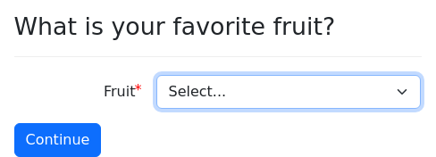
question: |
What is your favorite fruit?
field: user_favorite_fruit
dropdown:
code: fruitsIn Python, the variable fruits is this:
['Apple', 'Orange', 'Peach', 'Pear']You can also use the data block to create more complex data
structures. You can also use Mako in the data structure.
variable name: fruits
data:
Apple:
description: |
The apple is a tasty red fruit.
Everyone on ${ planet } loves
to eat apples.
seeds: 5
Orange:
description: |
The orange is, surprisingly,
orange-colored. Most people
on ${ planet } dislike
eating oranges.
seeds: 10
Peach:
description: |
The peach is a fragile fruit.
There are 165,323 peach
orchards on ${ planet }.
seeds: 1
Pear:
description: |
The pear is variously yellow,
green, or brown.
The planet ${ planet } is
shaped like a pear.
seeds: 0
---
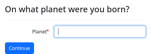
question: |
On what planet were you born?
fields:
Planet: planet
---
question: |
What is your favorite fruit?
field: user_favorite_fruit
choices:
code: fruits.keys()
---
mandatory: True
question: |
Summary of ${ user_favorite_fruit }
subquestion: |
${ fruits[user_favorite_fruit]['description'] }
The ${ user_favorite_fruit } has
${ nice_number(fruits[user_favorite_fruit]['seeds']) }
seeds.data blocks do not work the same way as template blocks. The
Mako templating in a data block is evaluated at the time the
variable indicted by variable name is defined. The text stored in
the data structure is the result of processing the Mako templating.
The Mako templating is not re-evaluated automatically each time a
question is shown.
You can also import data from YAML files using the
objects_from_file() function.
Structured data in object form
If you set use objects: True in a data block, then lists in your
YAML will become DALists in the resulting data structure, and
dictionaries in your YAML will become DADicts. The .gathered
attribute of these objects will be set to True.
In addition, when use objects: True is enabled, any dictionaries in
the data structure will be transformed into a DAContext object if
the keys of the dictionary are a subset of question, document,
docx, pdf, and pandoc that has at least two elements.
This is a useful shorthand for creating DAContext objects. For
example:
variable name: fruits
use objects: True
data:
- question: Apple
document: red fruit
- question: Orange
document: fruit that rhymes with nothing
- question: Peach
document: juicy fruit
docx: peachy peach
pandoc: very juicy fruit
---
question: |
What is your favorite fruit?
fields:
- Fruit: favorite_fruit
datatype: object
choices: fruitsIf you set use objects: objects, then the data structure under
data will be evaluated as though it were a file imported by the
objects_from_file() function.
variable name: people
use objects: objects
data:
object: Individual
module: docassemble.base.util
items:
- name:
object: IndividualName
item:
first: Fred
last: Smith
email: [email protected]
allergies:
- peanuts
- subway tokens
skills:
- guessing pennies
- name:
object: IndividualName
item:
first: Larry
last: Jones
email: [email protected]
allergies: []
skills:
- stapling
- making ${ 'coffee' }
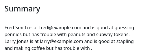
---
mandatory: True
question: |
Summary
subquestion: |
% for item in people:
${ item } is at ${ item.email } and is good at ${ item.skills }
but has trouble with ${ item.allergies }.
% endforBy default, if objects created with use objects: True or use
objects: objects contain DAList or DADict objects, these
objects will have their .gathered attributes set to True. If you
want to leave .gathered undefined, set gathered: False. In the
following interview, gathered: False is set so that the user can be
asked to fill in missing items.
variable name: people
use objects: objects
gathered: False
data:
object: Individual
module: docassemble.base.util
items:
- name:
object: IndividualName
item:
first: Fred
last: Smith
email: [email protected]
allergies:
- peanuts
- subway tokens
skills:
- guessing pennies
- name:
object: IndividualName
item:
first: Larry
last: Jones
email: [email protected]
allergies: []
skills:
- stapling
- making ${ 'coffee' }Storing structured data in a variable using code
The data from code block works just like the data block, except
that Python code is used instead of text or Mako markup.
variable name: fruits
data from code:
Apple:
description: |
', '.join(['red', 'shiny', 'for teachers'])
seeds: 10/2
Orange:
description: |
capitalize('round') + " and orange"
seeds: seeds_in_orange
Peach:
description: peach_description
seeds: 10**6
Pear:
description: |
"Like an apple, but not like an apple."
seeds: 0
---
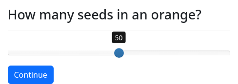
question: |
How many seeds in an orange?
fields:
- no label: seeds_in_orange
datatype: range
min: 0
max: 100
---
question: |
How would you describe a peach?
fields:
- no label: peach_description
---
question: |
What is your favorite fruit?
field: user_favorite_fruit
choices:
code: fruits.keys()
---
mandatory: True
question: |
Summary of ${ user_favorite_fruit }
subquestion: |
${ fruits[user_favorite_fruit]['description'] }
The ${ user_favorite_fruit } has
${ nice_number(fruits[user_favorite_fruit]['seeds']) }
seeds.Structured data from code in object form
The use objects modifier can also be used with data from code.
variable name: fruits
use objects: True
data from code:
- question: |
"Apple"
document: |
"red fruit"
- question: |
"Orange"
document: |
"fruit that rhymes " + "with nothing"
- question: |
"Peach"
document: |
"juicy fruit"
docx: |
"peachy peach"
pandoc: |
"very juicy " + "fruit"
---
question: |
What is your favorite fruit?
fields:
- Fruit: favorite_fruit
datatype: object
choices: fruitsThe data from code block also supports use objects: objects.
variable name: the_object
use objects: objects
data from code:
object: Thing
module: docassemble.base.util
item:
name:
object: Name
module: docassemble.base.util
item:
text: |
the_name
size: |
4 * unit_size
---
mandatory: True
question: |
The object is ${ the_object } and its size is
${ the_object.size }.The gathered: False modifier is also supported when use objects is
set to True or set to objects.
Keeping variables fresh: reset
The reset block will cause variables to be undefined every time a
screen loads.
This can be helpful in a situation where a variable is set by a
code block and the value of the variable ought to be considered
afresh based on the user’s latest input.
---
reset:
- client_is_guilty
- opposing_party_is_guilty
---Effectively, this causes variables to act like functions.
Another way to use this feature is to set the reconsider modifier
on a code block. This will have the same effect as reset, but
it will apply automatically to all of the variables that are capable
of being assigned by the code block.
The reset block and the reconsider modifier are computationally
inefficient because they cause extra code to be run every time a new
screen loads. For a more computationally efficient alternative, see
the reconsider() function
Running code when a variable changes: on change
If you allow users to go back and change their answers, you may
find situations where using depends on is not sufficient to
invalidate variables that depend on a variable that has been altered.
In this situation, you can write a block of Python code in an on
change block that will be executed when a variable is changed.
on change:
married: |
for item in income.complete_elements():
item.invalidate_attr('amount')
income.reset_gathered(mark_incomplete=True)
---
question: |
Are you married?
yesno: married
---
question: |
% if married:
What is the ${ ordinal(i) } income item
that you and your spouse earn?
% else:
What is your ${ ordinal(i) } income source?
% endif
fields:
- Name: income[i].name.text
- Amount per year: income[i].amount
datatype: currencyIf the user finishes this interview and then changes his mind about
whether he is married (indicated by the variable married), this will
invalidate the answers to the questions about income. If he had said
at the outset that he was married, the questions would have asked
about the income of both himself and his spouse.
Tagging the income[i].amount question with depends on: married
would not work because in the context of a change to married, the
variable i is not defined.
The on change block states explicitly what should be done if the
variable married changes: the .amount attributes should be
invalidated and the income list should be reopened for gathering.
Calling income.reset_gathered() with mark_incomplete=True will
undefine the .complete attributes on each of the income items. This
is important because otherwise the existing items would still be
considered “complete,” and thus the .amount attributes would not be
re-defined by the interview logic.
The on change specifier needs to point to a YAML dictionary in
which the keys are variable names and the values are Python code
that will be run when the given variable changes value.
The on change code is run not only when the variable is changed, but
when the variable is initialized. This is in contrast to depends
on, which does not invalidate dependent variables when a variable is
initialized, but only when it is changed.
It is important that you write on change code so that it will always
run to completion without encountering any undefined variables. This
code runs during a different part of the screen loading process than
other code. on change code runs before modules and imports
blocks have loaded (although the standard docassemble functions
from docassemble.base.util, such as undefine() and
invalidate(), are available). If you need to refer to names from
custom modules, bring them into the namespace manually with a line
like from docassemble.missouri import MyObject.
You can have more than one on change block in your interview. If
more than one block refers to the same variable, all of the code
blocks will be run. The code blocks will be run in the order in which
the blocks appear in the YAML file.
Changing order of precedence
As explained in how docassemble finds questions for variables,
if there is more than one question or code block that offers
to define a particular variable, blocks that are later in the YAML
file will be tried first.
If you would like to specify the order of precedence of blocks in a
more explicit way, so that you can order the blocks in the YAML file
in whatever way you want, you can tag two or more blocks with ids
and insert an order block indicating the order of precedence of the
blocks.
For example, suppose you have an interview with two blocks that could
define the variable favorite_fruit. Normally, docassemble will
try the the second block first because it appears later in the YAML
file; the second block will “override” the first.
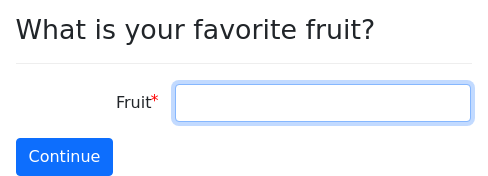
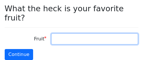
question: |
What the heck is your favorite fruit?
fields:
Fruit: favorite_fruit
---
question: |
What is your favorite fruit?
fields:
Fruit: favorite_fruit
---
mandatory: True
question: |
Your favorite fruit is
${ favorite_fruit }.However, if you actually want the first block to be tried first, you can manually specify the order in which the blocks will be tried:
order:
- informal favorite fruit question
- regular favorite fruit question
---
id: informal favorite fruit question
question: |
What the heck is your favorite fruit?
fields:
Fruit: favorite_fruit
---
id: regular favorite fruit question
question: |
What is your favorite fruit?
fields:
Fruit: favorite_fruit
---
mandatory: True
question: |
Your favorite fruit is
${ favorite_fruit }.Another way to override the order in which blocks will be tried is by
using the id and supersedes question modifiers.
Vocabulary terms and auto terms
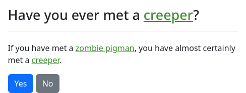
Sometimes you will use vocabulary terms that the user may or may not know. Instead of interrupting the flow of your questions to define every term, you can define certain vocabulary words, and docassemble will turn them into hyperlinks wherever they appear in curly brackets. When the user clicks on the hyperlink, a popup appears with the word’s definition.
terms:
creeper: |
A tall green creature that explodes if
you get too close.
zombie pigman: |
A harmless creature who carries a gold
sword.
---
question: Have you ever met a {creeper}?
subquestion: |
If you have met a {zombie pigman}, you
have almost certainly met a creeper.
yesno: met_a_creeperIf you want the terms to be highlighted every time they are used,
whether in curly brackets or not, use auto terms.
auto terms:
creeper: |
A tall green creature that explodes if
you get too close.
zombie pigman: |
A harmless creature who carries a gold
sword.
---
question: Have you ever met a creeper?
subquestion: |
If you have met a zombie pigman, you
have almost certainly met a creeper.
yesno: met_a_creeperUsing auto terms can lead to ambiguities, so it is generally better
to use terms if you can. If you have two terms, green apple and
apple, then auto terms will try to make a term within a term,
which will lead to unpredictable behavior.
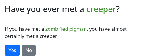
If you want to refer to a term but you want the text of the hyperlink
to be different from the name of the term, you can use the pipe
character | and write the alternate text after the |.
question: Have you ever met a {creeper}?
subquestion: |
If you have met a
{zombie pigman|zombified pigman}, you
have almost certainly met a creeper.
yesno: met_a_creeperAlternatively, in your definition of the terms, you can specify that
multiple phrases should be associated with a single definition. You
write your terms as a list of dictionaries, and if a dictionary has
two keys, phrases and definition, where phrases refers to a list
of terms and definition refers to a definition, that definition will
be used for each of the phrases:
terms:
- phrases:
- charged creeper
- creeper
definition: |
A tall green creature that explodes if
you get too close.
- zombie pigman: |
A harmless creature who carries a gold
sword.You can also use terms and auto terms as question modifiers, in
which case the terms will apply only to the question, not to the
interview as a whole. When you use terms and auto terms as
initial blocks, you cannot use Mako templating in the definitions,
but when you use them as question modifiers, you can use Mako
templating.
If you want to define terms using Python code, you can use the
update_terms() function.
The template block
The word “template” has a number of different meanings. If you are interested in how to insert variables into the text of your questions or documents using the Mako templating syntax, see markup. If you are interested in document assembly based on forms or document templates, see the Documents section.
A template block allows you to assign text to a variable and then
re-use the text by referring to a variable.
template: disclaimer
content: |
The opinions expressed herein do not
*necessarily* reflect the views
of ${ company }.
---
field: intro_screen
question: Welcome to the interview!
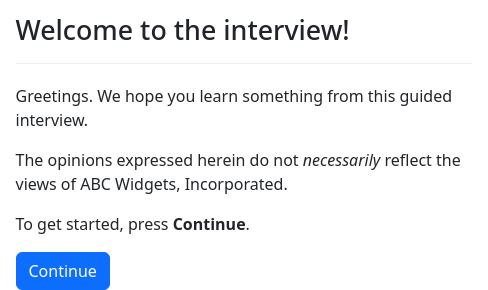
subquestion: |
Greetings. We hope you learn something
from this guided interview.
${ disclaimer }
To get started, press **Continue**.The content of a template may contain Mako and Markdown.
The name after template: is a variable name that you can refer to
elsewhere. The variable gets defined as a special type of object
known as a DALazyTemplate.
The template block, like question and code blocks, offers to
define a variable. So when docassemble needs to know the
definition of disclaimer and finds that disclaimer is not defined,
it will look for a question, code, or template block that offers
to define disclaimer. If it finds the template block above, it
will define the disclaimer variable.
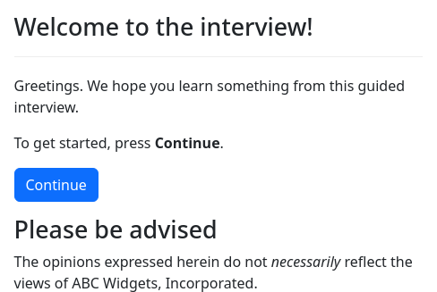
Optionally, a template can have a subject:
template: disclaimer
subject: |
Please be advised
content: |
The opinions expressed herein do not
*necessarily* reflect the views
of ${ company }.
---
field: intro_screen
question: Welcome to the interview!
subquestion: |
Greetings. We hope you learn something
from this guided interview.
To get started, press **Continue**.
under: |
### ${ disclaimer.subject }
${ disclaimer.content }You can refer to the two parts of the template by writing, e.g.,
disclaimer.subject and disclaimer.content.
Note that writing ${ disclaimer } has the same effect as writing ${
disclaimer.content }. You can also write ${ disclaimer.show() }
(for interchangability with images).
To convert the subject and the content to HTML, you can write
disclaimer.subject_as_html() and disclaimer.content_as_html().
These methods take the optional keyword argument trim. If True,
the resulting HTML will not be in a <p> element. (The default is
False.)
template objects are also useful for defining the content of e-mails. See
send_email() for more information on using templates with e-mails.
You might prefer to write text in Markdown files, rather than in
Markdown embedded within YAML. To facilitate this,
docassemble allows you to create a template that references a
separate Markdown file.
template: disclaimer
content file: disclaimer.md
---
field: intro_screen
question: Welcome to the interview!
subquestion: |
Greetings. We hope you learn something
from this guided interview.
${ disclaimer }
To get started, press **Continue**.The file disclaimer.md is a simple Markdown file containing the
disclaimer from the previous example.
The content file is assumed to refer to a file in the “templates”
folder of the same package as the interview source, unless a specific
package name is indicated. (e.g., content file:
docassemble.demo:data/templates/hello_template.md)
In the example above, the sample interview is in the file
docassemble.base:data/questions/examples/template-file.yml, while
the Markdown file is located at
docassemble.base:data/templates/disclaimer.md.
If the content file specifier refers to a dictionary in which the
only key is code, the code will be evaluated as Python code, and
the result will be used as the file.
code: |
template_file_to_use = 'disclaimer.md'
---
template: disclaimer
content file:
code: template_file_to_use
---
field: intro_screen
question: Welcome to the interview!
subquestion: |
Greetings. We hope you learn something
from this guided interview.
${ disclaimer }
To get started, press **Continue**.In this example, the code evaluated to the name of a file in the
templates folder. The code may also evaluate to a URL, DAFile,
DAFileList, DAFileCollection, or DAStaticFile.
For more information about this use of templates, see the section on
Inserting multi-line or formatted text into a single field in a DOCX
file.
The table block
The table works in much the same way as a template, except its
content is a table that will be formatted appropriately whether it is
included in a question or in a document.
This block should be used when each row of your table represents an item in a group; that is, you do not know how many rows the table will contain, because the information is in a list, dictionary, or set. If you just want to format some text in a table format, see the documentation about tables in the markup section.
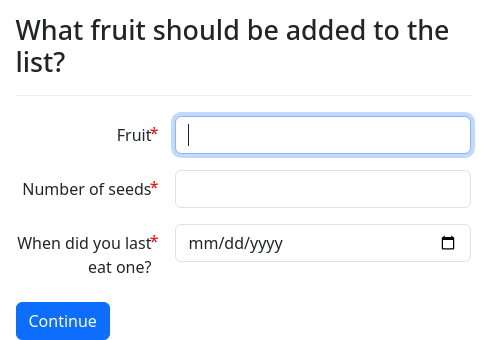
In the following example, the variable fruit is a DAList of
objects of type Thing, each of which represents a fruit. Each row
in the resulting table will describe one of the fruits.
objects:
- fruit: DAList
---
mandatory: true
code: |
fruit.object_type = Thing
---
mandatory: True
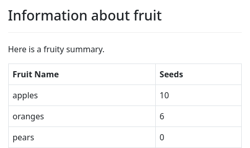
question: |
Information about fruit
subquestion: |
Here is a fruity summary.
${ fruit_table }
---
table: fruit_table
rows: fruit
columns:
- Fruit Name: row_item.name
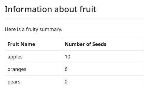
- Seeds: row_item.seedsThe table: fruit_table line indicates the name of the variable that
will hold the template for table. The question block includes the
table simply by referring to the variable fruit_table.
The rows: fruit line indicates the variable containing the group
of items that represent rows in the table. The fruit variable is a
DAList that gets populated during the interview.
Next, columns describes the header of each column and what should be
printed in each cell under that header. Like a fields list within
a question, columns must contain a YAML list where each item
is a key/value pair (a one-item dictionary) where the key is the
header of the column and the value is a Python expression
representing the contents of the cell for that column, for a given row.
In the example above, the header of the first column is “Fruit Name”
and the Python expression that produces the name of the fruit is
row_item.name.
There are two special variables available to these Python expressions:
row_item: this is the item in the group corresponding to the current row.row_index: this is0for the first row,1for the second row,2for the third row, etc.
You can pretend that the Python expressions are evaluated in a context like this:
row_index = 0
for row_item in fruit:
# evaluation takes place here
row_index = row_index + 1In this example, the first column will show name of the fruit
(row_item.name) and the second column will show the number of seeds
(row_item.seeds).
The header of each column is plain text (not a Python expression). The header can include Mako and Markdown.
If you have a complicated header, you can use the special keys
header and cell to describe the header and the cell separately.
(This is similar to using label and field within a fields
list.)
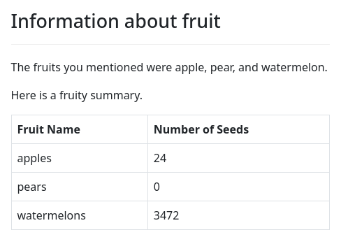
code: |
thing = "Fruit"
---
table: fruit_table
rows: fruit
columns:
- header: |
${ thing } Name
cell: |
row_item.name
- header: |
Number of Seeds
cell: |
row_item.seedsYou can use Python to create cells with content that is computed from the items of a group.
table: fruit_table
rows: fruit
columns:
- Fruit Name: |
noun_plural(row_item.name)
- Number of Seeds: |
row_item.seeds * 2The above example prints the name of the fruit as a plural noun, and inflates the number of seeds.
Remember that the Python code here is an expression, not a block of code. If you want to use if/then/else logic in a cell, you will need to use Python’s one-line form of if/then/else:
table: fruit_table
rows: fruit
columns:
- Fruit Name: |
noun_plural(row_item.name)
- Number of Seeds: |
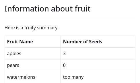
"too many" if row_item.seeds > 20 else row_item.seedsWhen fruit_table is inserted into the question, the result will
be a Markdown-formatted table.
This:
question: |
Information about fruit
subquestion: |
Here is a fruity summary.
${ fruit_table }will have the effect of this:
question: |
Information about fruit
subquestion: |
Here is a fruity summary.
Fruit Name |Number of Seeds
-----------|---------------
Apples |4
Oranges |3
Pears |6For more information about Markdown-formatted tables, see the documentation about tables in the markup section.
Instead of using a table block, you could construct your own
Markdown tables manually using a Mako “for” loop. For example:
mandatory: True
question: |
Information about fruit
subquestion: |
Here is a fruity summary.
Fruit Name |Number of Seeds
---------------|----------------
% for item in fruit:
${ item.name } | ${ item.seeds }
% endforThe advantages of using the table block are:
- The
tableblock describes the content of a table in a conceptual rather than visual way. In Markdown, simple tables look simple, but complicated tables can look messy. Thetableblock allows you to map out your ideas in outline form rather than squeezing everything into a single line that has a lot of punctuation marks. - The
tableblock will attempt to set the relative table widths in a sensible way based on the actual contents of the table. If you create your own tables in Markdown, and the text in any cell wraps, the relative table widths of the columns will be decided based on the relative widths of the cells in the divider row (----|---------). You might not know in advance what the relative sizes of the text will be in each column.
The table block acts like a template block in that the variable it
sets will be a docassemble object. The .content attribute will
be set to the text of the table in Markdown format.
If the variable indicated by rows is empty, the table will display
with only the headers. To suppress this, you can add show if empty:
False to the table block. The resulting .content will be the
empty string, "".
table: fruit_table
rows: fruit
columns:
- Fruit Name: row_item.name
- Number of Seeds: row_item.seeds
show if empty: FalseIf you would like a message to display in place of the table in the
event that there are no rows to display, you can set show if empty
to this message. Mako and Markdown can be used. The message will
become the .content of the resulting object.
table: fruit_table
rows: fruit
columns:
- Fruit Name: row_item.name
- Number of Seeds: row_item.seeds
show if empty: |
I'm very sorry, but there are no fruits
to display today.If you include a table in the content of an attachment, you might
find that the table is too wide, or not wide enough. Pandoc breaks
lines, determines the relative width of columns, and determines the
final width of a table based on the characters in the divider row
(----|---------).
By default, docassemble will construct a divider row that is no longer than 65 characters. This should work for standard applications (12 point font, letter size paper).
You can change the number of characters from 65 to something else by
setting value of table width in a features block.
features:
table width: 35
---
table: fruit_table
rows: fruit
columns:
- Fruit Name: row_item.name
- Seeds: row_item.seedsYou can also use table blocks with DADict objects:
scan for variables: False
mandatory: True
code: |
income['employment'].receives = True
income['employment'].amount = 237
income['benefits'].receives = False
income['interest'].receives = True
income['interest'].amount = 23
---
table: income.table
rows: income
columns:
- Type: |
row_index
- Receives: |
'Yes' if row_item.receives else 'No'
- Amount: |
currency(row_item.amount) if row_item.receives else ''
---
mandatory: True
question: |
Summary of income
subquestion: |
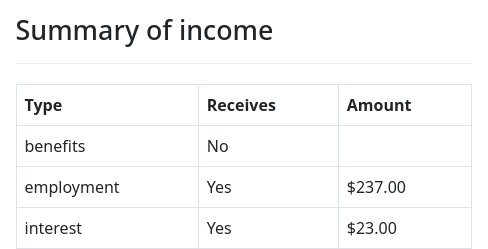
${ income.table }When rows refers to a DADict, then in the columns, row_index
represents the “key” and row_item represents the “value” of each
item in the dictionary.
By default, the display of a table
will require that the table is gathered. If you want to display a
table with the items in a group that have been completely gathered so
far, you can set require gathered: False in the table definition.
table: fruit.table
rows: fruit
columns:
- Fruit Name: row_item
- Number of Seeds: row_item.seeds
- Last eaten: row_item.last_eaten
require gathered: False
edit:
- name.text
- last_eatenWhen displaying a table using require
gathered: False, an item will not be shown unless it has been
completely gathered. If you want to show unfinished items, set show
incomplete: True.
table: fruit.table
rows: fruit
columns:
- Fruit Name: row_item
- Number of Seeds: row_item.seeds
- Last eaten: row_item.last_eaten
show incomplete: True
show if empty: You do not have any fruit.
edit:
- name.text
- last_eatenBy default, a column for which
information is not known will be displayed as “n/a.” You can
customize this by setting not available label. In this example, the
label is set to a blank value:
table: fruit.table
rows: fruit
columns:
- Fruit Name: row_item
- Number of Seeds: row_item.seeds
- Last eaten: row_item.last_eaten
show incomplete: True
show if empty: You do not have any fruit.
not available label: ""
edit:
- name.text
- last_eatenExporting tables to Excel and other formats
You can call the export() method on a table to get a DAFile
representation of the table.
For example, this interview provides a Microsoft Excel .xlsx file representation of a table:
objects:
- fruit: DAList
---
mandatory: true
code: |
fruit.object_type = Thing
---
mandatory: True
question: |
Information about fruit
subquestion: |
Here is a fruity summary.
${ fruit_table }
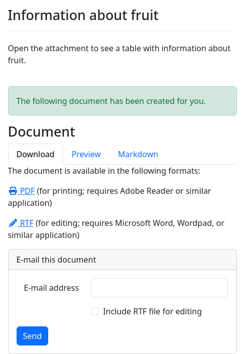
You can also [download this information].
[download this information]: ${ fruit_table.export('fruit.xlsx', title='fruit').url_for() }
---
table: fruit_table
rows: fruit
columns:
- Fruit Name: row_item.name
- Seeds: row_item.seeds
- Last eaten: row_item.last_eatenThis function uses the pandas module to export to various formats.
The export() method takes a filename, which is parsed to determine
the file format you want to use. This can also be provided as the
filename keyword parameter. If you omit the filename, you can
indicate the file format using the file_format keyword parameter.
The default file format is 'xlsx'. The valid file formats include
csv, xlsx, and json.
The title keyword parameter indicates the name of the data set.
This is used as the name of the Microsoft Excel sheet.
When the xlsx format is used, you can set the freeze_panes keyword
parameter to False to turn off the Microsoft Excel “freeze panes”
feature.
Here are some examples of usage:
fruit_table.export('fruit.xlsx'): returns a Microsoft Excel file calledfruit.xlsx.fruit_table.export('fruit.xlsx', title='Fruits'): returns a Microsoft Excel file calledfruit.xlsxwhere the sheet is named “Fruits”.fruit_table.export('fruit.xlsx', title='Fruits', freeze_panes=False): returns a Microsoft Excel file calledfruit.xlsxwhere the sheet is named “Fruits” and the “freeze panes” feature is turned off.fruit_table.export('fruit.csv'): returns a comma-separated values file calledfruit.csv.fruit_table.export(file_format='csv'): returns a comma-separated values file calledfile.csv.fruit_table.export(): returns a Microsoft Excel file calledfile.xlsx.
The optional keyword parameter output_to can be used to specify a
DAFile to which the output of .export() should be
written. If omitted, DAFile with a random instance name will be
returned.
Converting tables to a pandas dataframe
If you want to work with your table as a pandas dataframe, you can
call fruit_table.as_df() to obtain the information for the table as
a pandas dataframe object. However, note that objects from the
pandas package cannot necessarily be “pickled” by Python, so it is
best if you call this method from functions in Python modules, or in
such a way that the results do not get saved to variables in the
interview.
Using tables to edit groups
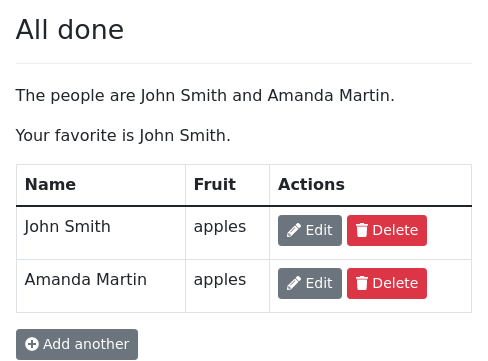
You can use a table to provide the user with an interface for
editing an already-gathered DAList or DADict.
mandatory: True
question: |
All done
subquestion: |
The people are ${ person }.
Your favorite is ${ favorite }.
${ person.table }
${ person.add_action() }
---
table: person.table
rows: person
columns:
- Name: |
row_item.name.full()
- Fruit: |
row_item.favorite_fruit
edit:
- name.first
- favorite_fruitFor more information about this feature, see the section on editing an already-gathered list in the section on groups.
Sorting and filtering items in a table
If you have a DAList or a DADict and you want to display a table
of some of the items, or display the items sorted in a different way,
you can specify sort key and filter options.
In a table definition where rows refers to a DAList, sort key
refers to a function that takes a single parameter as input, namely an
item in the list, and returns a value that should be used for
sorting the list. When Python sorts the list, it will call this
function on each item in the list. The sort key is passed to the
key parameter of the Python sorted function.
Any function name can be used. For example, writing sort key: str
will use the str() function to convert each item in the list to
text, and then alphabetize the rows based on that textual
representation of each item.
In most cases, though, you will want to write a lambda
function. For example:
table: fruit.table
rows: fruit
columns:
- Fruit Name: row_item
- Number of Seeds: row_item.seeds
- Last Eaten: row_item.last_eaten
sort key: |
lambda y: y.last_eaten
sort reverse: True
filter: |
row_item.seeds > 0
show if empty: |
You have never eaten any fruit.
edit:
- name.text
- last_eatenThis example uses
sort key: |
lambda y: y.last_eatenThe last_eaten attribute is defined by a datatype: date field, so
the rows will be presented to the user in date order.
A lambda function is just like a Python function, except it
doesn’t have a name. Equivalently, you could load a .py module file
that defines the following function:
def get_last_eaten(y):
return y.last_eatenand then you could write sort key: get_last_eaten. However, it is
easier to just write lambda y: y.last_eaten.
Note that the use of the variable name y is arbitrary. You could use
any variable name you want (as long as it isn’t a reserved Python
keyword).
In a table definition, sort reverse
indicates whether the rows will be sorted in reverse order. In the
above example, sort reverse: True is used, which means the table
will present the items in reverse chronological order. sort reverse
can refer to True, False, or any Python expression. If sort
reverse is omitted or it evaluates to a false value, the rows are
sorted in forward order.
If you want the table to present a filtered
list of the items, you can set filter to a Python expression that
should be evaluated to determine if the item should be included or
not. In the above example, the expression is row_item.seeds >
0. That means that the table will omit any items in the fruit
list where the seeds attribute is zero. Like an item in the
columns, the filter expression uses the special variables
row_item and row_index. The expression is evaluated for each item
in the list, and if the expression evaluates to a true value, the item
is included in the table.
If your table is editable, it is important to perform sorting and
filtering using sort key, sort reverse, and filter, rather than
by passing an expression to rows that returns an altered version of
the underlying list. If you give rows an altered version of a
DAList object, some of the editing features might not work
correctly.
Note that these sorting and filtering features do not alter the
underlying DAList in any way; they only affect the way the table
representation is displayed.
Sorting and filtering dictionaries
The sort key, sort reverse, and filter features also work if the
rows refers to a DADict object. The main difference is that the
sort key function is given a Python tuple with two items, the
dictionary key and the dictionary value. If you want to sort on the
key of a dictionary item, access the first item; if you want to sort
on the value of a dictionary item, access the second item.
table: income.table
rows: income
columns:
- Type: |
row_index
- Receives: |
'Yes' if row_item.receives else 'No'
- Amount: |
currency(row_item.amount) if row_item.receives else ''
sort key: |
lambda y: y[1].amount if y[1].receives else 0.0
filter: |
row_item.receives is False or row_item.amount < 100
edit:
- receives
delete buttons: FalseIn this example, the sort key expression is:
lambda y: y[1].amount if y[1].receives else 0.0Here, y[1] refers to the value of the dictionary item (a
DAObject). The income items that are not received are listed as
though their amount was zero, and then the other items are listed in
amount order.
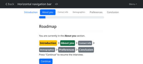
Defining the sections for the navigation bar
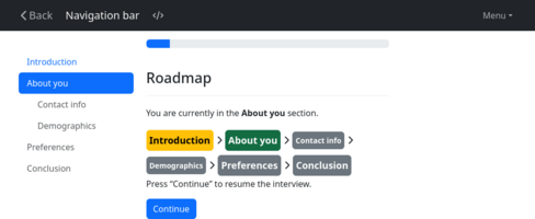
You can use the navigation bar feature or the
nav.show_sections() function to show your users the “sections” of
the interview and what the current section of the interview is.
Here is a complete example.
sections:
- Introduction
- About you:
- Contact info
- Demographics
- Preferences
- Conclusion
---
features:
navigation: True
progress bar: True
---
mandatory: True
code: |
menu_items = [ action_menu_item('Roadmap', 'road_map') ]
---
initial: True
code: |
if returning_user(minutes=0.5):
welcome_back
---
mandatory: True
question: |
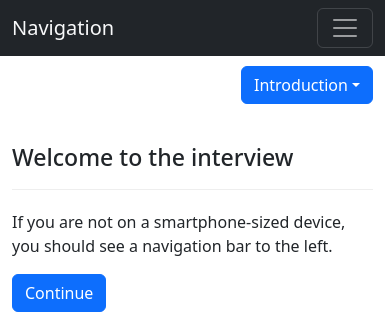
Welcome to the interview
subquestion: |
If you are not on a
smartphone-sized device,
you should see a navigation
bar to the left.
field: sees_nav_bar
---
mandatory: True
question: |
I am going to ask you some
questions about yourself.
field: intro_to_about_you
section: About you
---
mandatory: True
question: |
What is your name?
fields:
- First Name: first_name
- Last Name: last_name
section: Contact info
---
mandatory: True
question: |
What is your e-mail address?
fields:
- E-mail: email_address
datatype: email
---
mandatory: True
question: |
What is your gender?
field: gender
choices:
- Male
- Female
- Something else
section: Demographics
---
mandatory: True
question: |
What kind of belly button
do you have?
subquestion: |
To see what a user would
see after returning to
the interview after a period
of absence, try waiting
thirty seconds, then
[click into the
interview](${ interview_url(local=True) }).
In addition, there is a similar
screen available on the Menu in the
upper-right, under "Roadmap."
field: belly_button
choices:
- Innie
- Outie
---
mandatory: True
question: |
What is your favorite fruit?
fields:
- Favorite fruit: favorite_fruit
section: Preferences
---
mandatory: True
question: |
What is your favorite vegetable?
fields:
- Favorite vegetable: favorite_vegetable
---
progress: 100
mandatory: True
question: Thank you.
subquestion: |
${ first_name },
Your answers mean a lot to me.
I am going to go eat some
${ favorite_vegetable }
now.
section: Conclusion
---
event: welcome_back
question: |
Welcome back!
subquestion: |
You are currently in the
**${ nav.get_section(display=True) }**
section.
${ nav }
Press "Continue" to pick up
where you left off.
buttons:
Continue: continue
---
event: road_map
question: |
Roadmap
subquestion: |
You are currently in the
**${ nav.get_section(display=True) }**
section.
${ nav }
Press "Continue" to resume the
interview.
buttons:
Continue: continueSubsections are supported, but only one level of nesting is allowed.
If your interview uses multiple languages, you can specify more than
one sections block and modify each one with a language modifier:
---
language: en
sections:
- Introduction
- Fruit
- Vegetables
- Conclusion
---
language: es
sections:
- Introducción
- Fruta
- Vegetales
- Conclusión
---If no language is specified, the fallback language * is used.
Section headings are not processed as Mako. As a result, the
translations system cannot be used to translate section
headings. Thus the translation method described above, using the
language modifier, must be used to support section headings in
multiple languages. (Alternatively, you could use code blocks and
the nav.set_sections() to define the sections using template
blocks reduced to text.)
In the example above, the section modifier referred to sections
using the same text that is displayed to the user. However, in some
circumstances, you might want to use a shorthand to refer to a
section, and update the actual section names displayed to the user
without having to make changes in numerous places in your interview.
You can do this by using key/value pairs in your sections block, and
using the special key subsections to indicate subsections:
sections:
- intro: Introduction
- about: About you
subsections:
- contact: Contact info
- demographic: Demographics
- prefs: Preferences
- conclusion: Conclusion
---
features:
navigation: True
---
mandatory: True
question: |
Welcome to the interview
subquestion: |
If you are not on a
smartphone-sized device,
you should see a navigation
bar to the left.
field: sees_nav_bar
---
mandatory: True
question: |
I am going to ask you some
questions about yourself.
field: intro_to_about_you
section: about
---
mandatory: True
question: |
What is your name?
fields:
- First Name: first_name
- Last Name: last_name
section: contact
---
mandatory: True
question: |
What is your e-mail address?
fields:
- E-mail: email_address
datatype: email
---
mandatory: True
question: |
What is your gender?
field: gender
choices:
- Male
- Female
- Something else
section: demographic
---
mandatory: True
question: |
What kind of belly button
do you have?
field: belly_button
choices:
- Innie
- Outie
---
mandatory: True
question: |
What is your favorite fruit?
fields:
- Favorite fruit: favorite_fruit
section: prefs
---
mandatory: True
question: |
What is your favorite vegetable?
fields:
- Favorite vegetable: favorite_vegetable
---
mandatory: True
question: Thank you.
subquestion: |
${ first_name },
Your answers mean a lot to me.
I am going to go eat some
${ favorite_vegetable }
now.
section: conclusionThe keywords for section names need to be valid Python names. When choosing keywords, make sure not to use the names of variables that already exist in your interview.
This is because the keywords can be used to make the left-hand navigation bar clickable. If a keyword for a section is a variable that exists in the interview, clicking on the section will cause an action to be launched that seeks a definition of that variable.
The recommended way to use this feature is to set up review blocks
that have event set to the keyword of each section that you want
to be clickable.
sections:
- intro: Introduction
- about: About you
subsections:
- contact: Contact info
- demographic: Demographics
- prefs: Preferences
- conclusion: Conclusion
---
event: contact
section: contact
question: |
Review contact information
review:
- Edit name: first_name
button: |
Name: ${ first_name } ${ last_name }
- Edit e-mail: email_address
button: |
E-mail: ${ email_address }
---
event: demographic
section: demographic
question: |
Review demographic information
review:
- Edit gender: gender
button: |
Gender: ${ gender }
- Edit belly button: belly_button
button: |
Belly button: ${ belly_button }
---
event: prefs
section: prefs
question: |
Preferences
review:
- Edit fruit: favorite_fruit
button: |
Favorite fruit: ${ favorite_fruit }
- Edit vegetable: favorite_vegetable
button: |
Favorite vegetable: ${ favorite_vegetable }Note that if you use review blocks in an interview with sections,
every question should have a section defined. Otherwise, when your
users jump around the interview, their section may not be appropriate
for the question they are currently answering. Alternatively, you
could use code blocks and the nav.set_section() function to
make sure that the section is set appropriately.
By default, users are only able to click on sections that they have
visited. If you want users to be able to click on any section at any
time, set progressive to False:
sections:
- intro: Introduction
- about: About you
subsections:
- contact: Contact info
- demographic: Demographics
- prefs: Preferences
- conclusion: Conclusion
progressive: False
---
event: intro
code: |
force_ask('sees_nav_bar')
---
event: about
code: |
force_ask('intro_to_about_you')
---
event: contact
code: |
force_ask('first_name', 'email_address')
---
event: demographic
code: |
force_ask('gender', 'belly_button')
---
event: prefs
code: |
force_ask('favorite_fruit', 'favorite_vegetable')
---
event: conclusion
code: |
force_ask('final_screen')
---
features:
navigation: TrueBy default, subsections are not shown until the user has entered one
of the subsections. If you want subsections to be opened by default,
set auto open to True.
sections:
- Introduction
- About you:
- Contact info
- Demographics
- Preferences
- Conclusion
auto open: TrueNote that docassemble’s logic system is very different from that
of SurveyMonkey or TypeForm, where defining a sequence of questions
and dividing those questions into sections is straightforward. In
docassemble, the question that is asked at any given time is based
on the interview logic. The interview logic is evaluated and if a
necessary piece of information is undefined, docassemble will ask
a question (or run a code block) to get a definition of that piece
of information. This is convenient when working toward an end goal,
because the interview developer can focus on specifying correct rules,
without worrying about the complexities of designing an interview
process. The downside is that the sequence of questions might be
different from one interview to another, and the sequence might not be
easy to fit into well-defined sections. Once variables are defined,
the sequence of questions that led to those variables being defined is
lost and cannot be repeated. Nor should the original interview process
be repeated, necessarily, because if the user makes changes that
impact the logic, the sequence should be different.
Given the way that docassemble’s interview logic works, if you
want to let the user revisit a section they have already completed,
you need to specify a process for that. Clicking on a section heading
and going to a special review screen is one of the ways you can
specify a process.
The idea of a review screen for a section is that you can give the
user an overview of the information they already entered. If users can
see their information from a summary perspective, it helps them notice
what might be incorrect or inconsistent. The review screen can be
divided into subsections with headings indicated in Markdown. You can
embed Mako logic in the text and explain to the user the significance
of what they have entered.
A review screen should ideally not have one button per variable, but
rather have one button for a sequence of one or more screens that the
user might want to revisit, after which they are returned to the
review screen and they can see what has changed. If the user has
entered information into groups, you can show the user a table of
the information they entered and let them add, edit, or delete items.
Assisting users with interview help
---
interview help:
heading: How to use this web site
content: |
Answer each question. At the end, you will get a prize.
---An interview help block adds text to the “Help” page of every
question in the interview. If the question has help text of its
own, the interview help will appear after the question-specific
help.
You can also add audio to your interview help:
---
interview help:
heading: How to use this web site
audio: answer_each_question.mp3
content: |
Answer each question. At the end, you will get a prize.
---You can also add video to help text using the video specifier.
See the question modifiers section for an explanation of how audio and video file references work.
You can also provide a label as part of the interview help. This
label will be used instead of the word “Help” in the main navigation
bar as a label for the “Help” tab.
---
interview help:
label: More info
heading: More information about this web site
content: |
If you are not sure what the right answer is, provide
your best guess.
You are answering these questions under the pains and
penalties of perjury. Your answers will be
shared with the special prosecutor.
---Note that if you provide question-specific help, and you include a
label as part of that help, that label will override the default
label provided in the interview help (except if question help
button is enabled).
Mako functions: def
def: adorability
mako: |
<%def name="describe_as_adorable(person)"> \
${ person } is adorable. \
</%def>A def block allows you to define Mako “def” functions that you
can re-use later in your question or document templates. You can use
the above function by doing:
---
question: |
${ describe_as_adorable(spouse) } Am I right?
yesno: user_agrees_spouse_is_adorable
usedefs:
- adorability
---Due to the way docassemble parses interviews, the def block
needs to be defined before it is used.
Note the \ marks at the end of the lines in the mako definition.
Without these marks, there would be an extra newline inserted. You
may or may not want this extra newline.
Setting the default role
default role: client
code: |
if user_logged_in() and user_has_privilege('advocate'):
user = advocate
role = 'advocate'
else:
user = client
role = 'client'
set_info(user=user, role=role)
---If your interview uses the roles feature for multi-user interviews,
the default role specifier will define what role or roles will be
required for any question that does not contain an explicit role
specifier.
When you use the roles feature, you need to have some way of telling your interview logic what the role of the interviewee is.
If you include code within the same block as your default role
specifier, that code will be executed every time the interview logic
is processed, as if it was marked as initial. For this reason, any
default role specifier that contains code should be placed earlier
in the interview file than any mandatory questions or code blocks.
In the example above, the interview has two roles: “client” and
“advocate”. The special variable role is set in the code block,
which is executed every time the interview logic is processed.
In addition, the set_info() function is called. This lets the
linguistic functions know who the user is, so that questions can ask
“What is your date of birth?” or “What is John Smith’s date of birth”
depending on whether the current user is John Smith or not.
Setting the default language
---
default language: es
---This sets the language to use for all of the remaining questions in
the file for which the language modifier is not specified. The
purpose of this is to save typing; otherwise you would have to set the
language modifier for each question. Note that this does not extend to
questions in included files.
If your interview only uses one language, it is not necessary to (and
probably not a good idea to) set a default language.
See language support for more information about how to create
multi-lingual interviews. See question modifiers for information
about the language setting of a question.
Translation files
One way that docassemble supports multi-lingual interviews is
through the language modifier on a question and the default
language block, which sets a default value for the language
modifier. Your interview can contain questions in English that
don’t have a language modifier, and questions in French that
have the language: fr modifier set. If the current language in an
interview (as determined by the set_language() function) is French
(fr), then when docassemble seeks a block to set a given
variable, it will search the French blocks first.
This method of creating multi-lingual interviews is good if the person who translates text from English to French is someone who understands how docassemble YAML files work.
There is another method of creating multi-lingual interviews that
may be preferable if the translator is someone who does not understand
how docassemble YAML files work. This second method extracts
the phrases from an interview (specifically, everywhere in the YAML
where Mako templating is allowed) and lists them all in an Excel
spreadsheet. The spreadsheet can then be given to a French
translator, and the translator fills out a column in the spreadsheet
with the translation of each phrase. Then the completed spreadsheet
can be stored in the sources folder of a package and referenced in
an interview using the translations block:
translations:
- custody.xlsxThen, if the current language in an interview is French, the interview will use the French version of each phrase.
This allows you to support multi-lingual interviews while having a code base that is all in one language.
To obtain such a spreadsheet for a given interview, visit the Utilities.
The translations block is only capable of defining translations for
blocks that come after the translations block. Therefore, it is a
good practice to make sure that the translations block is placed as
one of the very first blocks in your interview YAML file.
Since the translations block only translates phrases in which Mako
templating is allowed, there are some parts of the YAML that are not
translatable through a translations block. For example, sections
blocks do not use Mako and thus do not use the translations
system.
For more information about using translation files, read the section
Download an interview phrase translation file. See language
support for more information about how to create multi-lingual
interviews. See question modifiers for information about the
language setting of a question. See also the default language
block and the default language specifier under
metadata.
Default screen parts
The default screen parts allows you to write Mako and Markdown
to create text that will appear by default in parts of the screen on
every page.
default screen parts:
under: |
You have seen
${ quantity_noun(counter, 'screen') }
of this interview so far.
help label: |
About
help button color: warning
back button label: |
Back
back button color: secondary
continue button label: |
Go to next step
continue button color: success
subtitle: |
A _groovy_ interview
pre: |
The text below **does not**
constitute legal advice.
submit: |
Please re-read the question
before moving forward.
post: |
This interview was generously
sponsored by Example, Inc.
css class: normalquestionWhen using this, make sure you do not cause your interview to go into
an infinite loop. If any of your screen parts require information
from the user, your interview will need to pose a question to the
user to gather that information, but in order to pose the
question, it will need the information. To avoid this, you can
use the defined() function, the showifdef() function, or other
methods.
In a multi-lingual interview, you can use multiple default screen
parts blocks with different language modifiers. If you are using
a translations block, the screen parts in a default screen
parts block can be translated through the XLSX or XLIFF files that
your translations block references.
For information about other ways to set defaults for different parts of the screens during interviews, see the screen parts section.
Custom validation messages
The docassemble user interface uses the jQuery Validation Plugin to pop up messages when the user does not enter information for a required field, or if a number does not meet a minimum, or if an e-mail address is not valid, and other circumstances.
The messages that are displayed can be customized in a number of ways.
On a server-wide level, the messages can be customized the same way
other built-in phrases in docassemble can be customized: using the
words directive in the Configuration to make a “translation
table” between the built-in text to the values you want to be used in
their place.
On an interview-wide level, the messages can be customized using a
default validation messages block:
default validation messages:
required: |
I would really like to know this.
Please tell me!
max: |
No more than %s, please!Within an individual field in a question, you can use the
validation messages field modifier to define what validation
messages should be used. These will override the default validation
messages.
Each validation message has a code. In the above example, the codes
used were required and max. The complete list of codes is:
requiredforThis field is required.There is a default text transformation for languageenthat translates this to “You need to fill this in.” This is the standard message that users see when they fail to complete a required field.multiple choice requiredforYou need to select one.This is shown for multiple-choice fields.combobox requiredforYou need to select one or type in a new value.This is shown forcomboboxfields.checkboxes requiredforCheck at least one option, or check "%s"This is shown forcheckboxesfields with a “None of the above” option. It is also used foryesnofields withuncheck othersset, which is shown when the user does not check any of theyesnofields.%sis a code that is replaced with the label of the “None of the above” choice.minlengthforYou must type at least %s characters.This is shown when there is aminlengthfield modifier.maxlengthforYou cannot type more than %s characters.This is shown when there is amaxlengthfield modifier.checkbox minmaxlengthforPlease select exactly %s.This is shown when there is acheckboxesfield with aminlengthfield modifier that is the same as themaxlengthfield modifier.checkbox minlengthforPlease select at least %s.This is shown when there is acheckboxesfield with aminlengthfield modifier set to something other than1.checkbox maxlengthforPlease select no more than %s.This is shown when there is acheckboxesfield with amaxlengthfield modifier.multiselect minmaxlengthforPlease select exactly %s.This is shown when there is amultiselectfield with aminlengthfield modifier that is the same as themaxlengthfield modifier.multiselect minlengthforPlease select at least %s.This is shown when there is amultiselectfield with aminlengthfield modifier set to something other than1.multiselect maxlengthforPlease select no more than %s.This is shown when there is amultiselectfield with amaxlengthfield modifier.dateforYou need to enter a valid date.This is shown fordatefields when the text entered is not an actual date.date minmaxforYou need to enter a date between %s and %s.This is shown fordatefields withminandmaxset.date minforYou need to enter a date on or after %s.This is shown fordatefields withminset.date maxforYou need to enter a date on or before %s.This is shown fordatefields withmaxset.timeforYou need to enter a valid time.This is shown fortimefields.datetimeforYou need to enter a valid date and time.This is shown fordatetimefields.emailforYou need to enter a complete e-mail address.This is shown foremailfields.numberforYou need to enter a number.This is shown for numeric fields (number,currency,float, andinteger) when the input is not valid.minforYou need to enter a number that is at least %s.This is shown for numeric fields with aminfield modifier.maxforYou need to enter a number that is at most %s.This is shown for numeric fields with amaxfield modifier.fileforYou must provide a file.This is shown for file upload fields.acceptforPlease upload a file with a valid file format.This is shown for file upload fields with anacceptfield modifier.
Machine learning training data
If you use machine learning in your interviews, then by default, docassemble will use training data associated with the particular interview in the particular package in which the interview resides.
If you would like your interview to share training data with another
interview, you can use the machine learning storage specifier to
point to the training data of another interview.
For example, suppose you have developed an interview called
child_custody.yml that uses machine learning, and you have built
rich training sets for variables within this interview. Then you
decide to develop another interview, in the same package, called
child_support.yml, which uses many of the same variables. It would
be a lot of work to maintain two identical training sets in two
places.
In this scenario, you can add the following block to the
child_support.yml interview:
---
machine learning storage: ml-child_custody.json
---ml-child_custody.json is the name of a file in the data/sources
directory of the package. This file contains the training data for
the child-custody.yml interview. The naming convention for these
data files is to start with the name of the interview YAML file, add
ml- to the beginning, and replace .yml with .json.
Now, both the child-custody.yml and child-support.yml interviews
will use ml-child_custody.json as “storage” area for training data.
In the Training interface, you will find this data set under the
name child_custody.
If you had run the child-support.yml interview before adding
machine learning storage, you may still see a data set called
child-support in the Training interface. If you are using the
Playground, you may see a file called ml-child-support.json in the
Sources folder. To get rid of this, go into the Playground and
delete the ml-child-support.json file from the Sources folder.
Then go into the Training interface and delete any “items” that
exist within the child-support interview.
If you want, you can set machine learning storage to a name that
does not correspond with an actual interview. For example, you could
include machine learning storage: ml-family-law.json in both the
child-custody.yml and child-support.yml interviews. Even though
there is no interview called family-law.yml, this will still work.
If you are using the Playground, a file called ml-family-law.json
will automatically be created in the Sources folder.
You can also share “storage” areas across packages. Suppose you are
working within a package called docassemble.missourifamilylaw, but
you want to take advantage of training sets in a package called
docassemble.generalfamilylaw. You can write:
---
machine learning storage: docassemble.generalfamilylaw:data/sources/ml-family.json
---For more information about managing training data, see the machine learning section on packaging your training sets
Optional features
The features block sets some optional features of the interview.
Whether debugging features are available
If the debug directive in the Configuration is True, then by
default, the main navigation bar will contain a “Source” link that
shows information about how the interview arrived at the question
being shown. If the debug directive is False, then this will
not be shown.
This can be overridden in the features by setting debug to True
or False depending on the behavior you want.
The following example demonstrates turning the debug feature off.
features:
debug: FalseOn the server that hosts the demonstration interviews, the debug
directive is True, so the “Source” link is normally shown. Setting
debug: False makes the “Source” link disappear.
Note that if you are running an interview in the Playground, the
“Source” link is always shown, because the Playground is a
development and testing environment. You will need to install your
package to see the effect of the debug feature.
Whether interview is centered
If you do not want your interview questions to be centered on the
screen, set centered to False.
features:
centered: FalseWidening the screen when right is used
If you want the effect of centered: False when there is text in the
right screen part, set wide side by side to True.
features:
wide side by side: TrueProgress bar
The progress bar feature controls whether a progress bar is shown
during the interview. You can use the progress modifier or the
set_progress() function to indicate the setting of the progress
bar.
features:
progress bar: TrueIf you want the progress bar to display the percentage, include show
progress bar percentage: True:
features:
progress bar: True
show progress bar percentage: TrueBy default, if you do not set the progress modifier on a
question, then each time the user takes a step, the progress bar
will advance 5% of the way toward the end.
The 5% figure is known as the progress bar multiplier and it is
configurable:
features:
progress bar: True
progress bar multiplier: 0.01The default is 0.05.
If you set progress bar method: stepped, the progress bar advances a
different way when there is no progress modifier.
features:
progress bar: True
progress bar method: steppedInstead of advancing toward 100%, it advances toward the next greatest
progress value that is defined on a question in the interview.
(Note that docassemble cannot predict the future, so whether the
question with the next highest progress value will actually be
reached is unknown; docassemble just looks at all the
questions in the interview that have progress values defined.)
The amount by which it advances is determined by progress bar
multiplier.
To use the default method for advancing the progress bar, omit
progress bar method, or set it to default.
features:
progress bar: True
progress bar method: defaultBy default, the progress bar will not regress if the progress
specifier of the current question has a lower value than the current
progress value. You can turn off this limit by setting progress can
go backwards to True:
features:
progress bar: True
progress can go backwards: TrueNavigation bar
The navigation feature controls whether a secondary navigation bar
is shown during the interview to show users the sections of the
interview. You can use the sections initial block or the
nav.set_sections() function to define the sections of your
interview. The section modifier or the nav.set_section()
function can be used to change the current section.
sections:
  - Introduction
  - About you:
    - Contact info
    - Demographics
  - Preferences
  - Conclusion
---
features:
  navigation: True
  progress bar: True
---
mandatory: True
code: |
  menu_items = [ action_menu_item('Roadmap', 'road_map') ]
---
initial: True
code: |
  if returning_user(minutes=0.5):
    welcome_back
---
mandatory: True
question: |
  Welcome to the interview
subquestion: |
  If you are not on a
  smartphone-sized device,
  you should see a navigation
  bar to the left.
field: sees_nav_bar
---
mandatory: True
question: |
  I am going to ask you some
  questions about yourself.
field: intro_to_about_you
section: About you
---
mandatory: True
question: |
  What is your name?
fields:
  - First Name: first_name
  - Last Name: last_name
section: Contact info
---
mandatory: True
question: |
  What is your e-mail address?
fields:
  - E-mail: email_address
    datatype: email
---
mandatory: True
question: |
  What is your gender?
field: gender
choices:
  - Male
  - Female
  - Something else
section: Demographics
---
mandatory: True
question: |
  What kind of belly button
  do you have?
subquestion: |
  To see what a user would
  see after returning to
  the interview after a period
  of absence, try waiting
  thirty seconds, then
  [click into the
  interview](${ interview_url(local=True) }).

  In addition, there is a similar
  screen available on the Menu in the
  upper-right, under "Roadmap."
field: belly_button
choices:
  - Innie
  - Outie
---
mandatory: True
question: |
  What is your favorite fruit?
fields:
  - Favorite fruit: favorite_fruit
section: Preferences
---
mandatory: True
question: |
  What is your favorite vegetable?
fields:
  - Favorite vegetable: favorite_vegetable
---
progress: 100
mandatory: True
question: Thank you.
subquestion: |
  ${ first_name },

  Your answers mean a lot to me.

  I am going to go eat some
  ${ favorite_vegetable }
  now.
section: Conclusion
---
event: welcome_back
question: |
  Welcome back!
subquestion: |
  You are currently in the
  **${ nav.get_section(display=True) }**
  section.

  ${ nav }

  Press "Continue" to pick up
  where you left off.
buttons:
  Continue: continue
---
event: road_map
question: |
  Roadmap
subquestion: |
  You are currently in the
  **${ nav.get_section(display=True) }**
  section.

  ${ nav }

  Press "Continue" to resume the
  interview.
buttons:
Continue: continueIf you want the secondary navigation bar to be horizontal across the
top of the page, set navigation to horizontal:
features:
navigation: horizontal
progress bar: TrueOn small screens, it is not possible for the vertical navigation bar to display, so it is hidden, and the horizontal navigation bar is shown in its place.
The horizontal navigation bar functions differently than the vertical navigation. Subsections are shown if the user is inside a subsection, but otherwise they are not visible. There is no caret symbol for opening and closing subsections.
On smaller screens, the horizontal navigation bar uses less padding and a smaller font. This works well if there are only a few sections, but if there are too many sections, it may be impossible to fit them on the screen.
If you want the navigation bar to be hidden on small screens, set
small screen navigation: False in your features:
sections:
- Introduction
- About you:
- Contact info
- Demographics
- Preferences
- Conclusion
---
features:
navigation: True
small screen navigation: False
progress bar: True
---
mandatory: True
code: |
menu_items = [ action_menu_item('Roadmap', 'road_map') ]
---
initial: True
code: |
if returning_user(minutes=0.5):
welcome_back
---
mandatory: True
question: |
Welcome to the interview
field: sees_nav_bar
---
mandatory: True
question: |
I am going to ask you some
questions about yourself.
field: intro_to_about_you
section: About you
---
mandatory: True
question: |
What is your name?
fields:
- First Name: first_name
- Last Name: last_name
section: Contact info
---
mandatory: True
question: |
What is your e-mail address?
fields:
- E-mail: email_address
datatype: email
---
mandatory: True
question: |
What is your gender?
field: gender
choices:
- Male
- Female
- Something else
section: Demographics
---
mandatory: True
question: |
What kind of belly button
do you have?
subquestion: |
To see what a user would
see after returning to
the interview after a period
of absence, try waiting
thirty seconds, then
[click into the
interview](${ interview_url(local=True) }).
In addition, there is a similar
screen available on the Menu in the
upper-right, under "Roadmap."
field: belly_button
choices:
- Innie
- Outie
---
mandatory: True
question: |
What is your favorite fruit?
fields:
- Favorite fruit: favorite_fruit
section: Preferences
---
mandatory: True
question: |
What is your favorite vegetable?
fields:
- Favorite vegetable: favorite_vegetable
---
progress: 100
mandatory: True
question: Thank you.
subquestion: |
${ first_name },
Your answers mean a lot to me.
I am going to go eat some
${ favorite_vegetable }
now.
section: Conclusion
---
event: welcome_back
question: |
Welcome back!
subquestion: |
You are currently in the
**${ nav.get_section(display=True) }**
section.
${ nav }
Press "Continue" to pick up
where you left off.
buttons:
Continue: continue
---
event: road_map
question: |
Roadmap
subquestion: |
You are currently in the
**${ nav.get_section(display=True) }**
section.
${ nav }
Press "Continue" to resume the
interview.
buttons:
Continue: continueIf you want the navigation bar to be converted into a dropdown on
small screens, set small screen navigation: dropdown in your
features:
features:
navigation: True
small screen navigation: dropdownThe dropdown version shows all of the sections, including subsections that are not active.
Back button style
By default, there is a “Back” button located in the upper-left corner
of the page. (However, the “Back” button is not present when the user
is on the first page of an interview, or the prevent_going_back()
function has been used, or the prevent going back modifier is in
use.)
Whether this back button is present can be controlled using the
navigation back button feature. This will hide the “Back” button:
features:
navigation back button: FalseYou can also place a “Back” button inside the body of a question, next
to the other buttons on the screen, by setting the question back button
feature to True (the default is False).
features:
question back button: True
navigation back button: FalseYou can also place a “Back” button inside the body of a question on
some questions but not others, using the back button modifier.
Help tab style
When interview help is available, or the help modifier is
present on a question, the “Help” tab will be present in the
navigation bar. When the help modifier is present, the “Help” tab
is highlighted yellow and marked with a yellow star. When the user
presses the help tab, the help screen will be shown.
If you set the question help button to True, users will be able to
access the help screen by pressing a “Help” button located within the
body of the question, to the right of the other buttons on the page.
When question help button is True, the “Help” tab will not be
highlighted yellow.
Here is an interview in which the question help button is not
enabled (which is the default).
features:
question help button: False
---
interview help:
label: More info
heading: About this interview
content: |
This is an interview about fruit.
---
question: |
What is your favorite fruit?
fields:
- Fruit: favorite_fruit
help:
label: Huh?
heading: What is a fruit?
content: |
A fruit is a fleshy edible
part of a plant that has
seeds.
---
question: |
What is your favorite color?
fields:
- Color: favorite_color
help:
heading: What is a color?
content: |
Every photon has a frequency, which
determines its color.
---
question: |
What is your favorite vegetable?
fields:
- Vegetable: favorite_vegetableHere is the same interview, with the question help button feature
enabled:
features:
  question help button: True
---
interview help:
  label: More info
  heading: About this interview
  content: |
    This is an interview about fruit.
---
question: |
  What is your favorite fruit?
fields:
  - Fruit: favorite_fruit
help:
  label: Huh?
  heading: What is a fruit?
  content: |
    A fruit is a fleshy edible
    part of a plant that has
    seeds.
---
question: |
  What is your favorite color?
fields:
  - Color: favorite_color
help:
  heading: What is a color?
  content: |
    Every photon has a frequency, which
    determines its color.
---
question: |
  What is your favorite vegetable?
fields:
- Vegetable: favorite_vegetableNote that when question help button is enabled, the label for the
help tab in the navigation bar always defaults to “Help” or to the
label of the interview help, and it is not highlighted yellow
when question-specific help is available.
Positioning labels above fields
By default, the docassemble user interface uses Bootstrap’s
horizontal form style. If you want your interview to use the
Bootstrap’s standard style, set labels above fields to True:
features:
  labels above fields: True
Floating labels
By default, the docassemble user interface uses Bootstrap’s
horizontal form style. If you want your interview to use the
Bootstrap’s floating labels style, set floating labels to True:
features:
  floating labels: True
If floating labels are used, then the hint field modifier and the
help field modifier are unavailable.
Suppress autofill
By default, web browsers try to be helpful by presenting you with a
drop-down menu of past values you have used when you filled in a form
field. Luckily, it is possible to tell the browser not to autofill
form fields. If you want to tell the browser not to autofill, set
suppress autofill to True.
features:
  suppress autofill: True
Hiding the standard menu items
By default, the menu in the corner provides logged-in users with the
ability to edit their “Profile” and the ability to go to “My
Interviews,” which is a list of interview sessions they have started.
If you want to disable these links, you can use the hide standard
menu specifier:
features:
hide standard menu: TrueIf you want to add any of these links manually, or add them with
different names, you can do so with the
menu_items special variable and the url_of() function.
mandatory: True
code: |
  menu_items = [
    {'label': 'Edit my Profile', 'url': url_of('profile')},
    {'label': 'Saved Sessions', 'url': url_of('interviews')}
  ]
Hiding the menu and login interface entirely
The interface in the upper-right corner lets the user log in, or shows
a menu, shows the exit button, and/or shows the navigation bar
html. This interface can be removed by setting hide corner
interface to True.
features:
hide corner interface: TrueJavascript and CSS files
If you are a web developer and you know how to write HTML, JavaScript, and CSS, you can embed HTML in your interview text. You can also bring JavaScript and CSS files into the user’s browser.
For example, the following interview brings in a JavaScript file,
my-functions.js, and a CSS file, my-styles.css, into the
user’s browser. These files are located in the data/static folder
of the same package in which the interview is located.
features:
  javascript: my-functions.js
  css: my-styles.css
---
mandatory: True
question: |
  A test of Javascript and CSS
subquestion: |
<span class="groovy"></span>The contents of my-functions.js are:
$(document).on('daPageLoad', function(){
  $(".groovy").html("I am purple");
});
The contents of my-styles.css are:
.groovy {
  color: purple;
}
You can write whatever you want in these files; they will simply be loaded by the user’s browser. Note that your JavaScript files will be loaded after jQuery is loaded, so your code can use jQuery, as this example does.
If you have JavaScript code that you want to run after each screen of
the interview is loaded, attach a jQuery event handler to document
for the event daPageLoad, which is a docassemble-specific event
that is triggered after each screen loads. (Since docassemble
uses Ajax to load each new screen, if you attach code using
jQuery’s ready() method, the code will run when the browser
first loads, but not every time the user sees a new screen.) The
example above demonstrates this; every time the page loads, the code
will replace the contents of any element with the class groovy.
This example demonstrates bringing in CSS and JavaScript files that
are located in the data/static directory of the same package as the
interview. You can also refer to files in other packages:
features:
  css: docassemble.demo:data/static/my.css
or on the internet at a URL:
features:
  javascript: https://example.com/js/my-functions.js
Also, if you want to bring in multiple files, specify them with a YAML list:
features:
  css:
    - my-styles.css
    - https://cdnjs.cloudflare.com/ajax/libs/animate.css/3.5.2/animate.min.css
  javascript:
    - https://code.jquery.com/mobile/1.4.5/jquery.mobile-1.4.5.min.js
    - https://cdnjs.cloudflare.com/ajax/libs/offline-js/0.7.18/offline.min.js
If you want to include CSS or JavaScript code in a specific
question, rather than in all questions of your interview you can use
the script and css modifiers.
The HTML of the screen showing a
question contains a number of placeholder CSS classes that are
not used for formatting, but that are available to facilitate
customization:
- If a
questionis tagged with anid, the<body>will be given a class beginning withquestion-followed by theid, except that theidwill be transformed into lowercase and non-alphanumeric characters will be converted into hyphens. For example, if theidisIntro screen, the class name will bequestion-intro-screen. <fieldset>s are tagged with classes likefield-yesnoandfield-buttons.<div>s that contain fields are tagged with classes likefield-container,field-container-datatype-area,field-container-inputtype-combobox, and other classes.
For more information, use the DOM inspector in your web browser to see what the class names are and which elements have the class names.
Example use of JavaScript: charting
Here is an example interview that uses a javascript feature and a
script modifier to draw a doughnut chart using chart.js.
features:
  javascript: https://cdnjs.cloudflare.com/ajax/libs/Chart.js/2.7.2/Chart.js
---
mandatory: True
question: Your stuff
subquestion: |
  <div class="chart-container" style="position: relative; height:450px; width:100%">
    <canvas id="myChart" width="600" height="400"></canvas>
  </div>
script: |
  <script>
    var ctx = $("#myChart");
    var myDoughnutChart = new Chart(ctx, {
     type: 'doughnut',
     data: ${ json.dumps(data) }
    });
  </script>
---
code: |
  data = {'datasets': [{'data': [how_many[y] for y in things],
                        'backgroundColor': [color[y] for y in range(len(things))]}],
          'labels': things}
---
variable name: color
data:
  - '#3366CC'
  - '#DC3912'
  - '#FF9900'
  - '#109618'
  - '#990099'
  - '#3B3EAC'
  - '#0099C6'
  - '#DD4477'
  - '#66AA00'
  - '#B82E2E'
  - '#316395'
  - '#994499'
  - '#22AA99'
  - '#AAAA11'
  - '#6633CC'
  - '#E67300'
  - '#8B0707'
  - '#329262'
  - '#5574A6'
- '#3B3EAC'Here is an example interview that draws a pie chart using Google Charts.
features:
  javascript: https://www.gstatic.com/charts/loader.js
---
mandatory: True
question: Your stuff
subquestion: |
  <div id="piechart" style="width: 100%; min-height: 450px;"></div>
script: |
  <script type="text/javascript">
    google.charts.load('current', {'packages':['corechart']});
    google.charts.setOnLoadCallback(drawChart);

    function drawChart() {
      var chartwidth = $('#piechart').width();
      var data = google.visualization.arrayToDataTable(${ json.dumps(data) });
      var options = {
        title: ${ json.dumps(title) },
        width: chartwidth,
        chartArea: {width: chartwidth, left: 20, top: 20, height: chartwidth*0.75}
      };

      var chart = new google.visualization.PieChart(document.getElementById('piechart'));

      chart.draw(data, options);
    }
  </script>
---
code: |
  title = "Household stuff"
data = [['Thing', 'How many']] + [[y, how_many[y]] for y in things]Disable analytics
By default, if your Configuration enables a segment id, your
interviews will send information to Segment, and if it enables an
analytics id in the google configuration, it will send
information to Google Analytics. To turn this off for a particular
interview, set disable analytics to True in the features block.
features:
  disable analytics: True
Bootstrap theme
Using the bootstrap theme feature, you can change the look and feel
of your interview’s web interface by instructing your interview to use
a non-standard CSS file in place of the standard CSS file used by
Bootstrap.
features:
bootstrap theme: lumen.min.cssThe file can be referenced in a number of ways:
lumen.min.css: the filelumen.min.cssin the “static” folder of the current package.docassemble.demo:lumen.min.css: the filelumen.min.cssin the “static” folder (data/static/) of thedocassemble.demopackage.docassemble.demo:data/static/lumen.min.css: the same.https://bootswatch.com/lumen/bootstrap.min.css: a file on the internet.
For more information about using custom Bootstrap themes, and for
information about applying themes on a global level, see the
documentation for the bootstrap theme configuration directive.
Inverted Bootstrap navbar
By default, docassemble uses Bootstrap’s “dark” (formerly known
as “inverted”) style of navigation bar so that the navigation bar
stands out from the white background. If you do not want to use the
inverted navbar, set the inverse navbar feature to False.
features:
inverse navbar: FalseTo make this change at a global level, see the
inverse navbar configuration directive.
Hiding the navbar
By default, docassemble shows a navigation bar at the top of the
screen. To make it disappear, you can set hide navbar: True.
Width of tables in attachments
As explained more fully in the tables section, if you include a
table in an attachment and the table is too wide, or not wide
enough, you can change the default character width of tables from 65
to some other value using the table width specifier within the
features block.
features:
  table width: 75
Disabling document caching
By default, docassemble caches assembled documents for performance
reasons. To disable the document caching feature for a given
interview, set cache documents to False.
features:
  cache documents: False
Using pdftk to fill in PDF form fields
If you want the PDF files filled in by pdf template file in your
interview to be produced by pdftk instead of pikepdf, set pdftk
to True.
features:
  pdftk: True
The setting can also be made on a per-attachment basis by setting the
pdftk attachment setting.
Producing PDF/A files
If you want the PDF files produced by your interview to be in PDF/A format, you can set this as a default:
features:
  pdf/a: True
The default is determined by the pdf/a configuration directive.
The setting can also be made on a per-attachment basis by setting the
pdf/a attachment setting.
When using docx template file, you also
have the option of creating a “tagged PDF,” which is similar to
PDF/A. You can set this as an interview-wide default:
features:
  tagged pdf: True
The default is determined by the tagged pdf configuration directive.
This setting can also be made on a per-attachment basis by setting the
tagged pdf attachment setting.
Limiting size of uploaded images
If your users upload digital photos into your interviews, the uploads
may take a long time. Images can be reduced in size before they are
uploaded. To require by default for all uploads in your interview,
set maximum image size in the features block of your interview.
features:
maximum image size: 100In this example, images will be reduced in size so that they are no taller than 100 pixels and no wider than 100 pixels.
Note that the image file type of the uploaded file may be changed to PNG during the conversion process. Different browsers behave differently.
This is just a default value; you can override it by setting the
maximum image size in a field definition.
If you have an interview-wide default, but you want to override it for
a particular field to allow full-resolution camera uploads, you can
set the maximum image size field modifier to None.
If you want to use a site-side default value, set the
maximum image size in the configuration.
Converting the format of uploaded images
If you are using maximum image size, you can also cause images to be
converted to PNG, JPEG, or BMP by the browser during the upload
process by setting the image upload type to png, jpeg, or bmp.
features:
  maximum image size: 100
image upload type: jpegGoing full screen when interview is embedded
It is possible to embed a docassemble interview in a web page using an iframe. However, the user experience on mobile is degraded when an interview is embedded.
If you want the interview to switch to “full screen” after the user
moves to the next screen in the embedded interview, you can do so.
Within a features block, include go full screen: True.
features:
  go full screen: True
---
question: |
  Let's go on a quest!
subquestion: |
  How exciting would you
  like your quest to be?
field: excitement_level
choices:
  - Thrilling
  - Interesting
  - Soporific
---
question: |
  We are nearing the end of the
  quest.
field: quest_almost_over
---
question: |
  We have finished the quest.
buttons:
  - Return: exit
    url: |
      ${ referring_url() }
need:
  - excitement_level
  - quest_almost_over
mandatory: TrueFor more information about implementing an embedded interview like this, see the HTML source of the web page used in this example.
Note that in this example, the user is provided with an exit button
at the end of the interview that directs the user back to the page
that originally embedded the interview. This is accomplished by
setting the url of the exit button to the result of the
referring_url() function.
If you only want the interview to go full screen if the user is using
a mobile device, use go full screen: mobile.
features:
  go full screen: mobile
---
code: |
  if device().is_mobile or device().is_tablet:
    on_mobile = True
  else:
    on_mobile = False
---
mandatory: True
code: |
  excitement_level
  quest_almost_over
  if on_mobile:
    final_screen_mobile
  else:
    final_screen_desktop
---
question: |
  Let's go on a quest!
subquestion: |
  % if on_mobile:
  I see you are using a mobile
  device.
  % else:
  I see that you are not using
  a mobile device.
  % endif

  How exciting would you
  like your quest to be?
field: excitement_level
choices:
  - Thrilling
  - Interesting
  - Soporific
---
question: |
  We are nearing the end of the
  quest.
field: quest_almost_over
---
event: final_screen_mobile
question: |
  We have finished the quest.
buttons:
  - Return: exit
    url: |
      ${ referring_url() }
---
event: final_screen_desktop
question: |
We have finished the quest.Note that this example provides a different ending screen depending
on whether the user is on a desktop or a mobile device. If a desktop
user is viewing the interview in an iframe on a web site, the
interview should not provide an exit button that takes the user to a
web site, because then the user will see a web site embedded in a web
site. The interview in this example uses the device() function to
detect whether the user is using a mobile device. Note that the
interview logic looks both at device().is_mobile as well as
device().is_tablet. This corresponds with the functionality of go
full screen: mobile, which will make the interview go full screen if
the user has either a mobile phone or a tablet.
Infinite loop protection
The infinite loop protection section of the configuration documentation explains how you can change the default limits on recursion and looping for all interviews on the server.
You can also set these limits on a per-interview basis using the loop
limit and recursion limit features.
features:
loop limit: 600
recursion limit: 600Customizing buttons on review pages
By default, when you use a review screen that includes buttons,
the buttons have the Bootstrap “success” color. You can style these
buttons using the review button color and review button icon
features.
The review button color can be one of primary, secondary,
success, danger, warning, info, light, link, and dark.
The default is 'success'. The actual colors depend on the Bootstrap
theme.
The review button icon can be set to the name of the Font Awesome
icon to use at the start of the button. The default is
'pencil-alt'. The icon name is assumed to refer to an icon in the
“solid” collection (fas). To use a different collection, specify a
name such as fab-fa-windows for the windows icon in the “brand”
collection. The default is None, which means no icon is included.
Here is an example that uses the same style as “Edit” buttons within tables.
features:
  review button color: secondary
review button icon: pencil-altEnabling catchall blocks
If you set use catchall to True, then any variables for which no
block is available will be set to a DACatchAll object.
features:
  use catchall: True
For more information about this feature, see the catchall questions subsection.
Default date limits
If you want to set a default min and/or max on a date
field, you can use default date min and/or default date max.
features:
  default date min: "1950-01-01"
  default date max: "2029-12-31"
---
question: |
  What is the date?
fields:
  - Date: the_date
datatype: dateMako cannot be used to set these dates inside a features block.
If you want to use a computed value, you need to specify a min or
max on the field.
Whether data about the question should be sent to the browser
When a docassemble interview loads in a user’s browser, the user
typically sees a question. If the user appends &json=1 to the
URL, the user can see a JSON representation of the current
question. The /api/session/question API endpoint also
provides a JSON representation of a question.
If you want this data to be available in the JavaScript environment,
you can set send question data in features to True.
features:
  send question data: True
Then, the data structure respresenting the current question will be
available as the JavaScript variable daQuestionData.
Popover trigger
The help, terms and auto terms features use the Bootstrap
popover feature to show a tooltip. This feature allows different
methods of triggering the tooltip to appear, including click,
hover, focus, and manual.
The default trigger method is focus. If you want to set the trigger
method to something else, set the popover trigger under features.
features:
  popover trigger: hover
Bootstrap allows you to specify multiple methods separated by spaces.
Loading custom datatypes
By default, docassemble will load the JavaScript for any
CustomDataType data types that are used in the interview
YAML. However, if fields are created by Python code, docassemble
cannot detect which CustomDataType data types will be used. In this
circumstance, you can manually specify which custom datatypes to load
using the custom datatypes to load feature.
features:
  custom datatypes to load:
    - ssn
    - iso639language
This will cause the web application to run the JavaScript for the
ssn and iso639language custom data types.
Jinja2 filters to apply automatically
You can write your own custom Jinja2 filters using
register_jinja_filter(), but if you would like to apply a text
transformation to all Jinja2 variable interpolations automatically,
you can use the auto jinja filter feature to specify a Python
function that should be used to transform all text being inserted into
the document.
For example, suppose you have a Python file my_filters.py,
containing this:
import re

__all__ = ['animal']

def animal(text):
    return re.sub(r'\b(dog|fish|turtle)\b', 'cat', text)
Suppose you have a DOCX file animal_testimonial.docx that contains
the following:
{{ testimonial }} `
You can then write a YAML file like this:
modules:
  - .my_filters
---
features:
  auto jinja filter: animal
---
question: |
  Describe to me what your favorite animal is and why you like it so much.
fields:
  - Favorite animal essay: testimonal
---
mandatory: True
question: |
  Final document
attachment:
  docx template file: animal_testimonial.docx
Any mention of the words “dog,” “fish,” or “turtle” in the
testimonal will be replaced by the word “cat” in the output.
The result will be as though you used register_jinja_filter() to
make a filter from the animal() function and then your DOCX file
contained:
{{ testimonial animal }} `

